June 5th, 2013 | 7 Comments
If you are looking for nice color maps which are especially prepared to work with cartographic like plots you should have a look at colorbrewer2.org. On that site hosted by Cynthia Brewer you can pick from a large set of well balanced color maps. The maps are ordered regarding their usage. Figure 1 shows example color maps for three different use cases.
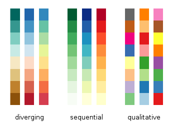
Fig. 1 Examples of color maps from colorbrewer2.org ordered in three categories (code to produce this figure, data)
The diverging color maps are for data with extremes at both points of a neutral value, for example like the below and above sea level. The sequential color maps are for data ordered from one point to another and the qualitative color maps are for categorically-grouped data with now explicit ordering.
Thanks to Anna Schneider there is an easy way to include them (at least the ones with eight colors each) into gnuplot. Just go to her gnuplot-colorbrewer github site and download the color maps. Place them in the same path as your plotting file, or add the three pathes of the repository to your load pathes, for example by adding the following to your .gnuplot file.
set loadpath '~/git/gnuplot-colorbrewer/diverging' \
    '~/git/gnuplot-colorbrewer/qualitative' \
    '~/git/gnuplot-colorbrewer/sequential'
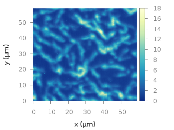
Fig. 2 Photoluminescence yield plotted with the YlGnBu color map from colorbrewer2.org (code to produce this figure, data)
After this you can pick the right color map for you on colorbrewer2.org, keep its name and load it before your plot command. For example in Fig. 2 we are plotting again the photoluminescence yield with the sequential color map named YlGnBu. First we load the color map, then switch the two poles of the color map by setting the palette to negative, and finally plotting the data.
load 'YlGnBu.plt'
set palette negative
plot 'matlab_colormap.txt' u ($1/3.0):($2/3.0):($3/1000.0) matrix with image
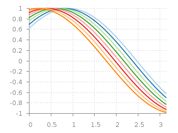
Fig. 3 Eight lines plotted with the Paired color map from colorbrewer2.org (code to produce this figure)
The nice thing of the palettes coming with gnuplot-colorbrewer is that they also include the corresponding line colors. In Fig. 3 you see the Paired qualitative color map in action with lines.
load 'Paired.plt'
plot for [ii=1:8] f(x,ii) ls ii lw 2
Nice tip! How could I use the colormap in a log scale ? I mean, the colors changing faster at the top of scale. Congratulations for such nice site.
Hi Thadeu — The colorbrewer scales are designed to be perceptually linear. But you can take the exponential of your data then apply the linear colormap.
Thanks for the nice illustration. I have a question regarding to plotting several colorful vectors.
My dataset consists of 4 columns in which I have three categories .
All categories should be plotted as vector but in different colors.
Could you advise me how I could do that in gnuplot?
Thanks
Hi Jasmine.
I’m afraid you have to specify your problem a little bit more precise:
* what do you mean by “colorful vectors”? Using the vector plotting style with different colors?
* are the three categories separated by the columns or have you three categories in all of the columns?
First of all, thank you very much for this amazing web-site. I’ve learned so many amazing new things!
I have a question about using palettes for line colours. Number of lines in my plots is varying (from a few to a few tens), but I want them to be rainbow-coloured, with the first line always being red, and the last line always being purple. By defining line styles, I am able to achieve the desired result only for as many lines as there are styles. Could you help me with this?
Hi Tetiana.
This is indeed a feature that is missing, and I’m afraid it is not straight forward to achieve as gnuplot normally cannot know beforehand how many lines you will plot.
Maybe there is a way to write a function or a script that gets as input the number of lines and the color palette to use and generates the corresponding line styles on the fly. I will think about it.
Thank you for your answer.
I was thinking maybe something using pm3d and additional column for color code?
Anyway, if you come up with a solution, please share it with us!