March 12th, 2013 | 12 Comments
We discussed already the plotting of heat maps at more than one occasions. Here we will add the possibility to interpolate the data in a heat map figure.

Fig. 1 A simple heat map (code to produce this figure, data)
Suppose we have the following data matrix, stored in heat_map_data.txt.
6 5 4 3 1 0
3 2 2 0 0 1
0 0 0 0 1 0
0 0 0 0 2 3
0 0 1 2 4 3
0 1 2 3 4 5
The normal way of plotting them would be with
plot 'heat_map_data.txt' matrix with image
But to be able to interpolate the data we have to use splot and pm3d instead.
set pm3d map
splot 'heat_map_data.txt' matrix
In Fig. 1 the result of plotting the data just with splot, without interpolation is shown. Note, that the result differs already from the plot command. The plot command would have created six points, whereas the splot command comes up with only five different regions for every axis.

Fig. 2 A heat map interpolated to use twice as much points on every axis (code to produce this figure, data)
Now if we want to double the number of visible points, we can tell pm3d easily to interpolate the data by the interpolate command.
set pm3d interpolate 2,2
The two numbers 2,2 are the number of additional points along the x- and y-axis.
The resulting plot can be found in Fig. 2.
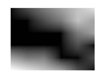
Fig. 3 A heat map interpolated with an optimal number of points (code to produce this figure, data)
In addition to explicitly setting the number of points we can tell gnuplot to choose the correct number of interpolation points by itself, by setting them to 0.
set pm3d interpolate 0,0
Now gnuplot decides by itself how to interpolate, which leads to the result in Fig. 3.
Very interesting, but… what is the interpolation method? Linear? Bicubic?
I do not see it explicitly mentioned in the documentation…
I would assume that it is linear interpolation. In addition, you could have a look in the gnuplot code, how it is implemented.
I believe it is bicubic. I ran into an issue with overshoot from interpolation with pm3d plots. This indicates that it’s not linear. Can someone verify or refute this?
I’m pretty sure it is bilinear. As you can see such changes clearly along the main axis in Fig. 3 (horizontal and vertical) indicating the plains were interpolating with two constant directional vector x and y for each plain. (From the given point, the interpolated data is radially symmetric along both axis).
Be very carefull with the use of pm3d for matrix representation !!!!
As it’s written in GNUPLOT manual, with the plot command and a M x N matrix, you will have a surface of M x N elements. This is different from the pm3d plotting style, where an M x N set of data will form a surface of (M-1) x (N-1) elements.
[…] documentation (which was AMAZING by the way), I was able to figure out that I wanted to make a heat map using an image file format. I worked off the examples given and was able to get a batch file […]
How I can make an interpolation to smooth my image if my “heat-map” was generated from a file X, Y, Z?
Hi Jorge.
If your data is in the right format it is straightforward. Just remove the
matrixoption and plot it withThe rest of the code should be the same.
Thanks for a great tutorial! I was frantically looking for a way to make something like a Mathematica density plot in Gnuplot, and this is the only place I could find such a thing. Three cheers!
I tried to plot this txt file (http://1drv.ms/1P22zYh). while it does plot it correctly with the command stated in the above article, the plot is upside down. while i could invert the diagram, but then the axis would invert as well. what could possibly be the reason for this?
I don’t know if it by design or something funny happens when 2d projection is done, but you feed 6×6 matrix and what is plotted in Figure 1 is a 5×5 matrix (even when not interpolated) — I actually need all col and rows — any idea how to fix it? I tried pretty much every combination of plot/splot paramters, but it is not working ( I have ugly workaround by setting xrange to a range slightly longer+taller and offsetting from set xrange [0:5] to set xrange[-0.5, 5.5]. Thanks
I can write the data of my map plot into a file by using “set table”. However, this does only work without an interpolation. Is there a way to write the interpolated points and values into a file?