Gnuplotting

Create scientific plots using gnuplot

May 22nd, 2012 | 3 Comments

In one of the last posts we have looked at how to plot equipotential lines. Here we want to plot the equipotential lines of two sources with different charges, like an electron and a positron.

Equipotential lines of an electron and a positron

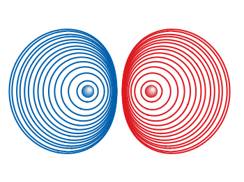
Fig. 1 Equipotential lines of an electron and a positron (code to produce this figure, electron.gnu, positron.gnu)

In addition the sources should be plotted as well, as can be seen in Fig. 1. There the electron is drawn as a red sphere with some lightning effect and the positron as a red sphere. This effect can be achieved with Gnuplot by plotting a bunch of circles with slightly different color and size on top of each other.

set for [n=0:max-1] object n+object_number circle \
    at posx(x,n,max/1.0),posy(y,n,max/1.0) size size(n,max/1.0)
set for [n=0:max-1] object n+object_number \
    fc rgb blue(n,max/1.0) fillstyle solid noborder lw 0

The size and position are determined by the posx,poxy,size functions. The color is chosen according to the blue function for the electron, which is a little tricky and composed of the three color functions r,g,b. These functions generate a color gradient starting from the blue, which is used as the line color for the equipotential lines, into a slight white.

size(x,n) = s*(1-0.8*x/n)
r(x,n) = floor(240.0*x/n)
g(x,n) = floor(144.0*x/n)+96
b(x,n) = floor(67.0*x/n)+173
blue(x,n) = sprintf("#%02X%02X%02X",r(x,n),g(x,n),b(x,n))
posx(X,x,n) = X + 0.03*x/n
posy(Y,x,n) = Y + 0.03*x/n

The code shown so far is put into external functions (electron.gnu, positron.gnu) and can be used in any script to plot equipotential lines, as the one used to generate Fig. 1.

Equipotential lines of two sources with different charge

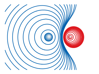
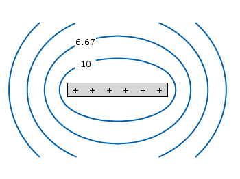
Fig. 2 Equipotential lines of two sources with different charges (code to produce this figure)

The position and size of the source are the parameters of the functions. Fig. 2 shows the result for a negative particle with twice the absolute charge of the positive charged particle.

# positron
x1 = 2; y1 = 1; q1 = 1
# electron
x2 = 1; y2 = 1; q2 = -2
call 'positron.gnu' x1 y1 '0.1'
call 'electron.gnu' x2 y2 '0.2'

Thanks to Gnuplotter for the original idea.

April 2nd, 2012 | 9 Comments

Since last month the new Gnuplot version 4.6 is officially available. There are a lot of interesting changes in this new version and we will cover the bigger ones within the next posts. Here we start with, in my opinion, the nicest new feature: block-structured conditions and loops.

Until 4.6 an iteration over different lines of code was only possible with the help of an extra file. This technique was used, for example, for the gif animation entry. There the loop was executed by

t = 0
end_time = 1
load 'bessel.plt'

with the file bessel.plt containing the code to execute within the loop

# bessel.plt
t = t + 0.02
outfile = sprintf('animation/bessel%03.0f.png',50*t)
set output outfile
splot u*sin(v),u*cos(v),bessel(u,t) w pm3d ls 1
if(t<end_time) reread;

This can now be reformulated in a much shorter way by applying the new do command and the block-structure given by the { }

do for [t=0:50] {
    outfile = sprintf('animation/bessel%03.0f.png',t)
    set output outfile
    splot u*sin(v),u*cos(v),bessel(u,t/50.0) w pm3d ls 1
}

Now there is no need for an additional file. The only thing to consider is the change of the index t, because for the for-loop t has to be an integer.

The block-structure can in the same way be applied to the if-statement.

March 15th, 2012 | 8 Comments

Suppose you have an image and wanted to add some lines, arrows, a scale or whatever to it. Of course you can do this easily with Gnuplot as you can see in Fig. 1.

jpg image

Fig. 1 Plotting a jpg image within your graph and adding a scale (code to produce this figure, image data). Image source: © SFTEP.

To plot the jpg image of the longnose hawkfish you have to tell the plot command that you have binary data, the filetype, and choose rgbimage as a plotting style. Also we ensure that the image axes are in the right relation to each other by setting ratio to -1.

set size ratio -1
plot 'fish.jpg' binary filetype=jpg with rgbimage

The scale needs a little more work, because Gnuplot can not plot a axis with tics to both directions of it. Hence we are using a bunch of arrows to achieve the same result. The text is than set by labels to the axis.

set arrow from 31,40 to 495,40 nohead front ls 1
set for [ii=0:11] arrow from 31+ii*40,35 to 31+ii*40,45 nohead \
   front ls 1
# set number and unit as different labels in order
# to get a smaller distance between them
set label '0'  at  25,57 front tc ls 1
set label 'cm' at  37,57 front tc ls 1
set label '5'  at 225,57 front tc ls 1
set label 'cm' at 237,57 front tc ls 1
set label '10' at 420,57 front tc ls 1
set label 'cm' at 442,57 front tc ls 1

March 5th, 2012 | 3 Comments

If you want to compare some time series of data with each other it could be a good idea to plot them just onto a grid without anything else. Here we will generate a scale paper like grid and plot two simple functions on it.

colored lines

Fig. 1 Plotting some time data on scale paper like grid (code to produce this figure)

In Fig. 1, two harmonic tone complexes are shown, plotted within the multiplot environment. But the thing to consider here is the grid below them. In order to get such a grid, we have to remove all borders and tics. This is done by the following code.

set style line 11 lc rgb '#ffffff' lt 1
set border 0 back ls 11
set tics out nomirror scale 0,0.001
set format ''

The second number of scale for the tics corresponds to the minor tics and must be greater than zero, otherwise no minor tics will appear.

In the last step we enable minor tics on both axes, set the style for the grid and define the grid itself.

set mxtics
set mytics
set style line 12 lc rgb '#ddccdd' lt 1 lw 1.5
set style line 13 lc rgb '#ddccdd' lt 1 lw 0.5
set grid xtics mxtics ytics mytics back ls 12, ls 13

February 20th, 2012 | 1 Comment

Most of you will probably know the problem of visualizing more than two dimensions of data. In the past we have seen some solutions to this problem by using color maps, or pseudo 3D plots. Here is another solution which will just plot a bunch of lines, but varying their individual colors.

colored lines

Fig. 1 Plot of interaural time differences for different frequency channels, indicated by different colors (code to produce this figure, data)

For this we first define the colors we want to use. Here we create a transition from blue to green by varying the hue in equal steps. The values can be easily calculated with GIMP or any other tool that comes with a color chooser.

set style line 2  lc rgb '#0025ad' lt 1 lw 1.5 # --- blue
set style line 3  lc rgb '#0042ad' lt 1 lw 1.5 #      .
set style line 4  lc rgb '#0060ad' lt 1 lw 1.5 #      .
set style line 5  lc rgb '#007cad' lt 1 lw 1.5 #      .
set style line 6  lc rgb '#0099ad' lt 1 lw 1.5 #      .
set style line 7  lc rgb '#00ada4' lt 1 lw 1.5 #      .
set style line 8  lc rgb '#00ad88' lt 1 lw 1.5 #      .
set style line 9  lc rgb '#00ad6b' lt 1 lw 1.5 #      .
set style line 10 lc rgb '#00ad4e' lt 1 lw 1.5 #      .
set style line 11 lc rgb '#00ad31' lt 1 lw 1.5 #      .
set style line 12 lc rgb '#00ad14' lt 1 lw 1.5 #      .
set style line 13 lc rgb '#09ad00' lt 1 lw 1.5 # --- green

Then we plot our data with these colors and get Figure 1 as a result.

plot for [n=2:13] 'itd.txt' u 1:(column(n)*1000) w lines ls n

There the interaural time difference (ITD) between the right and left ear for different frequency channels ranging from 236 Hz to 1296 Hz is shown. As can be seen the ITD varies depending on the incident angle (azimuth angle) of the given sound.

Another possibility to indicate the frequency channels given by the different colors is to add a colorbox to the graph as shown in Figure 2.

Colored lines

Fig. 2 Plot of interaural time differences for different frequency channels, indicated by different colors as shown in the colorbox (code to produce this figure, data)

To achieve this we have to set the origin and size of the colorbox ourselves. Note, that the notation is not the same as for a rectangle object and uses only the screen coordinates which is a little bit nasty. In addition we have to define our own color palette, as has been discussed already in another colorbox entry. In a last step we add a second phantom plot to our plot command by plotting 1/0 using the image style in order to get the colorbox drawn onto the graph.

set colorbox user horizontal origin 0.32,0.385 size 0.18,0.035 front
set cbrange [236:1296]
set cbtics ('236 Hz' 236,'1296 Hz' 1296) offset 0,0.5 scale 0
set palette defined (\
    1  '#0025ad', \
    2  '#0042ad', \
    3  '#0060ad', \
    4  '#007cad', \
    5  '#0099ad', \
    6  '#00ada4', \
    7  '#00ad88', \
    8  '#00ad6b', \
    9  '#00ad4e', \
    10 '#00ad31', \
    11 '#00ad14', \
    12 '#09ad00' \
    )
plot for [n=2:13] 'itd.txt' u 1:(column(n)*1000) w lines ls n, \
   1/0 w image

February 3rd, 2012 | 6 Comments

In the first post regarding animations we have created a bunch of png files and combined them to a single gif animation. Now we want to generate again a bunch of png files, but combine them to a movie.

Fig. 1 Video animation of Huygens principle (code to produce this figure, loop function)

We create the png files in analogy to the gif example, hence we will discuss only the generation of the movie here. In order to compose a avi file from the png files we are using Mencoder. Gnuplot is able to directly start Mencoder by its system command.

# Create movie with mencoder
ENCODER = system('which mencoder');
if (strlen(ENCODER)==0) print '=== mencoder not found ==='; exit
CMD = 'mencoder mf://animation/*.png -mf fps=25:type=png -ovc lavc -lavcopts vcodec=mpeg4:mbd=2:trell -oac copy -o huygen.avi'
system(CMD)

The first two lines check if Mencoder is available and quit gnuplot if not. The Mencoder command itselfs gets the directory containing the png files mf://animation/*.png, frames per second and input type-mf fps=25:type=png, video -ovc and audio -oac options, and finally of course the output file -o huygen.avi.

In order to generate a webm video file for a web site, ffmpeg can be used to convert the video.

$ ffmpeg -i huygen.avi huygen.webm

January 22nd, 2012 | No Comments

Axis with arrow

Fig. 1 Plot of a sinusoid with arrows on the axes (code to produce this figure, data)

You can easily add arrows to the end of the x- and y-axis using the set arrow command. The two last values of the size option determines the opening and closing angles of the arrows.

set arrow from graph 1,0 to graph 1.05,0 size screen 0.025,15,60 \
    filled ls 11
set arrow from graph 0,1 to graph 0,1.05 size screen 0.025,15,60 \
    filled ls 11

January 5th, 2012 | 16 Comments

This time another colormap plot. If you are using Matlab or Octave you are probably be familiar with Matlabs nice default colormap jet.

Matlab colorbar

Fig. 1 Photoluminescence yield plotted with the jet colormap from Matlab (code to produce this figure, data)

In Fig.1, you see a photoluminescence yield in a given region, and as you can see Gnuplot is able to apply the jet colormap from Matlab. This can be achieved by defining the palette as follows.

set palette defined ( 0 '#000090',\
                      1 '#000fff',\
                      2 '#0090ff',\
                      3 '#0fffee',\
                      4 '#90ff70',\
                      5 '#ffee00',\
                      6 '#ff7000',\
                      7 '#ee0000',\
                      8 '#7f0000')

The numbers 0..8 are automatically rescaled to 0..1, which means you can employ arbitrary numbers here, only their difference counts.

If you want to use this colormap regularly, you can store it in the Gnuplot config file as a macro.

# ~/.gnuplot
set macros
MATLAB = "defined (0  0.0 0.0 0.5, \
                   1  0.0 0.0 1.0, \
                   2  0.0 0.5 1.0, \
                   3  0.0 1.0 1.0, \
                   4  0.5 1.0 0.5, \
                   5  1.0 1.0 0.0, \
                   6  1.0 0.5 0.0, \
                   7  1.0 0.0 0.0, \
                   8  0.5 0.0 0.0 )"

Here we defined the colors directly as rgb values in the range of 0..1, which can be alternatively used a color definition.
In order to apply the colormap, we now can simple write

set palette @MATLAB

December 18th, 2011 | 12 Comments

In physics equipotential lines describe lines in space which are at the same potential, for example of the electric field.

Equipotential lines

Fig. 1 Equipotential lines of a plate with electric charges (code to produce this figure)

In Fig. 1 equipotential lines for the electric field of six charges equally spaced on a plate are shown. In order to get these lines we need the function of the potential v(x,y) and make a contour plot with splot to a file to save the positions of the lines.

# calculate and save equipotential lines
set view map
unset surface
set contour base
# distance between contour lines according to 1/r
# => equal distance between lines
set cntrparam levels discrete 4,5,6.67,10
set isosam 31,31
set table 'equipotential_lines.txt'
splot v(x,y) w l ls 1
unset table

plot 'equipotential_lines.txt' u 1:2 w l ls 1

The positions of the lines are given by the cntrparam levels which are chosen in a way, to get equally spaced lines in the far field. The set table command stores the contour lines to a file, and finally the last command plots the stored lines.

In addition to the equipotential lines the value of the contour is stored as a third column in the equipotential_lines.txt file and can be plotted on the graph, too. This is shown in Fig. 2.

Equipotential lines with labels

Fig. 2 Equipotential lines of a plate with electric charges with labels (code to produce this figure)

To get the label of the contour we have to choose a x-position which is given by lx0 in the following. The labels(x,y) function sets a string to the value of the third column, if the right x-position is given and we are above the plate. The function f(x,y) checks if we are near the point where a label should be drawn and undefines the contour line around this point. The size of this area is given by eps.

lx0 = 1.14899
eps = 0.15
labels(x,y) = (x==lx0 && y>y0) ? stringcolumn(3) : ""
f(x,y) = (abs(lx0-x)<eps && y>y0) ? 1/0 : y

November 29th, 2011 | 3 Comments

A spectrogram is a time-frequency representation that shows how the spectral content of a signal varies with time. In Fig. 1 the spectrogram of the German sentence “Achte auf die Autos” is shown.

Spectrogram

Fig. 1 Spectrogram plotted with plot (code to produce this figure, data)

The spectrogram is plotted as mentioned in the color maps entry.

plot 'spec.dat' binary matrix with image

In addition the letters were putted on the graph at their corresponding time of occurrence. The letters itself and their positions are stored in the two lists syl and xpos. In order to access the single entries of these lists within a for loop the function word is needed.

# Adding the syllables
syl  = 'A    ch   te   a    u    f    d    ie   A    u    t    \
o    s   '
xpos = '0.15 0.22 0.36 0.44 0.49 0.56 0.62 0.66 0.89 1.01 1.16 \
1.26 1.42'
set for [n=1:words(syl)] label word(syl,n) at word(xpos,n),6800

Another way to plot the spectrogram is by using splot which will result in a different kind of smoothing algorithm of the spectrogram, as can be seen in Fig. 2.

Spectrogram

Fig. 2 Spectrogram plotted with splot (code to produce this figure, data)

But to get this result we have to fix some of the margins, because plot is two-dimensinal and splot is three-dimensional which is not desired here.

set border 10 front ls 11
set tmargin at screen 0.75
set bmargin at screen 0.25
set rmargin at screen 0.95
set lmargin at screen 0.15