July 8th, 2011 | 1 Comment
The last entry has plotted all its data from data files, even the signal at 700Hz. In this entry we will see how to plot the signal as a function using the special-filenames property of Gnuplot.
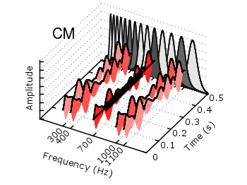
Fig. 1 Visualization of the comodulation masking release using splot and special-filenames (code to produce this figure, gfb_loop.gnu, gfb.dat, noise.dat)
In Fig. 1 the end result is seen. What we have done is to replace the last splot command from the cmr.gnu file with the following code.
set samples 500
# Define the sinusoid signal to be plotted
sig(y) = y>0.1 && y<0.4 ? 0.45*sin(2*pi*100*y)+2 : 2
# The desired range is 0:0.5, but the samples were created for the
# x-axis, which has a range of 0:1400, therefore we calculate an
# factor to do the plot
fact = 1400/0.5
splot '+' u (700):($1/fact):(sig($1/fact)) w l ls 14
We define the function sig(y) which is a 100Hz sinusoid centered at 2 for values of y between 0.1 and 0.4 and constant 2 else. In order to place this two dimensional function in our 3D plot we use the special-filenames property from Gnuplot, in this case the '+' variant. This tells Gnuplot to use the xrange, apply a sampling of it and return it as first column for the plot command. But for our plot we need the y-axis and not the x-axis, because the x values should be constant at 700 and are therefore given by (700) at the splot command. The values of the first column, given by $1 are scaled by fact in order to match the two axis and are then directly used as y values and given to the sig(y) function for the z values.
I’m really loving the theme/design of your site. Do you ever run into any internet browser compatibility issues? A couple of my blog readers have complained about my website not working correctly in Explorer but looks great in Firefox. Do you have any recommendations to help fix this issue?