September 23rd, 2010 | 5 Comments
In the last entry we had mean and standard variation data for five different conditions. Now let us assume that we have only two different conditions, but have measured with three different instruments A, B and C. We have used a ANOVA to verify that the data for the two conditions are significant different. As a result the plot in Fig. 1 should be created.
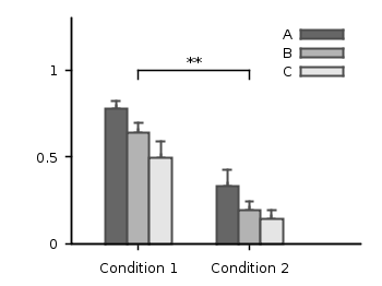
Fig. 1 Plot the mean and variance of the given data (code to produce this figure)
Therefore we store our data in a format, that can be used by the index command in Gnuplot. Note that the data have two empty lines between the blocks in the real data file:
# mean      std
# A
0.77671    0.20751
0.33354    0.30969


# B
0.64258    0.22984
0.19621    0.22597


# C
0.49500    0.31147
0.14567    0.21857
Now every instrument is stored in a different data block containing both conditions as columns.
The color definitions and axes settings are done in a similar way as in the previous blog entry. Note that we have to define two more colors for the boxes, because we use three different colors. Also we define a black line to plot the significance indicator (arrow).
set style line 1 lc rgb 'gray30' lt 1 lw 2
set style line 2 lc rgb 'gray40' lt 1 lw 2
set style line 3 lc rgb 'gray70' lt 1 lw 2
set style line 4 lc rgb 'gray90' lt 1 lw 2
set style line 5 lc rgb 'black' lt 1 lw 1.5
set style fill solid 1.0 border rgb 'grey30'
The significance indicator is created by three black arrows and a text label:
# Draw line for significance test
set arrow 1 from 0,1 to 1,1 nohead ls 5
set arrow 2 from 0,1 to 0,0.95 nohead ls 5
set arrow 3 from 1,1 to 1,0.95 nohead ls 5
set label '**' at 0.5,1.05 center
For the plot the index command is used to plot first condition A, then B and then C by using block 0,1, and 2 respectively. The x-position of the boxes for instrument A are slightly shifted to the left, the ones for C to the right by subtracting or adding the value of bs. The value of bs has the width of one box in order to plot the boxes side by side.
# Size of one box
bs = 0.2
# Plot mean with variance (std^2) as boxes with yerrorbar
plot 'statistics.dat' i 0 u ($0-bs):1:($2**2) notitle w yerrorb ls 1, \
     ''               i 0 u ($0-bs):1:(bs) t 'A' w boxes ls 2, \
     ''               i 1 u 0:1:($2**2) notitle w yerrorb ls 1, \
     ''               i 1 u 0:1:(bs) t 'B' w boxes ls 3, \
     ''               i 2 u ($0+bs):1:($2**2) notitle w yerrorb ls 1, \
     ''               i 2 u ($0+bs):1:(bs) t 'C' w boxes ls 4
Hello Hagen,
how can i get a 4th case (D) in my histogram?
# Plot mean with variance (std^2) as boxes with yerrorbar
plot ‘statistics.dat’ i 0 u ($0-bs):1:($2**2) notitle w yerrorb ls 1, \
” i 0 u ($0-bs):1:(bs) t ‘A’ w boxes ls 2, \
” i 1 u 0:1:($2**2) notitle w yerrorb ls 1, \
” i 1 u 0:1:(bs) t ‘B’ w boxes ls 3, \
” i 2 u ($0+bs):1:($2**2) notitle w yerrorb ls 1, \
” i 2 u ($0+bs):1:(bs) t ‘C’ w boxes ls 4
Thanks
Andreas
First you have to add a fourth section to your data file.
Fig. 2 Plot the mean and variance of the given data (code to reproduce this figure)
Then I would modify the plotting command a little bit, that not only a forth box is plotted, but also the boxes are centered again around the condition tics and are made a little bit narrower. The result is shown in Fig. 2.
# Plot mean with variance (std^2) as boxes with yerrorbar plot 'statistics.dat' i 0 u ($0-1.5*bs):1:($2**2) notitle w yerrorb ls 1, \ '' i 0 u ($0-1.5*bs):1:(bs) t 'A' w boxes ls 2, \ '' i 1 u ($0-0.5*bs):1:($2**2) notitle w yerrorb ls 1, \ '' i 1 u ($0-0.5*bs):1:(bs) t 'B' w boxes ls 3, \ '' i 2 u ($0+0.5*bs):1:($2**2) notitle w yerrorb ls 1, \ '' i 2 u ($0+0.5*bs):1:(bs) t 'C' w boxes ls 4, \ '' i 3 u ($0+1.5*bs):1:($2**2) notitle w yerrorb ls 1, \ '' i 3 u ($0+1.5*bs):1:(bs) t 'D' w boxes lt 1 lw 2 \ lc rgb 'white'Thanks very much
Hello Hagen,
how can I output this into .pdf keeping the size? I tried it myself and it got biased.
Thanks!
Daniela
Hi Daniela.
The easiest solution is to use the pdfcairo terminal. The only thing you have to do, is to change the size to cm or inches, because pixel is not supported at the moment. Change the terminal settings to these two lines in the code from Fig.1 and just plot it.