June 24th, 2011 | No Comments
The filledcurves style is only available for 2d plots. But it can be used with some limitations with splot in 3d plots as well. In this entry we want to visualize an effect known from psychoacoustics, called comodulation masking release. The effect describes the possibility of our hearing system to perceive a masked tone (in this case at 700 Hz) easier in the presence of so called comodulated maskers present in other auditory filters. Comodulation describes the fact, that all maskers have the same envelope, as can be seen in Fig. 1.
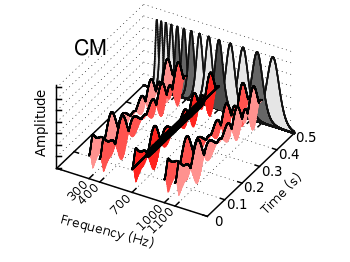
Fig. 1 Visualization of the comodulation masking release using splot and filledcurves (code to produce this figure, gfb_loop.gnu, gfb.dat, sig.dat, noise.dat)
First we start with the gammatone filters. The values for them are stored in the gfb.dat file as one column per filter. In order to apply different colors to different filters the style function sty(x) is defined. The data(x) function is defined to be able to plot the filters in a particular order. This will result in the nice effect of overlapping filters shown in Fig. 2.
sty(x) = x<7 ? 1 : x<10 ? 2 : x<12 ? 1 : x==12 ? 3 : x<15 ? 1 : \
    x==15 ? 2 : 1
data(x) = x<12 ? x : 29-x
The filter bank itself is plotted by the gfb_loop.gnu function. There the data are plotted first as filledcurves and then as a line. This two step mechanism has to be used, because the filledcurves style is not able to draw an extra line in 3d. Hence it has to be done in the extra gfb_loop.gnu function, because the simple for iteration only works for a single plot and is not able to plot the line around the filters.
# gfb_loop.gnu
splot 'gfb.dat' u 2:1:(column(data(i))) w filledcurves \
    ls sty(data(i)), \
      ''        u 2:1:(column(data(i))) ls 4
i = i+1
if (i<maxi) reread
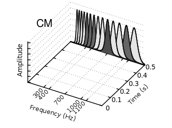
Fig. 2 Plotting gammatone filters with an extra loop file (code to produce this figure, gfb_loop.gnu, gfb.dat)
Thereafter the modulated noise and its envelope and the signal are plotted in different parts of the graph by explicitly giving the x position.
The result is shown in Fig. 1.
splot 'noise.dat' u  (300):1:2 ls 11, \
      ''          u  (300):1:3 ls 14, \
      ''          u  (400):1:2 ls 12, \
      ''          u  (400):1:3 ls 14, \
      ''          u  (700):1:2 ls 13, \
      ''          u  (700):1:3 ls 14, \
      ''          u (1000):1:2 ls 12, \
      ''          u (1000):1:3 ls 14, \
      ''          u (1100):1:2 ls 11, \
      ''          u (1100):1:3 ls 14
splot 'sig.dat'   u  (700):1:2 ls 14