Gnuplotting

Create scientific plots using gnuplot

October 17th, 2012 | 5 Comments

Some data could be nicely visualized by representing them as arrows. For example, assume that we have done an experiment where we played something to a subject through three loudspeakers and the subject should name the direction where he or she perceived it. In Fig. 1 we show the named direction by the direction of the arrows. The color of the arrow indicates the deviation from the desired direction. A white and not visible arrow means no deviation and a dark red one a deviation of 40° or more.

Vector field showing localization data

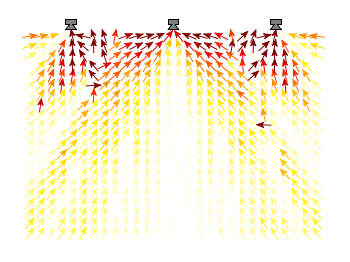
Fig. 1 Vector field showing localization results. The arrows are pointing towards the direction the subject had named. The color indicates the deviation from the desired direction. (code to produce this figure, set_loudspeakers.gnu, data)

In gnuplot the with vectors command enables the arrows in the plot. It requires four parameters, x, y, dx, dy, where dx and dy controls the endpoint of the arrow as offset values to x,y. In our example the direction is stored as an angle, hence the following functions do the conversion to dx,dy. 0.1 defines the length of the arrows.

xf(phi) = 0.1*cos(phi/180.0*pi+pi/2)
yf(phi) = 0.1*sin(phi/180.0*pi+pi/2)

An optional fifth parameter controls the color of the vector together with the lc palette setting. The arrows start at x-dx,y-dy and point to x+dx,y+dy.

plot 'localization_data.txt' \
    u ($1-xf($3)):($2-yf($3)):(2*xf($3)):(2*yf($3)):4 \
    with vectors head size 0.1,20,60 filled lc palette

February 20th, 2012 | 1 Comment

Most of you will probably know the problem of visualizing more than two dimensions of data. In the past we have seen some solutions to this problem by using color maps, or pseudo 3D plots. Here is another solution which will just plot a bunch of lines, but varying their individual colors.

colored lines

Fig. 1 Plot of interaural time differences for different frequency channels, indicated by different colors (code to produce this figure, data)

For this we first define the colors we want to use. Here we create a transition from blue to green by varying the hue in equal steps. The values can be easily calculated with GIMP or any other tool that comes with a color chooser.

set style line 2  lc rgb '#0025ad' lt 1 lw 1.5 # --- blue
set style line 3  lc rgb '#0042ad' lt 1 lw 1.5 #      .
set style line 4  lc rgb '#0060ad' lt 1 lw 1.5 #      .
set style line 5  lc rgb '#007cad' lt 1 lw 1.5 #      .
set style line 6  lc rgb '#0099ad' lt 1 lw 1.5 #      .
set style line 7  lc rgb '#00ada4' lt 1 lw 1.5 #      .
set style line 8  lc rgb '#00ad88' lt 1 lw 1.5 #      .
set style line 9  lc rgb '#00ad6b' lt 1 lw 1.5 #      .
set style line 10 lc rgb '#00ad4e' lt 1 lw 1.5 #      .
set style line 11 lc rgb '#00ad31' lt 1 lw 1.5 #      .
set style line 12 lc rgb '#00ad14' lt 1 lw 1.5 #      .
set style line 13 lc rgb '#09ad00' lt 1 lw 1.5 # --- green

Then we plot our data with these colors and get Figure 1 as a result.

plot for [n=2:13] 'itd.txt' u 1:(column(n)*1000) w lines ls n

There the interaural time difference (ITD) between the right and left ear for different frequency channels ranging from 236 Hz to 1296 Hz is shown. As can be seen the ITD varies depending on the incident angle (azimuth angle) of the given sound.

Another possibility to indicate the frequency channels given by the different colors is to add a colorbox to the graph as shown in Figure 2.

Colored lines

Fig. 2 Plot of interaural time differences for different frequency channels, indicated by different colors as shown in the colorbox (code to produce this figure, data)

To achieve this we have to set the origin and size of the colorbox ourselves. Note, that the notation is not the same as for a rectangle object and uses only the screen coordinates which is a little bit nasty. In addition we have to define our own color palette, as has been discussed already in another colorbox entry. In a last step we add a second phantom plot to our plot command by plotting 1/0 using the image style in order to get the colorbox drawn onto the graph.

set colorbox user horizontal origin 0.32,0.385 size 0.18,0.035 front
set cbrange [236:1296]
set cbtics ('236 Hz' 236,'1296 Hz' 1296) offset 0,0.5 scale 0
set palette defined (\
    1  '#0025ad', \
    2  '#0042ad', \
    3  '#0060ad', \
    4  '#007cad', \
    5  '#0099ad', \
    6  '#00ada4', \
    7  '#00ad88', \
    8  '#00ad6b', \
    9  '#00ad4e', \
    10 '#00ad31', \
    11 '#00ad14', \
    12 '#09ad00' \
    )
plot for [n=2:13] 'itd.txt' u 1:(column(n)*1000) w lines ls n, \
   1/0 w image

October 10th, 2011 | No Comments

In the last entry we have seen how to use a color map to represent matrix data. Another way to visualize such kind of data is to code their values not as color, but as height information using so called pseudo 3D plots.

Pseudo 3D plot

Fig. 1 Pseudo 3D plot of basilar membrane activity (code to produce this figure, data)

Suppose we have some data like spectra with different parameters, slightly shifted and plotted into the same figure, or different oscillations over time as shown in Fig. 1. There, the movement of the basilar membrane to an input stimuli dependent on the center frequency in ERB is plotted over time. The movement on the basilar membrane is dependent on the frequency of the incoming stimulus, with different frequencies acting on different places along the membrane. In order to plot this kind of data the for command of Gnuplot can be used to iterate through the data. The pseudo 3D effect is realized by shifting the data in every iteration one ERB by the +ii part and the usage of filledcurves to overwrite not visible parts of the plot with white color.

set style fill solid 1.0 border rgb 'black'
plot for [ii=25:1:-1] 'bmm.txt' u (f(column(ii))+ii) \
    w filledcu y1=-2 ls 1

The amplitude of the data was originally stored in order to fit in a plot given in Hz. Hence, we have to convert the data into ERB. This is done by the function f. As arguments to the function the values of each column are given in the iteration. Therefore, the column number is indexed by the column function.

July 29th, 2011 | 5 Comments

In one post we have used the parametric plot option to plot the world. Here we want to add some temperature data as a heat map to the world plots. The data show the temperature anomalies of the year 2005 in comparison to the baseline 1951-1980 and is part of the GISTEMP data set.

Heat map

Fig. 1 A 2D heat map of the temperature anomalies in 2005 to the baseline 1951-1980 (code to produce this figure, temperature data, world data)

The first problem you face, if you want to create a heat map, is that the data has to be in a specific format shown in the Gnuplot example page for heat maps. Therefore we first arrange the data and end up with this temperature anomalies file. Unknown data points are given by 9999.0.

In order to plot this data to the 2D world map we have to add a reasonable cbrange and a color palette and the plot command for the map:

set cbrange [-5:10]
set palette defined (0 "blue",17 "#00ffff",33 "white",50 "yellow",\
    66 "red",100 "#990000",101 "grey")
plot 'temperature.dat' u 2:1:3 w image, \
     'world.dat' with lines linestyle 1

The trick with the wide range from 0 to 101 for the color bar is chosen in order to use grey for the undefined values (9999.0) without seeing the grey color in the color bar. The result is shown in Fig. 1.

Heat map

Fig. 2 A 3D heat map of the temperature anomalies in 2005 to the baseline 1951-1980 (code to produce this figure, temperature data, world data)

The same data can easily be applied to the 3D plot of the world. We have to add front to the hidden3d command in order to make the black world lines visible. In addition the radius must be given explicitly as third column to the plot command for the temperature data.

set hidden3d front
splot 'temperature.dat' u 2:1:(1):3 w pm3d, \
      r*cos(v)*cos(u),r*cos(v)*sin(u),r*sin(v) w l ls 2, \
      'world.dat' u 1:2:(1) w l ls 1

The result is shown in Fig. 2.

May 6th, 2011 | 2 Comments

loudspeaker circle

Fig. 1 A circular loudspeaker array drawn with the object command (code to produce this figure, set_loudspeaker function)

In one of the last entries we have seen how to plot a loudspeaker with Gnuplot.
This time we will have a look at the case of setting more than one loudspeaker to your plot. Furthermore we allow the placement of the loudspeakers after entries in a data file.
Let us assume we have a data file containing the x position, y position and orientation phi of a single loudspeakers per line. Now we have to read the data with Gnuplot and set the objects according to the data. This can be done by a dummy plot, because by applying the plot command, variables can be stored. For the dummy plot we setting the output of the plot command to table and use /dev/null as the place to write the data.

# --- Read loudspeaker placement from data file
set table '/dev/null'
add_loudspeaker(x,y,phi) = sprintf(\
    'call "set_loudspeaker.gnu" "%f" "%f" "%f" "%f";',x,y,phi,0.2)
CMD = ''
plot 'loudspeaker_pos.dat' u 1:(CMD = CMD.add_loudspeaker($1,$2,$3))
eval(CMD)
unset table

The plot command now enables us to add the data from the file to the variable CMD, which is then executed by the eval command. To create the variable, the add_loudspeaker function creates a string with the data for every single line of the data file. The eval(CMD) calls the set_loudspeaker.gnu function once for every single data line, which corresponds to a single loudspeaker. The set_loudspeaker.gnu function itself does the same as we have done in the draw a single loudspeaker entry, but in addition it uses a rotation matrix to change the orientation of the single loudspeakers.

After having set the loudspeakers, we add some activity to three of the loudspeakers and finally get the result in Fig. 1.

# --- Plot loudspeaker activity
set parametric
fx(t,r,phi) = -1.5*cos(phi)+r*cos(t)
fy(t,r,phi) = -1.5*sin(phi)+r*sin(t)
set multiplot
set trange [-pi/6+pi/8:pi/6+pi/8]
plot for [n=1:3] fx(t,n*0.25,pi/8),fy(t,n*0.25,pi/8) w l ls 2
unset object
set trange [-pi/6-pi/8:pi/6-pi/8]
plot for [n=1:3] fx(t,n*0.25,-pi/8),fy(t,n*0.25,-pi/8) w l ls 2
set trange [-pi/6:pi/6]
plot for [n=1:3] fx(t,n*0.25,0),fy(t,n*0.25,0) w l ls 1
unset multiplot

The three waves before the desired loudspeakers are plotted within an iteration that effects the radius by using the for command. The unset object is executed after the first plot in the multiplot environment, because the loudspeakers should only be drawn once.

October 6th, 2010 | 14 Comments

If we want to plot a single point, we can do this by creating a data file, containing only one line:

# x   y
1   2

But there exist an easier method without any additional data file. In Fig. 1 three points with different symbols are plotted.

Three points

Fig. 1 Plot of three single points (code to produce this figure)

To achieve this we just use the following command:

plot '-' w p ls 1, '-' w p ls 2, '-' w p ls 3
1 2
e
2 1
e
3 1.5
e

We use the possibility to tell Gnuplot with the '-' input to read from standard input. Here we tell Gnuplot to do this three times. After the plot command the data is entered. Every single data entry have to ended with the e line.
In order to have different symbols for the points we set them before:

set style line 1 lc rgb 'black' pt 5   # square
set style line 2 lc rgb 'black' pt 7   # circle
set style line 3 lc rgb 'black' pt 9   # triangle

Note: if we want to use the replot command then the above code will not work probably. But the same can be achieved by using:

plot "<echo '1 2'"   with points ls 1, \
     "<echo '2 1'"   with points ls 2, \
     "<echo '3 1.5'" with points ls 3

September 23rd, 2010 | 5 Comments

In the last entry we had mean and standard variation data for five different conditions. Now let us assume that we have only two different conditions, but have measured with three different instruments A, B and C. We have used a ANOVA to verify that the data for the two conditions are significant different. As a result the plot in Fig. 1 should be created.

statistics

Fig. 1 Plot the mean and variance of the given data (code to produce this figure)

Therefore we store our data in a format, that can be used by the index command in Gnuplot. Note that the data have two empty lines between the blocks in the real data file:

# mean      std
# A
0.77671    0.20751
0.33354    0.30969
 
 
# B
0.64258    0.22984
0.19621    0.22597
 
 
# C
0.49500    0.31147
0.14567    0.21857

Now every instrument is stored in a different data block containing both conditions as columns.

The color definitions and axes settings are done in a similar way as in the previous blog entry. Note that we have to define two more colors for the boxes, because we use three different colors. Also we define a black line to plot the significance indicator (arrow).

set style line 1 lc rgb 'gray30' lt 1 lw 2
set style line 2 lc rgb 'gray40' lt 1 lw 2
set style line 3 lc rgb 'gray70' lt 1 lw 2
set style line 4 lc rgb 'gray90' lt 1 lw 2
set style line 5 lc rgb 'black' lt 1 lw 1.5
set style fill solid 1.0 border rgb 'grey30'

The significance indicator is created by three black arrows and a text label:

# Draw line for significance test
set arrow 1 from 0,1 to 1,1 nohead ls 5
set arrow 2 from 0,1 to 0,0.95 nohead ls 5
set arrow 3 from 1,1 to 1,0.95 nohead ls 5
set label '**' at 0.5,1.05 center

For the plot the index command is used to plot first condition A, then B and then C by using block 0,1, and 2 respectively. The x-position of the boxes for instrument A are slightly shifted to the left, the ones for C to the right by subtracting or adding the value of bs. The value of bs has the width of one box in order to plot the boxes side by side.

# Size of one box
bs = 0.2
# Plot mean with variance (std^2) as boxes with yerrorbar
plot 'statistics.dat' i 0 u ($0-bs):1:($2**2) notitle w yerrorb ls 1, \
     ''               i 0 u ($0-bs):1:(bs) t 'A' w boxes ls 2, \
     ''               i 1 u 0:1:($2**2) notitle w yerrorb ls 1, \
     ''               i 1 u 0:1:(bs) t 'B' w boxes ls 3, \
     ''               i 2 u ($0+bs):1:($2**2) notitle w yerrorb ls 1, \
     ''               i 2 u ($0+bs):1:(bs) t 'C' w boxes ls 4

September 9th, 2010 | No Comments

If we have done a experiment in order to apply a significance test like a ANOVA to our measured data, we are interested in presenting our statistical data in a familiar way.
Let us assume we have the following mean and standard deviation data for five different conditions:

"A"     0.66257     0.41854
"B"     0.70842     0.38418
"C"     0.66733     0.44059
"D"     0.45375     0.52384
"E"     0.43900     0.53116

The results for the last two conditions are significant different from the first ones. Using this data we want to create a plot that looks like the one in Fig. 1.

mean and variance

Fig. 1 Plot the mean and variance of the given data (code to produce this figure)

To achieve the plot in Fig. 1 we have to define two different color styles for the color of the errorbars and the color of the boxes. Also, we need the fill style (solid) for the boxes and the gray line around the boxes which is given by the border rgb 'grey30' option to the set style fill command. For the line color we choose the same color as for the errorbars:

set style line 1 lc rgb 'grey30' ps 0 lt 1 lw 2
set style line 2 lc rgb 'grey70' lt 1 lw 2
set style fill solid 1.0 border rgb 'grey30'

For the first line style which is used to plot the errorbars also a point size of 0 is specified in order to plot only the errorbars and no points on top of the boxes.

The *-dots above the two last conditions to indicate their significant difference are just added as labels. The border of the graph on the top and right side is removed by set border 3 (see here for an explanation of the number codes) and by using the nomirror option for the tics. The xtics are not visible, because we set them to scale 0.

set label '*' at 3,0.8 center
set label '*' at 4,0.8 center
set border 3
set xtics nomirror scale 0
set ytics nomirror out scale 0.75 0.5

Then we plot first the errorbars in order to overlay the boxes on it, so only the top half of the errorbars will be visible. Note that we have standard deviation data in the data file, therefore we have to use their squares in order to get the variance. As xtic labels we use the first row in the data file by appending xtic(1):

plot 'simple_statistics.dat' u 0:2:($3**2) w yerrorbars ls 1, \
     ''                      u 0:2:(0.7):xtic(1) w boxes ls 2

August 29th, 2010 | No Comments

If you are want to use another format for your data, e.g. a csv file with a comma as seperator, you can easily tell Gnuplot this by:

set datafile separator ','

July 11th, 2010 | 5 Comments

In the Gnuplot demo files folder that comes with your Gnuplot installation exists the file world.dat which contains data in order to plot a map of the world. Therefore we remove the key from the figure and set a grid (the dashed line in Fig. 1). Also we remove the tics by setting the format to nothing and the scale to zero. We could also remove the tics with unset tics, but the grid depends on the tics positions. After that we just plot the data:

unset key
set grid
set format ''
set tics scale 0
plot 'world.dat' with lines linestyle 1
The world

Fig. 1 A 2D plot of the world (code to produce this figure)

Here you can see a problem of the svg terminal of Gnuplot: it can’t produce dashed lines. In order to fix this, we can use Inkscape and open the svg file. Then pressing CRTL+F and type gray into the Style field and hit Enter. Now all the grid lines should be selected and you can set their stroke style to dashed by typing CRTL+Shift+F and choose one under Dashes. Doing so will lead to a figure shown in Fig. 2.

The world

Fig. 2 The 2D plot of the world edited with Inkscape

We can also easily draw a whole globe in 3D from the given data. Therefore we first add a gray line style, unset the border and arrange the figure margins.

set style line 2 lc rgb '#c0c0c0' lt 1 lw 2
unset border
set lmargin screen 0
set bmargin screen 0
set rmargin screen 1
set tmargin screen 1

The 3D plot needs a little more settings. We have to tell Gnuplot to map the data on a sphere and using angle values in degree. Also we want to have a non transparent world, therefore we need hidden3d. We arrange the appeareance of the plot by setting the xy-plane to the lowest z value in order to avoid an
offset between the lowest z vlaue an the xy-plane. To have Europe in the center we set also the viewport.

set mapping spherical
set angles degrees
set hidden3d
set xyplane at -1
set view 56,81

For the grid we have to remove the set grid command, because it doesn’t work with splot. So we draw the grid by our own using the parametric mode and finally plot the whole globe:

set parametric
set isosamples 25
set urange[0:360]
set vrange[-90:90]
splot cos(v)*cos(u),cos(v)*sin(u),sin(v) with lines linestyle 2, \
      'world.dat' with lines linestyle 1
The world

Fig. 3 A 3D plot of the world (code to produce this figure)

As you can see we have some problems with the data for Africa which lies behind the grid at some points. To avoid this and to make the grid dashed again we draw a grid with tinier radius and use Inkscape.

r = 0.99
splot r*cos(v)*cos(u),r*cos(v)*sin(u),r*sin(v) with lines \
      linestyle 2, \

In order to select the grid in Inkscape we have to search after the Style blue for some strange reason (on another PC green was the right color to search). You may have a look at the xml data to figure this out. Therefore under Edit you will find XML Editor. We not only set the stroke style to dashed we also lowered the selected objects
to avoid that any line of the grid covered a black world line. Having done all that we will finally get the nice globe in Fig. 4.

The world

Fig. 4 The 3D plot of the world edited with Inkscape