Gnuplotting

Create scientific plots using gnuplot

June 10th, 2012 | 8 Comments

In one off the last entries we defined a color palette similar to the default one in Matlab. Now we will use a color palette with only a few discrete colors, as shown in Fig. 1. This can be useful if we want to see all values from a measurement lying above a given threshold.

Palette with discrete colors

Fig. 1 Photoluminescence yield plotted with a palette with discrete colors (code to produce this figure, data)

The trick is to set maxcolors to the number of colors you want in your plot. In addition, the colors to use can be specified by the defined command. Note, that the absolute values you specify in the palette definition were automatically scaled to your min and max values (0 and 18 in this case).

set palette maxcolors 3
set palette defined ( 0 '#000fff',\
                      1 '#90ff70',\
                      2 '#ee0000')

February 20th, 2012 | 1 Comment

Most of you will probably know the problem of visualizing more than two dimensions of data. In the past we have seen some solutions to this problem by using color maps, or pseudo 3D plots. Here is another solution which will just plot a bunch of lines, but varying their individual colors.

colored lines

Fig. 1 Plot of interaural time differences for different frequency channels, indicated by different colors (code to produce this figure, data)

For this we first define the colors we want to use. Here we create a transition from blue to green by varying the hue in equal steps. The values can be easily calculated with GIMP or any other tool that comes with a color chooser.

set style line 2  lc rgb '#0025ad' lt 1 lw 1.5 # --- blue
set style line 3  lc rgb '#0042ad' lt 1 lw 1.5 #      .
set style line 4  lc rgb '#0060ad' lt 1 lw 1.5 #      .
set style line 5  lc rgb '#007cad' lt 1 lw 1.5 #      .
set style line 6  lc rgb '#0099ad' lt 1 lw 1.5 #      .
set style line 7  lc rgb '#00ada4' lt 1 lw 1.5 #      .
set style line 8  lc rgb '#00ad88' lt 1 lw 1.5 #      .
set style line 9  lc rgb '#00ad6b' lt 1 lw 1.5 #      .
set style line 10 lc rgb '#00ad4e' lt 1 lw 1.5 #      .
set style line 11 lc rgb '#00ad31' lt 1 lw 1.5 #      .
set style line 12 lc rgb '#00ad14' lt 1 lw 1.5 #      .
set style line 13 lc rgb '#09ad00' lt 1 lw 1.5 # --- green

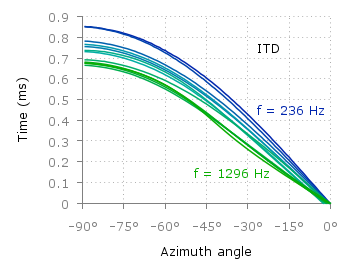
Then we plot our data with these colors and get Figure 1 as a result.

plot for [n=2:13] 'itd.txt' u 1:(column(n)*1000) w lines ls n

There the interaural time difference (ITD) between the right and left ear for different frequency channels ranging from 236 Hz to 1296 Hz is shown. As can be seen the ITD varies depending on the incident angle (azimuth angle) of the given sound.

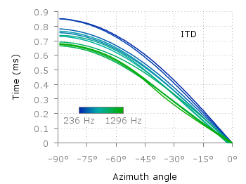
Another possibility to indicate the frequency channels given by the different colors is to add a colorbox to the graph as shown in Figure 2.

Colored lines

Fig. 2 Plot of interaural time differences for different frequency channels, indicated by different colors as shown in the colorbox (code to produce this figure, data)

To achieve this we have to set the origin and size of the colorbox ourselves. Note, that the notation is not the same as for a rectangle object and uses only the screen coordinates which is a little bit nasty. In addition we have to define our own color palette, as has been discussed already in another colorbox entry. In a last step we add a second phantom plot to our plot command by plotting 1/0 using the image style in order to get the colorbox drawn onto the graph.

set colorbox user horizontal origin 0.32,0.385 size 0.18,0.035 front
set cbrange [236:1296]
set cbtics ('236 Hz' 236,'1296 Hz' 1296) offset 0,0.5 scale 0
set palette defined (\
    1  '#0025ad', \
    2  '#0042ad', \
    3  '#0060ad', \
    4  '#007cad', \
    5  '#0099ad', \
    6  '#00ada4', \
    7  '#00ad88', \
    8  '#00ad6b', \
    9  '#00ad4e', \
    10 '#00ad31', \
    11 '#00ad14', \
    12 '#09ad00' \
    )
plot for [n=2:13] 'itd.txt' u 1:(column(n)*1000) w lines ls n, \
   1/0 w image

January 5th, 2012 | 16 Comments

This time another colormap plot. If you are using Matlab or Octave you are probably be familiar with Matlabs nice default colormap jet.

Matlab colorbar

Fig. 1 Photoluminescence yield plotted with the jet colormap from Matlab (code to produce this figure, data)

In Fig.1, you see a photoluminescence yield in a given region, and as you can see Gnuplot is able to apply the jet colormap from Matlab. This can be achieved by defining the palette as follows.

set palette defined ( 0 '#000090',\
                      1 '#000fff',\
                      2 '#0090ff',\
                      3 '#0fffee',\
                      4 '#90ff70',\
                      5 '#ffee00',\
                      6 '#ff7000',\
                      7 '#ee0000',\
                      8 '#7f0000')

The numbers 0..8 are automatically rescaled to 0..1, which means you can employ arbitrary numbers here, only their difference counts.

If you want to use this colormap regularly, you can store it in the Gnuplot config file as a macro.

# ~/.gnuplot
set macros
MATLAB = "defined (0  0.0 0.0 0.5, \
                   1  0.0 0.0 1.0, \
                   2  0.0 0.5 1.0, \
                   3  0.0 1.0 1.0, \
                   4  0.5 1.0 0.5, \
                   5  1.0 1.0 0.0, \
                   6  1.0 0.5 0.0, \
                   7  1.0 0.0 0.0, \
                   8  0.5 0.0 0.0 )"

Here we defined the colors directly as rgb values in the range of 0..1, which can be alternatively used a color definition.
In order to apply the colormap, we now can simple write

set palette @MATLAB