July 16th, 2012 | 32 Comments
Sometimes it can be helpful to visualize a third dimension by the color of the line in the plot. For example in Fig. 1 you see a logarithmic sweep going from 0 Hz to 100 Hz. Here the frequency is decoded by the color of the line.
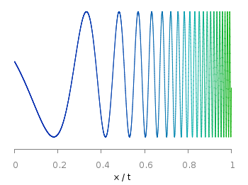
Fig. 1 A logarithmic sweep ranging from 0 Hz to 100 Hz and decoding the frequency with the line color (code to produce this figure, data)
This can be easily achieved by adding a lc palette to the plot command, which uses the values specified in the third row of the data file.
plot 'logarithmic_sweep.txt' u 1:2:3 w l lc palette
The palette can be defined as shown in the Multiple lines with different colors entry. But it can be set in a more easy way, by only setting the start and end color and calculating the colors in between. Therefore, we are picking the two hue values in GIMP (the H entry in Fig. 2 and Fig. 3) for the starting and ending color.
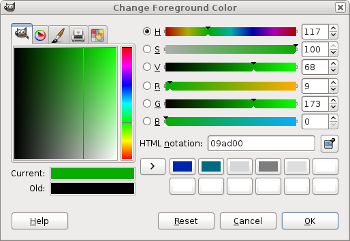
Fig. 2 Picking the HSV value corresponding to the given color of #09ad00.
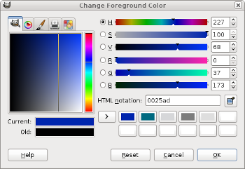
Fig. 3 Picking the HSV value corresponding to the given color of #0025ad.
These colors are then used to specify the palette in HSV mode. The S and V values can also directly be seen in GIMP.
# start value for H
h1 = 117/360.0
# end value for H
h2 = 227/360.0
# creating the palette by specifying H,S,V
set palette model HSV functions (1-gray)*(h2-h1)+h1,1,0.68
Excellent! This was extremely useful, thanks!
Hello.
I am new to GNUplot and I was wondering, is it necessary to setup 3 columns of data. I am trying to setup an xy plotted curve using the color gradient similar to the above graph. Low values will be green, while high values will be red. Is there anyway to set the start and end values for just the y-values?
Thanks
Yes, you can just reuse the y data for the third column:
Or if you want to do some manipulations of that data:
Thanks! This really helped! I am a student who is helping a friend with a report and this made things so much easier.
I was wondering, could i have three curves with lc palette with three different dashing styles one the same plot? It doesn’t seem to work.
The problem could be your terminal, because dashing is not working with all terminals at the moment.
If you try the following changes to the code from above you will get a postscript file with two different dashed lines
set terminal postscript set output 'sweep.ps' plot 'logarithmic_sweep.txt' u 1:(0.4*$2-0.5):3 w l lc palette lt 1, \ '' u 1:(0.4*$2+0.5):3 w l lc palette lt 3How is it possible to make these palettes transparent in order to distinguish and see highly overlapping functions or data?
Transparent line colors are not possible at the moment, but the development version of gnuplot have them:
http://sourceforge.net/tracker/?func=detail&aid=3286640&group_id=2055&atid=302055
I’m not able to use dashed lines and lc palette at the same time.
It all works fine if I only have a small set of points, and each straight line segment gets dashed. But if I have many points as a smooth curve, I guess gnuplot makes dashed lines between segmetns of the same color… which are tiny, and leads to continuous curve.
Can you try this with our logarithmic_sweep.txt? Pretty much the same code you have above, but in term wxt or epslatex.
I get the same result. Dashed lines in gnuplot is in general a little buggy. It is not the first time that it didn’t worked.
Thanks a lot, for your time and your excellent job, and congratulations for the web site. I found very useful this entry !
Do you know if there is way to use ‘lc palette’ with the ‘filledcurves’ option ? I’m triying to fill histogram-like bars, but instead showing the frequency through the height I want to do it through the color. I’m stacked.
Thank you !
Hi Juan.
Yes, you can do this. I’m preparing a blog post about this topic at the moment.
In the mean time you can try out something like this:
where the third column of the data file is used for the coloring.
Thank you Hagen for the quick answer, but it didn’t solve my problem. In fact, I confess I don’t see why to use the second argument of ‘using’ as you do.
Anyway, I provide the data format, to make the things clearer. I have a bunch of data like
# X Y Intensity
1 1 2
2 1 2
3 1 3
4 1 3
….
All the ‘bars’ have the same height, y=1 and the same width dx=1. I’m trying something like:
plot for [ii=0:1] ‘data.dat’ index ii u 1:2:3 w filledcu y1=0 lc palette
The problem is that for ii=0 it does take the proper value of the intensity, but from there on, all the other bars are filled with the same color.
Any idea about what is going on ?
Thank you againg and sorry for bothering.
juan
Hi Hagen,
i just want to plot the following function with the color of the line changing from red to blue (chirped pulse) but using the above code didnt work
f(x) = 0.5*exp(-x**2)*cos(15*x)
greetz
Hi Fouad.
If you want to plot a function and modify its color by another function (for example frequency or time or …), you could do it with the
special-filenameproperty.Fig. 4 Plotting a chirp function with its time value defining its line color. (code to produce this figure)
Here the color of the line is given by the value of
x, the result is shown in Fig. 4. You can modifyxwith a function g(x) byu 1:(f($1)):(g($1)).Hi Juan.
For your purposes it is better to directly apply the
boxesplotting style. Your data can then look like this.Fig. 5 Boxes with colors given as extra column. (code to produce this figure, data)
The plot is then created with the
lc paletteoption and the result is shown in Fig. 5.Thanks Hagen. Looking further for the coming up tutorials!
Very helpful, thanks! I used a map of rivers & streams and added a third data column based on feature length. Then I used this line palette technique and your mercator projection tutorial to plot it. I created a color-cycling animation by changing an offset to the third column like so:
mod(x,y) = x-floor(x/y)*y
#generate 20 frames
do for [i=0:19] {
  set output sprintf("frame%03i.png",i)
  plot 'data' using 1:(mercator($2)):(mod($3+i/20.0,1)) with lines lc palette notitle
}
Here’s the result: http://gfycat.com/PertinentKnobbyEgg
Cool, nice idea.
Hello,
I was wondering if it is possible to do this with SPLOT using 6 rows (x, y, z, dx, dy, dz=color) with vectors. I am trying to do something like this, but it seems that the 6th row doesn’t matter.
My data has 6 rows and I wrote:
Do you know where is the problem?
Thank you in advance!
Regards.
Hi Cesar.
You need to use a seventh column for this, compare the Vectors documentation in the manpage. If the color should be really given by dz, you have to write something like:
Hello,
I was trying to get something along the lines of your Fig. 5 plot, using gnuplot 4.2 (patchlevel 6), but while I do get the correct colors as indicated in my third column when using lines or points, when I try boxes the palette takes the color values from the first column of data (which is instead the height of the boxes).
Any idea what’s going on? may it be a version related problem?
Sorry for bothering you.
Stefano
Hi Stefano.
Please try if you can reproduce Fig. 5 by the gnuplot script and data given in the figure caption. If not then it is most likely a problem due to your gnuplot version.
Hi,
Yes, turns out the version was the problem, works fine with 4.6. I’d like to thank you for this website: it’s a real lifesaver :)
Hi hagen
i want to plot the following file of vectors with the color of the vectors changing according to the position
Thank you in advance!
Regards.
Hi,
I am new gnuplot, I have a set of single column values, like below,
30.5
20.3
50.5
60.2
75.1
all I want to do is, if the value is 20 yellow and >50 red. How do I do this?
Below are the code that I am using now,
set term pngcairo
set output “***.png”
set style fill transparent solid 0.30 noborder
plot ‘***.dat’ with filledcurves x1 lc rgb “blue”
Once again thanks for all your tips!
I am seriously thinking in saving all your tips in a PDF manual as back up! :P As an active user of gnuplot I find this website probably my first resource to make the plots look nice. Thanks so much! Carlo
Hi Carlo,
thanks for your nice words. Don’t worry, I’m not very active here at the moment, but the page will be available during the next years.
Is it possible to have a line-point style for xy plot in which color of points is different from line. I know it possible to plot xy two times one with line and one with points each use different color, but I don’t mean this solution
Great! It was really helpful, thanks!
https://commons.wikimedia.org/wiki/File:Graph_of_sin(exp(x))_function.svg