June 10th, 2012 | 8 Comments
In one off the last entries we defined a color palette similar to the default one in Matlab. Now we will use a color palette with only a few discrete colors, as shown in Fig. 1. This can be useful if we want to see all values from a measurement lying above a given threshold.
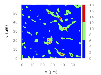
Fig. 1 Photoluminescence yield plotted with a palette with discrete colors (code to produce this figure, data)
The trick is to set maxcolors to the number of colors you want in your plot. In addition, the colors to use can be specified by the defined command. Note, that the absolute values you specify in the palette definition were automatically scaled to your min and max values (0 and 18 in this case).
set palette maxcolors 3
set palette defined ( 0 '#000fff',\
                      1 '#90ff70',\
                      2 '#ee0000')
How can I plot the colorbox marks labels (2, 4, ….) *inside* the colorbox?
Thanks again for your website!!!
I’ve found it:
set cbtics font “Helvetica,8” #smaller font
set format cb “%2.0f” #format
set cbtics offset -2 #change location
A much simpler way to do this is to use:
set palette maxcolors N
where N is the number of levels to use.
Thanks, that is a much nicer method.
I have updated the post to include maxcolors.
hi,
first I would like to thank you for your very interesting and helpful website.
I also would like to ask you a question because after a lot of test, I didn’t manage to use maxcolors with a defined palette.
Do you know how to fix this issue ?
Thanks in advance
Hi kipgon,
what exactly happens if you try to replot Fig. 1?
I’ve been trying to get a discrete colorbar like the one in this tutorial but without having to specify the colors for the segments explicitly. This is because I’m sampling the colors from a palette, and I want to take advantage of the palettes’ correct coloration for each stepwise change in dataset. I’m using the lc palette method with the third column of data describing the part of the colorbar to draw from as is described elsewhere on this site. My dataset is being shown as I wanted it, with colors picked evenly along the length of the palette in accordance with how many datasets there are. However the color bar remains continuous though I’ve added a maxcolors statement below where I load the palette. I suppose I need to use the ‘set palette defined’ statement too, but I haven’t figured out how to retain my automatic sampling from the palette while also having this statement in my script. Also as I said above it would be a huge win for me not to have to re-figure out what the rgb values of each subset of data are if I have to change them in a later iteration of this figure. Any advice would be appreciated.
I have been searching for some time with no success to find out how to set what I like to set when trying to create gnuplot graph that is basically only needs two colours. I am using the set palette and the graph works as I like, but I do not want the colour bar that shows to right of right margin. I have not been able to find a way for this colour bar gradient not to show. I have read the set palette command syntax many times as well as lot of searching to find out the answer to this question I do not have to use set palette if there is an alternate method to accomplish one colour for negative and one colour for positive.