Gnuplotting

Create scientific plots using gnuplot

January 22nd, 2012 | No Comments

Axis with arrow

Fig. 1 Plot of a sinusoid with arrows on the axes (code to produce this figure, data)

You can easily add arrows to the end of the x- and y-axis using the set arrow command. The two last values of the size option determines the opening and closing angles of the arrows.

set arrow from graph 1,0 to graph 1.05,0 size screen 0.025,15,60 \
    filled ls 11
set arrow from graph 0,1 to graph 0,1.05 size screen 0.025,15,60 \
    filled ls 11

September 8th, 2011 | 3 Comments

In the last entry about attractive plots we introduced the usage of gray borders and tics in order to emphasize the content of the figure.
If we want to do the same in the epslatex terminal, we had to add the color of the text directly with some LaTeX code:

set terminal epslatex size 10.4cm,6.35cm color colortext standalone \
'phv,9' header '\definecolor{tics}{rgb}{0.5,0.5,0.5}'
set format '\color{tics}$%g$'

The problem is that the output looks not the way it should be, but like the one in Fig. 1.
It appears that all the letters we have written in the format string are used for the calculation of the size of the tics.

nice plot

Fig. 1 Colored tics plotted with Gnuplot version <4.4.3 (code to produce this figure)

An easy solution to that problem is to use Gnuplot 4.4.3, because the size calculation has been updated. Fig. 2 shows the result if we use Gnuplot 4.4.3 to create the figure. But still there is some room for improvements.

nice plot

Fig. 2 Colored tics plotted with Gnuplot 4.4.3 (code to produce this figure)

The length of the color name has still an influence on the calculated tics size. Hence we use only one letter for the color definition:

set terminal epslatex size 10.4cm,6.35cm color colortext standalone \
'phv,9' header '\definecolor{t}{rgb}{0.5,0.5,0.5}'
set format '\color{t}$%g$'

The final result is shown in Fig. 3.

nice plot

Fig. 3 Colored tics plotted with Gnuplot 4.4.3 (code to produce this figure)

August 11th, 2011 | 6 Comments

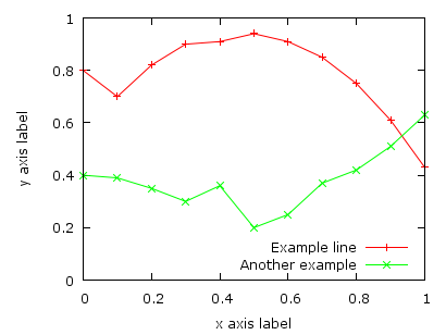
As you surely have noticed I don’t use the default colors and line styles from Gnuplot, but define them myself. The simple reason is that the default colors are not optimized to be very pleasant, but are simply primary colors. I just stumbled over an blog entry of Brighten Godfrey, which deals with some thoughts on beautiful plots.
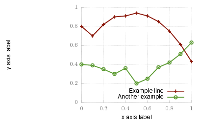
He suggest to create scientific plots like the way he created his figure which I have reproduced more or less accurate in Fig. 1.

nice plot

Fig. 1 Nice plot with the pngcairo terminal (code to produce this figure, data)

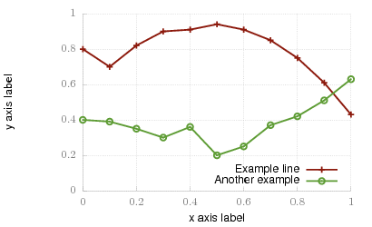
In Fig. 2 the default output of the pngcairo terminal is shown. I think the difference is quiet obvious.

not so nice plot

Fig. 2 Default output of the pngcairo terminal (code to produce this figure, data)

In the following I will have a look at the things we have to do to reach Fig. 1 and why we should do this:

1) change the default colors to more pleasant ones and make the lines a little bit thicker

set style line 1 lc rgb '#8b1a0e' pt 1 ps 1 lt 1 lw 2 # --- red
set style line 2 lc rgb '#5e9c36' pt 6 ps 1 lt 1 lw 2 # --- green

2) put the border more to the background by applying it only on the left and bottom part and put it and the tics in gray

set style line 11 lc rgb '#808080' lt 1
set border 3 back ls 11
set tics nomirror

3) add a slight grid to make it easier to follow the exact position of the curves

set style line 12 lc rgb '#808080' lt 0 lw 1
set grid back ls 12

The last thing I would like to mention is the problem, that the output of the svg terminal is slightly different from the pngcairo terminal. Especially the dashed line of the grid is not created in the right way, even though the dashed option is used for the terminal. This and a solution to convert the lines to dashed versions is also mentioned in the plotting the world entry.

nice plot with svg terminal

Fig. 1 Nice plot with the svg terminal (code to produce this figure, data)

July 27th, 2010 | 1 Comment

In the introduction I have set the xtics labels manually to use a multiple of π:

set xtics ('-2π' -2*pi, '-π' -pi, 0, 'π' pi, '2π' 2*pi)

But there is an easier way to achieve the same. First we tell Gnuplot to place the tics at multiplies of π. And then the trick: with the set format option we can tell Gnuplot to use multiple of π too:

set xtics pi
set format x '%.0Pπ'

In the same way we can place tics without any label by applying:

set format x ''