Gnuplotting

Create scientific plots using gnuplot

February 3rd, 2012 | 6 Comments

In the first post regarding animations we have created a bunch of png files and combined them to a single gif animation. Now we want to generate again a bunch of png files, but combine them to a movie.

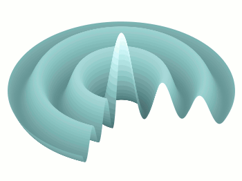
Fig. 1 Video animation of Huygens principle (code to produce this figure, loop function)

We create the png files in analogy to the gif example, hence we will discuss only the generation of the movie here. In order to compose a avi file from the png files we are using Mencoder. Gnuplot is able to directly start Mencoder by its system command.

# Create movie with mencoder
ENCODER = system('which mencoder');
if (strlen(ENCODER)==0) print '=== mencoder not found ==='; exit
CMD = 'mencoder mf://animation/*.png -mf fps=25:type=png -ovc lavc -lavcopts vcodec=mpeg4:mbd=2:trell -oac copy -o huygen.avi'
system(CMD)

The first two lines check if Mencoder is available and quit gnuplot if not. The Mencoder command itselfs gets the directory containing the png files mf://animation/*.png, frames per second and input type-mf fps=25:type=png, video -ovc and audio -oac options, and finally of course the output file -o huygen.avi.

In order to generate a webm video file for a web site, ffmpeg can be used to convert the video.

$ ffmpeg -i huygen.avi huygen.webm

October 21st, 2011 | 11 Comments

For presentation or teaching purposes it can be useful to show not only a figure, but an animation to illustrate something more clear. There exists different possibilities to do this in Gnuplot. Today we will have a look at how to create a gif animation.

Bessel function

Fig. 1 Animation of Bessel function (code to produce this figure, loop)

Fig. 1 shows a gif animation of a Bessel function of first kind and zeroth order. Gnuplot has a gif output terminal, but the result will be smoother if we first create png files with Gnuplot and then the animated gif file with another program. In order to create a set of png files we have to loop through the time value t and different output files.

# initializing values for the loop and start the loop
t = 0
end_time = 1
system('mkdir -p animation')
load 'bessel.plt'

The above code sets a start value for the running time variable t and the end_time variable at which the looping should be stopped. Then a folder for the output png files is created and the loop file bessel.plt is loaded. The content of this loop file is shown below.

# bessel loop
t = t + 0.02
outfile = sprintf('animation/bessel%03.0f.png',50*t)
set output outfile
splot u*sin(v),u*cos(v),bessel(u,t) w pm3d ls 1
if(t<end_time) reread;

Here we update the time t, create a file name with a different number and plot out Bessel function. Finally the last line checks if our time t is smaller than the end_time variable, and executes the loop again if this is the case.

After we have created the png files in the animation folder, we start GIMP and load all the files as layers (File > Open as Layers). After this we save all layers together as an animated gif file.

June 24th, 2011 | No Comments

The filledcurves style is only available for 2d plots. But it can be used with some limitations with splot in 3d plots as well. In this entry we want to visualize an effect known from psychoacoustics, called comodulation masking release. The effect describes the possibility of our hearing system to perceive a masked tone (in this case at 700 Hz) easier in the presence of so called comodulated maskers present in other auditory filters. Comodulation describes the fact, that all maskers have the same envelope, as can be seen in Fig. 1.

CMR

Fig. 1 Visualization of the comodulation masking release using splot and filledcurves (code to produce this figure, gfb_loop.gnu, gfb.dat, sig.dat, noise.dat)

First we start with the gammatone filters. The values for them are stored in the gfb.dat file as one column per filter. In order to apply different colors to different filters the style function sty(x) is defined. The data(x) function is defined to be able to plot the filters in a particular order. This will result in the nice effect of overlapping filters shown in Fig. 2.

sty(x) = x<7 ? 1 : x<10 ? 2 : x<12 ? 1 : x==12 ? 3 : x<15 ? 1 : \
    x==15 ? 2 : 1
data(x) = x<12 ? x : 29-x

The filter bank itself is plotted by the gfb_loop.gnu function. There the data are plotted first as filledcurves and then as a line. This two step mechanism has to be used, because the filledcurves style is not able to draw an extra line in 3d. Hence it has to be done in the extra gfb_loop.gnu function, because the simple for iteration only works for a single plot and is not able to plot the line around the filters.

# gfb_loop.gnu
splot 'gfb.dat' u 2:1:(column(data(i))) w filledcurves \
    ls sty(data(i)), \
      ''        u 2:1:(column(data(i))) ls 4
i = i+1
if (i<maxi) reread
CMR

Fig. 2 Plotting gammatone filters with an extra loop file (code to produce this figure, gfb_loop.gnu, gfb.dat)

Thereafter the modulated noise and its envelope and the signal are plotted in different parts of the graph by explicitly giving the x position.
The result is shown in Fig. 1.

splot 'noise.dat' u  (300):1:2 ls 11, \
      ''          u  (300):1:3 ls 14, \
      ''          u  (400):1:2 ls 12, \
      ''          u  (400):1:3 ls 14, \
      ''          u  (700):1:2 ls 13, \
      ''          u  (700):1:3 ls 14, \
      ''          u (1000):1:2 ls 12, \
      ''          u (1000):1:3 ls 14, \
      ''          u (1100):1:2 ls 11, \
      ''          u (1100):1:3 ls 14
splot 'sig.dat'   u  (700):1:2 ls 14