Gnuplotting

Create scientific plots using gnuplot

September 3rd, 2016 | 2 Comments

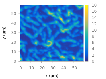
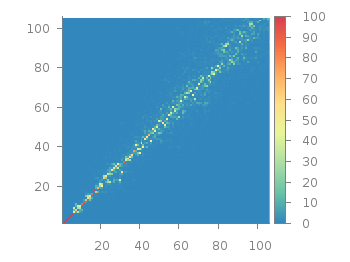
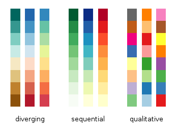
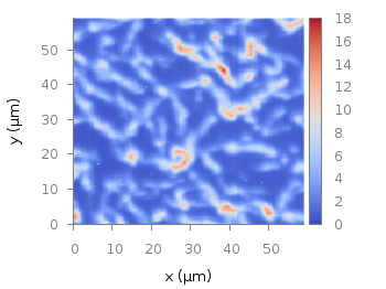
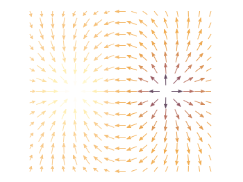
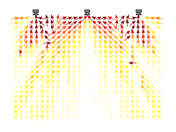
Matplotlib has four new colormaps called viridis, plasma, magma, and inferno. Especially viridis you might have seen already as this will be the new default in Matplotlib 2.0. They are freely available and now also included in the gnuplot-palettes repository on github. They are well designed to be perceptually uniform and friendly for common forms of colorblindness, so they should be save to use as your default colormap. Personally I would not recommend them for every kind of plot as they are a little dark if you have large areas with low values in your plot.

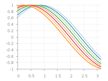
As usual in the gnuplot-palettes repository they are accompanied by line style definitions using the palette colors.

# viridis
set style line  1 lt 1 lc rgb '#440154' # dark purple
set style line  2 lt 1 lc rgb '#472c7a' # purple
set style line  3 lt 1 lc rgb '#3b518b' # blue
set style line  4 lt 1 lc rgb '#2c718e' # blue
set style line  5 lt 1 lc rgb '#21908d' # blue-green
set style line  6 lt 1 lc rgb '#27ad81' # green
set style line  7 lt 1 lc rgb '#5cc863' # green
set style line  8 lt 1 lc rgb '#aadc32' # lime green
set style line  9 lt 1 lc rgb '#fde725' # yellow
viridis colormap

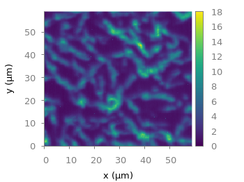
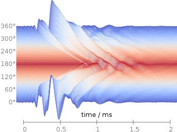
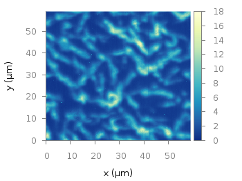
Fig. 1 Photoluminescence yield plotted with the viridis colormap from Matplotlib (code to produce this figure, viridis.pal, data)

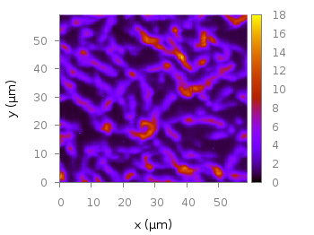
# plasma
set style line  1 lt 1 lc rgb '#0c0887' # blue
set style line  2 lt 1 lc rgb '#4b03a1' # purple-blue
set style line  3 lt 1 lc rgb '#7d03a8' # purple
set style line  4 lt 1 lc rgb '#a82296' # purple
set style line  5 lt 1 lc rgb '#cb4679' # magenta
set style line  6 lt 1 lc rgb '#e56b5d' # red
set style line  7 lt 1 lc rgb '#f89441' # orange
set style line  8 lt 1 lc rgb '#fdc328' # orange
set style line  9 lt 1 lc rgb '#f0f921' # yellow
plasma colormap

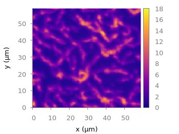
Fig. 2 Photoluminescence yield plotted with the plasma colormap from Matplotlib (code to produce this figure, plasma.pal, data)

# magma
set style line  1 lt 1 lc rgb '#000004' # black
set style line  2 lt 1 lc rgb '#1c1044' # dark blue
set style line  3 lt 1 lc rgb '#4f127b' # dark purple
set style line  4 lt 1 lc rgb '#812581' # purple
set style line  5 lt 1 lc rgb '#b5367a' # magenta
set style line  6 lt 1 lc rgb '#e55964' # light red
set style line  7 lt 1 lc rgb '#fb8761' # orange
set style line  8 lt 1 lc rgb '#fec287' # light orange
set style line  9 lt 1 lc rgb '#fbfdbf' # light yellow
magma colormap

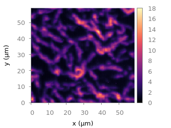
Fig. 3 Photoluminescence yield plotted with the magma colormap from Matplotlib (code to produce this figure, magma.pal, data)

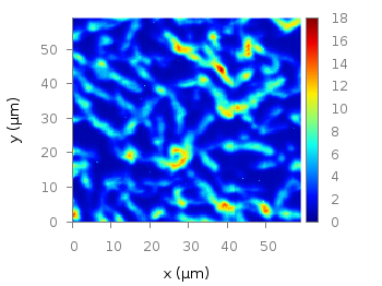
# inferno
set style line  1 lt 1 lc rgb '#000004' # black
set style line  2 lt 1 lc rgb '#1f0c48' # dark purple
set style line  3 lt 1 lc rgb '#550f6d' # dark purple
set style line  4 lt 1 lc rgb '#88226a' # purple
set style line  5 lt 1 lc rgb '#a83655' # red-magenta
set style line  6 lt 1 lc rgb '#e35933' # red
set style line  7 lt 1 lc rgb '#f9950a' # orange
set style line  8 lt 1 lc rgb '#f8c932' # yellow-orange
set style line  9 lt 1 lc rgb '#fcffa4' # light yellow
inferno colormap

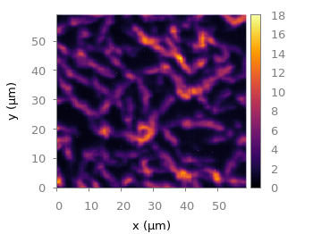
Fig. 4 Photoluminescence yield plotted with the inferno colormap from Matplotlib (code to produce this figure, inferno.pal, data)

March 2nd, 2015 | 4 Comments

If you are a regular gnuplot user you most probably want to reuse some common settings. I normally avoid it on this blog to have easy scripts that run as standalone files, but during my work I use a lot of small config files.

Bessel functions

Fig. 1 Bessel functions from order zero up to six plotted with the dark2 line colors. (code to produce this figure, dark2.pal, xyborder.cfg, grid.cfg, mathematics.cfg)

Let us start with the Bessel function example from the last blog entry. As you can see in Fig. 1, it is a 2D plot, including axes, a grid, line colors, and definitions of higher order Bessel functions. All of those could be easily stored in small config files and reused in other plots.
As an example I will start with the axes. Here, I have four different config files, called xyborder.cfg, xborder, yborder.cfg, noborder.cfg, which do exactly what their names would suggest. Here are the first and last file:

# xyborder.cfg
set style line 101 lc rgb '#808080' lt 1 lw 1
set border 3 front ls 101
set tics nomirror out scale 0.75
set format '%g'
# noborder.cfg
set border 0
set style line 101 lc rgb '#808080' lt 1 lw 1
unset xlabel
unset ylabel
set format x ''
set format y ''
set tics scale 0

In the main plotting file I then just have to load the setting I like to have and I’m done. The same can be done for adding a grid, the right line color definitions and the extra Bessel functions leading to the following excerpt from the main plotting file:

# set path of config snippets
set loadpath './config'
# load config snippets
load 'dark2.pal'
load 'xyborder.cfg'
load 'grid.cfg'
load 'mathematics.cfg'

The set loadpath command tells gnuplot the directory where it can find all the configuration snippets. If you want to see an overview, look at my gnuplot configuration snippets and at the collection of palettes and line colors.

If you want to include more complicated settings, you have to use the macro setting of gnuplot. Fig. 2 is a reproduction of an earlier entry plotting a vector field with arrows. It included an lenghty definition of how to plot these arrows. If you want to do it several time and define the arrows in the same way every time you should also put it into a config file, this time as a variable (macro). In our example it looks like

color_arrows = 'u ($1-dx($1,$2)/2.0):($2-dy($1,$2)/2.0):(dx($1,$2)):(dy($1,$2)):\
(v($1,$2)) with vectors head size 0.08,20,60 filled lc palette'

In the main file the only thing we have then to do is

set macros
load 'noborder.cfg'
load 'moreland.pal'
load 'arrows.cfg'

# [...] 

plot '++' @color_arrows

Important is the first line that enables the use of macros in gnuplot which is disabled by default.

January 8th, 2015 | 9 Comments

Some time ago I discussed how to get the jet colormap from Matlab in gnuplot. Since Matlab R2014b jet is no longer the default colormap. Now parula is the new default colormap. It was introduced together with new default line colors.

The changes in the default colormap address some of the points that were criticized of jet by Moreland and corrected by his colormap.

Matlab parula colormap

Fig. 1 Photoluminescence yield plotted with the parula colormap from Matlab (code to produce this figure, parula.pal, data)

A colormap similar to the original is stored in the parula.pal file, which is also part of the gnuplot-palettes repository on github. An example application of the colormap is presented in Fig. 1.

In order to apply the colormap you can simply load the file.

load 'parula.pal'

The parula.pal file also includes definitions of line styles. The first line styles (1-9) corresponds to the colors of the parula palette, the line styles 11-17 correspond to the new Matlab line colors, see Fig. 2.

Bessel functions

Fig. 2 Bessel functions from order zero up to six plotted with the new default Matlab line colors. (code to produce this figure, parula.pal, data)

set style line 11 lt 1 lc rgb '#0072bd' # blue
set style line 12 lt 1 lc rgb '#d95319' # orange
set style line 13 lt 1 lc rgb '#edb120' # yellow
set style line 14 lt 1 lc rgb '#7e2f8e' # purple
set style line 15 lt 1 lc rgb '#77ac30' # green
set style line 16 lt 1 lc rgb '#4dbeee' # light-blue
set style line 17 lt 1 lc rgb '#a2142f' # red

If you want to use only the palette and not the line colors, you should remove them from the parula.pal file.

September 29th, 2014 | 6 Comments

Some time ago I introduced already a waterfall plot, which I named a pseudo-3D-plot. In the meantime, I have been asked several times for a colored version of such a plot. In this post we will revisit the waterfall plot and add some color to it.

Colored waterfall plot

Fig. 1 Waterfall plot of head related impulse responses. (code to produce this figure, color palette, data)

In Fig. 1 the same head related impulse responses we animated already are displayed in a slightly different way. They describe the transmission of sound from a source to a receiver placed in the ear canal dependent on the position of the source. Here, we show the responses for all incident angles of the sound at once. At 0° the source was placed at the same side of the head as the receiver.

The color is added by applying the Moreland color palette, which we discussed earlier. The palette is defined in an extra file and loaded, this enables easy reuse of defined palettes. In the plotting command the palette is enabled with the lc palette command, that tells gnuplot to use the palette as line color depending on the value of the third column, which is given by color(angle).

load 'moreland.pal'
set style fill solid 0.0 border
limit360(x) = x180?360-x:x
amplitude_scaling = 200
plot for [angle=360:0:-2] 'head_related_impulse_responses.txt' \
    u 1:(amplitude_scaling*column(limit360(angle)+1)+angle):(color(angle)) \
    w filledcu y1=-360 lc palette lw 0.5

To achieve the waterfall plot, we start with the largest angle of 360° and loop through all angles until we reach 0°. The column command gives us the corresponding column the data is stored in the data file, amplitude_scaling modifies the amplitude of the single responses, and +angle shifts the data of the single responses along the y-axis to achieve the waterfall.

Even though the changing color in the waterfall plot looks nice you should always think if it really adds some additional information to the plot. If not, a single color should be used. In the following the same plot is repeated, but only with black lines and different angle resolutions which also have a big influence on the final appearance of the plot.

Colored waterfall plot

Fig. 2 Waterfall plot of head related impulse responses with a resolution of 5°. (code to produce this figure, data)

Colored waterfall plot

Fig. 3 Waterfall plot of head related impulse responses with a resolution of 2°. (code to produce this figure, data)

Colored waterfall plot

Fig. 4 Waterfall plot of head related impulse responses with a resolution of 1°. (code to produce this figure, data)

June 21st, 2013 | 7 Comments

Sometimes a classical heat map will not be the best way to visualize your data in a two dimensional plane. This is especially the case, when only a few data points on the plane have different values. For example in Fig. 1 you find a projection from one vector to another to visualize its similarity. This is a method used in normal mode analysis of molecules to determine if two different
calculations yield similar results. As you can see only the data points near the diagonal vary, which is hard to see because of the small size of the points. In addition, points farer away from the diagonal having a small percentage value are more or less invisible – compare to Fig. 2.

Sparse data with image plot style

Fig. 1 Vector dot product expressed in percentage plotted with the image style (code to produce this figure, data)

In order to emphasize the data, we abounded the image plot style and use transparent circles as plotting style for visualizing the data as shown in Fig. 2.

Sparse data with circles plot style

Fig. 2 Vector dot product expressed in percentage plotted with the circles style (code to produce this figure, data)

In order to do so, we remove all values from the plot that are 0, by setting them to 1/0. Further we set the transparency of the circles to 20%. Before plotting the data we are sorting them regarding their percentage value in order to plot the highest values above the lower ones.

f(x) = x>2 ? x : 1/0
set style fill transparent solid 0.8 noborder
plot '<sort -g -k3 vector_projection.txt' u 1:2:(1):(f($3)) w circles lc palette

June 5th, 2013 | 7 Comments

If you are looking for nice color maps which are especially prepared to work with cartographic like plots you should have a look at colorbrewer2.org. On that site hosted by Cynthia Brewer you can pick from a large set of well balanced color maps. The maps are ordered regarding their usage. Figure 1 shows example color maps for three different use cases.

Colorbrew color maps

Fig. 1 Examples of color maps from colorbrewer2.org ordered in three categories (code to produce this figure, data)

The diverging color maps are for data with extremes at both points of a neutral value, for example like the below and above sea level. The sequential color maps are for data ordered from one point to another and the qualitative color maps are for categorically-grouped data with now explicit ordering.
Thanks to Anna Schneider there is an easy way to include them (at least the ones with eight colors each) into gnuplot. Just go to her gnuplot-colorbrewer github site and download the color maps. Place them in the same path as your plotting file, or add the three pathes of the repository to your load pathes, for example by adding the following to your .gnuplot file.

set loadpath '~/git/gnuplot-colorbrewer/diverging' \
    '~/git/gnuplot-colorbrewer/qualitative' \
    '~/git/gnuplot-colorbrewer/sequential'
YlGnBu color map from colorbrewer

Fig. 2 Photoluminescence yield plotted with the YlGnBu color map from colorbrewer2.org (code to produce this figure, data)

After this you can pick the right color map for you on colorbrewer2.org, keep its name and load it before your plot command. For example in Fig. 2 we are plotting again the photoluminescence yield with the sequential color map named YlGnBu. First we load the color map, then switch the two poles of the color map by setting the palette to negative, and finally plotting the data.

load 'YlGnBu.plt'
set palette negative
plot 'matlab_colormap.txt' u ($1/3.0):($2/3.0):($3/1000.0) matrix with image
Paired color map from colorbrewer

Fig. 3 Eight lines plotted with the Paired color map from colorbrewer2.org (code to produce this figure)

The nice thing of the palettes coming with gnuplot-colorbrewer is that they also include the corresponding line colors. In Fig. 3 you see the Paired qualitative color map in action with lines.

load 'Paired.plt'
plot for [ii=1:8] f(x,ii) ls ii lw 2

May 21st, 2013 | 1 Comment

As you may have noted, gnuplot and Matlab have different default color maps. Designing such a default map is not easy, because they should handle a lot of different things (Moreland, 2009):
– The map yields images that are aesthetically pleasing
– The map has a maximal perceptual resolution
– Interference with the shading of 3D surfaces is minimal
– The map is not sensitive to vision deficiencies
– The order of the colors should be intuitively the same for all people
– The perceptual interpolation matches the underlying scalars of the map

In his paper Moreland developed a new default color map that was mentioned already in a user comment. In Fig. 1 the map is used to replot the photoluminescence yield plotted in an earlier entry.

Default color map after Moreland, 2009

Fig. 1 Photoluminescence yield plotted with the default color map after Moreland, 2009 (code to produce this figure, data)

To use the default color map proposed by Moreland, just download default.plt and store it to a path, that is available to gnuplot. For example store it under /home/username/.gnuplotting/default.plt and add the following line to your .gnuplot file.

set loadpath "/home/username/.gnuplotting"

After that you can just load the palette before your plot command via

load 'default.plt'
Default gnuplot color palette

Fig. 2 Photoluminescence yield plotted with gnuplots default color palette (code to produce this figure, data)

In Fig. 2 the same plot is shown using the default color map from gnuplot, which is a little bit dark in my opinion.

Default Matlab color palette

Fig. 3 Photoluminescence yield plotted with Matlabs default color palette (code to produce this figure, data)

Figure 3 shows the jet color map from Matlab, which is a classical rainbow map with all its pros and cons.

December 1st, 2012 | 7 Comments

In an earlier entry we created a vector field from measured data. Now we will visualize functions with the vector plotting style. As functions we have two 1/r potentials which define the amplitude of the vectors, as can be seen in Fig. 1. It is often better to indicate the amplitude by a color instead of by the length of the single vectors, especially if there are big changes. For the exact functions have a look into the corresponding file.

Vector field showing two sources

Fig. 1 Vector field of two sources with the opposite charge. The color indicates the amplitude. (code to produce this figure)

By analogy to the data vector field we have again a dx, and dy function for the length of the vectors.

dx(x,y) = scaling*ex(x,y)/enorm(x,y)
dy(x,y) = scaling*ey(x,y)/enorm(x,y)

Now we need a trick, because we have to fill the u 1:2:3:4 for the vector style with our function data. The four columns are then x,y,dx,dy of the vectors, where dx, dy are the lengths of the vector in x and y direction. Here the special filename ++ is a big help. It gives us x and y points as a first and second column, which we could address by $1 and $2. The number of points for the two axes are handled by the samples and isosamples command.

set samples 17    # x-axis
set isosamples 15 # y-axis
plot '++' u ($1-dx($1,$2)/2.0):($2-dy($1,$2)/2.0):\
    (dx($1,$2)):(dy($1,$2)):(v($1,$2)) \
    with vectors head size 0.08,20,60 filled lc palette

To place the vector at the center of the single x, y points, we move the starting point of the vectors to x-dx/2, y-dy/2.

October 17th, 2012 | 5 Comments

Some data could be nicely visualized by representing them as arrows. For example, assume that we have done an experiment where we played something to a subject through three loudspeakers and the subject should name the direction where he or she perceived it. In Fig. 1 we show the named direction by the direction of the arrows. The color of the arrow indicates the deviation from the desired direction. A white and not visible arrow means no deviation and a dark red one a deviation of 40° or more.

Vector field showing localization data

Fig. 1 Vector field showing localization results. The arrows are pointing towards the direction the subject had named. The color indicates the deviation from the desired direction. (code to produce this figure, set_loudspeakers.gnu, data)

In gnuplot the with vectors command enables the arrows in the plot. It requires four parameters, x, y, dx, dy, where dx and dy controls the endpoint of the arrow as offset values to x,y. In our example the direction is stored as an angle, hence the following functions do the conversion to dx,dy. 0.1 defines the length of the arrows.

xf(phi) = 0.1*cos(phi/180.0*pi+pi/2)
yf(phi) = 0.1*sin(phi/180.0*pi+pi/2)

An optional fifth parameter controls the color of the vector together with the lc palette setting. The arrows start at x-dx,y-dy and point to x+dx,y+dy.

plot 'localization_data.txt' \
    u ($1-xf($3)):($2-yf($3)):(2*xf($3)):(2*yf($3)):4 \
    with vectors head size 0.1,20,60 filled lc palette

July 16th, 2012 | 32 Comments

Sometimes it can be helpful to visualize a third dimension by the color of the line in the plot. For example in Fig. 1 you see a logarithmic sweep going from 0 Hz to 100 Hz. Here the frequency is decoded by the color of the line.

Logarithmic sweep

Fig. 1 A logarithmic sweep ranging from 0 Hz to 100 Hz and decoding the frequency with the line color (code to produce this figure, data)

This can be easily achieved by adding a lc palette to the plot command, which uses the values specified in the third row of the data file.

plot 'logarithmic_sweep.txt' u 1:2:3 w l lc palette

The palette can be defined as shown in the Multiple lines with different colors entry. But it can be set in a more easy way, by only setting the start and end color and calculating the colors in between. Therefore, we are picking the two hue values in GIMP (the H entry in Fig. 2 and Fig. 3) for the starting and ending color.

Picking the first hue value

Fig. 2 Picking the HSV value corresponding to the given color of #09ad00.

Picking the second hue value

Fig. 3 Picking the HSV value corresponding to the given color of #0025ad.

These colors are then used to specify the palette in HSV mode. The S and V values can also directly be seen in GIMP.

# start value for H
h1 = 117/360.0
# end value for H
h2 = 227/360.0
# creating the palette by specifying H,S,V
set palette model HSV functions (1-gray)*(h2-h1)+h1,1,0.68