October 10th, 2011 | No Comments
In the last entry we have seen how to use a color map to represent matrix data. Another way to visualize such kind of data is to code their values not as color, but as height information using so called pseudo 3D plots.
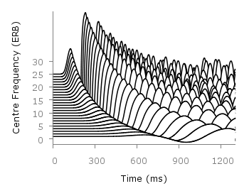
Fig. 1 Pseudo 3D plot of basilar membrane activity (code to produce this figure, data)
Suppose we have some data like spectra with different parameters, slightly shifted and plotted into the same figure, or different oscillations over time as shown in Fig. 1. There, the movement of the basilar membrane to an input stimuli dependent on the center frequency in ERB is plotted over time. The movement on the basilar membrane is dependent on the frequency of the incoming stimulus, with different frequencies acting on different places along the membrane. In order to plot this kind of data the for command of Gnuplot can be used to iterate through the data. The pseudo 3D effect is realized by shifting the data in every iteration one ERB by the +ii part and the usage of filledcurves to overwrite not visible parts of the plot with white color.
set style fill solid 1.0 border rgb 'black'
plot for [ii=25:1:-1] 'bmm.txt' u (f(column(ii))+ii) \
    w filledcu y1=-2 ls 1
The amplitude of the data was originally stored in order to fit in a plot given in Hz. Hence, we have to convert the data into ERB. This is done by the function f. As arguments to the function the values of each column are given in the iteration. Therefore, the column number is indexed by the column function.