December 21st, 2013 | 2 Comments
After plotting the world several times we will concentrate on a smaller level this time. Ben Johnson was so kind to convert the part dealing with the USA of the 10m states and provinces data set from natural earth to something useful for gnuplot. The result is stored in the file usa.txt.
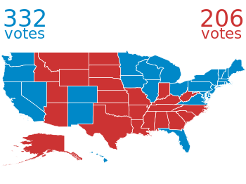
Fig. 1 Election results of single U.S. states. (code to produce this figure, USA data, election data)
Two double lines divide the single states. This allows us to plot a single state with the help of the index command. At the end of this post the corresponding index numbers for every state are listed.
In addition to the state border data we have another file that includes results from an example election and strings with the names of the states. The election result can be 1 or 2 – corresponding to blue and red. With the help of these two data sets we are able to create Fig. 1 and Fig. 2.
For drawing a single state in red or blue we first collect the results for every single state in the string variable ELEC. The stats command is suitable for this, because it parses all the data but doesn’t try to plot any of them. During the parsing of every line the election result stored in the second column will be added at the end of the ELEC variable.
ELEC=''
stats 'election.txt' u 1:(ELEC = ELEC.sprintf('%i',$2))
In a second step we plot the state borders and color the states with the help of the ELECstring. ELEC[1:1] will return the election result for the state with the index 0.
plot for [idx=0:48] 'usa.txt' i idx u 2:1 w filledcurves ls ELEC[idx+1:idx+1],\
                    ''              u 2:1 w l ls 3
Alaska and Hawaii are then added with additional plot commands and the help of multiplot.
The data file with the election results includes also the names of the single states and a coordinates to place them. This allows us to put them in the map as well, as you can see in Fig. 2.
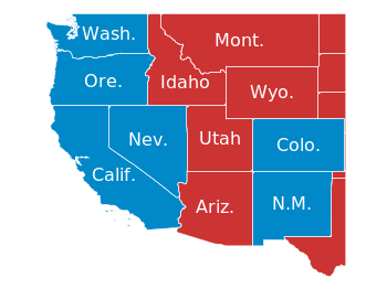
Fig. 2 Names and election results of single U.S. states. (code to produce this figure, USA data, election data)
The plotting of the state names is easily achieved by the labels plotting style:
plot for [idx=0:48] 'usa.txt' i idx u 2:1 w filledcurves ls ELEC[idx+1:idx+1],\
                    ''              u 2:1 w l ls 3,\
                    'election.txt'  u 6:5:3 w labels tc ls 3
At the end we provide the list with the index numbers and the corresponding states. If you want to plot a subset of states – as in Fig. 2 – you should adjust the xrange and yrange values accordingly.
0  Massachusetts
1  Minnesota
2  Montana
3  North Dakota
4  Idaho
5  Washington
6  Arizona
7  California
8  Colorado
9  Nevada
10 New Mexico
11 Oregon
12 Utah
13 Wyoming
14 Arkansas
15 Iowa
16 Kansas
17 Missouri
18 Nebraska
19 Oklahoma
20 South Dakota
21 Louisiana
22 Texas
23 Connecticut
24 New Hampshire
25 Rhode Island
26 Vermont
27 Alabama
28 Florida
29 Georgia
30 Mississippi
31 South Carolina
32 Illinois
33 Indiana
34 Kentucky
35 North Carolina
36 Ohio
37 Tennessee
38 Virginia
39 Wisconsin
40 West Virginia
41 Delaware
42 District of Columbia
43 Maryland
44 New Jersey
45 New York
46 Pennsylvania
47 Maine
48 Michigan
49 Hawaii
50 Alaska