Gnuplotting

Create scientific plots using gnuplot

January 31st, 2014 | 3 Comments

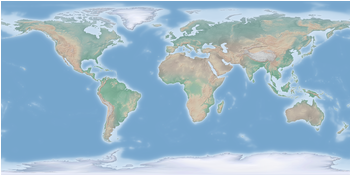
And another plot of the world. This time we are dealing with the raster data from Natural Earth. This data is normally available as tif-files. To use them in gnuplot we have to convert them first, then we can create a plot as shown in Fig. 1.
Cross-blended Hypsometric Tints

Fig. 1 Cross-blended hypsometric tint plot of the world. (code to produce this figure, data)

The conversion is done by the convert_natural_earth script. There the tif-file is first scaled down to the desired resolution using imagemagick. Afterwards it is converted to a text file and reordered for the splot command of gnuplot. The text file includes the longitude, latitude and three rgb color values.
You have to invoke the script in the following way.

$ ./convert_natural_earth $RES $FILE

where $RES is the desired resolution in pixel of your gnuplot plot and $FILE the input tif-file.
After finished we can plot the resulting text file simply by

set datafile separator ','
set size ratio -1
plot 'HYP_50M_SR_W_350px.txt' w rgbimage

which results in Fig. 1.
Natural Earth II Shaded Relief and Water

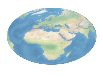
Fig. 2 Natural Earth II shaded relief and water plot of the world. (code to produce this figure, data)

The image can also be projected on a 3D figure of the world as shown in Fig. 2. To achieve this the three rgb values have to be summarized in one value and the rgb variable line color option has to be chosen together with pm3d.

rgb(r,g,b) = 65536 * int(r) + 256 * int(g) + int(b)
set mapping spherical
set angles degrees
splot 'NE2_50M_SR_W_700px.txt' u 1:2:(1):(rgb($3,$4,$5)) w pm3d lc rgb variable
August 22nd, 2013 | 30 Comments

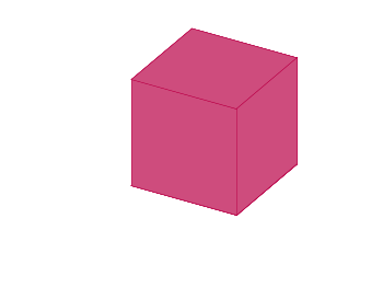
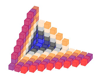
On the PGF plots page I found a nice example of visualizing data with cubes. Here we will recreate the same with gnuplot as you can see in Fig. 1.

Cubes

Fig. 1 Cubes with different colors. (code to produce this figure, cube function, data)

We need basically two things in order to achieve it. First we have to plot a single cube with gnuplot. This is not as straight forward as you may think. We have to define a data file for it and plot it with the pm3d style which will result in Fig. 2.

# single cube
0 0 0
0 0 1
0 1 1
0 1 0
0 0 0

1 0 0
1 0 1
1 1 1
1 1 0
1 0 0

0 0 0
1 0 0
1 1 0
0 1 0
0 0 0

0 0 1
1 0 1
1 1 1
0 1 1
0 0 1
set cbrange [0.9:1]
set palette defined (1 '#ce4c7d')
set style line 1 lc rgb '#b90046' lt 1 lw 0.5
set pm3d depthorder hidden3d
set pm3d implicit
unset hidden3d
splot 'cube.txt' u 1:2:3:(1) w l ls 1

The use of the fourth (1) column for the splot command ensures that the cube gets the same color on every side. Only the edges are highlighted by a slighty different color given by the line style.

A single cube

Fig. 2 A single cube. (code to produce this figure, data)

In a second step we reuse the code from the Object placement using a data file entry in order to plot cubes at different positions with different colors. To get the different colors and positions we replace the cube.txt file with a cube function that returns the values for the desired position and color.

add_cube(x,y,z,c) = sprintf('cube(%f,%f,%f,%i) w l ls %i,',x,y,z,c,c)
CMD = ''
stats 'cube_positions.txt' u 1:(CMD = CMD.add_cube($1,$2,$3,$4)) nooutput
CMD = 'splot '.CMD.'1/0 w l ls 2'
eval(CMD)

March 12th, 2013 | 12 Comments

We discussed already the plotting of heat maps at more than one occasions. Here we will add the possibility to interpolate the data in a heat map figure.

Heat map

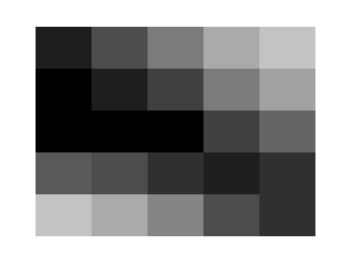
Fig. 1 A simple heat map (code to produce this figure, data)

Suppose we have the following data matrix, stored in heat_map_data.txt.

6 5 4 3 1 0
3 2 2 0 0 1
0 0 0 0 1 0
0 0 0 0 2 3
0 0 1 2 4 3
0 1 2 3 4 5

The normal way of plotting them would be with

plot 'heat_map_data.txt' matrix with image

But to be able to interpolate the data we have to use splot and pm3d instead.

set pm3d map
splot 'heat_map_data.txt' matrix

In Fig. 1 the result of plotting the data just with splot, without interpolation is shown. Note, that the result differs already from the plot command. The plot command would have created six points, whereas the splot command comes up with only five different regions for every axis.

Interpolated heat map

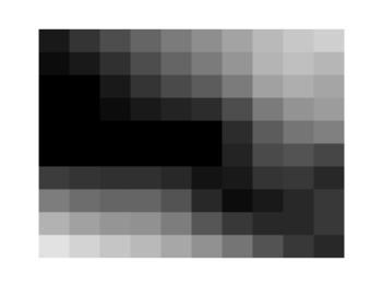
Fig. 2 A heat map interpolated to use twice as much points on every axis (code to produce this figure, data)

Now if we want to double the number of visible points, we can tell pm3d easily to interpolate the data by the interpolate command.

set pm3d interpolate 2,2

The two numbers 2,2 are the number of additional points along the x- and y-axis.
The resulting plot can be found in Fig. 2.

Strong interpolated heat map

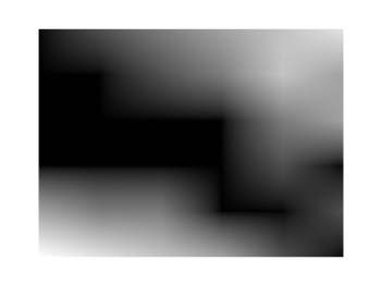
Fig. 3 A heat map interpolated with an optimal number of points (code to produce this figure, data)

In addition to explicitly setting the number of points we can tell gnuplot to choose the correct number of interpolation points by itself, by setting them to 0.

set pm3d interpolate 0,0

Now gnuplot decides by itself how to interpolate, which leads to the result in Fig. 3.

November 7th, 2012 | 6 Comments

Assume you have a data file describing a trajectory that you would like to animate like the spiral shown in Fig. 1.

moving spiral

Fig. 1 An animated spiral trajectory (code to produce this figure, data)

In order to create the animation we have to produce a set of png images and create the resulting gif animation with GIMP as shown in the Animation I – gif entry. Therefor, we have to tell gnuplot at which point of the data it has to stop for each image. This can be achieved by the every option. The point at the end of the line is just one data point. Here the start point and end point for every are just the same.

do for [ii=1:99] {
    splot 'spiral.txt' every ::1::ii w l ls 1, \
          'spiral.txt' every ::ii::ii w p ls 1
}

The downward spiral is created by running the loop in the other direction.

do for [ii=99:1:-1] {
    splot 'spiral.txt' every ::1::ii w l ls 1, \
          'spiral.txt' every ::ii::ii w p ls 1
}

By the way, I don’t know why the antialiasing of the output png images is not working in this example. If you have any idea, feel free to tell me.Assume you have a data file describing a trajectory that you would like to animate like the spiral shown in Fig. 1.

July 8th, 2011 | 1 Comment

The last entry has plotted all its data from data files, even the signal at 700Hz. In this entry we will see how to plot the signal as a function using the special-filenames property of Gnuplot.

CMR

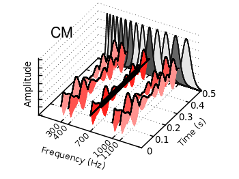
Fig. 1 Visualization of the comodulation masking release using splot and special-filenames (code to produce this figure, gfb_loop.gnu, gfb.dat, noise.dat)

In Fig. 1 the end result is seen. What we have done is to replace the last splot command from the cmr.gnu file with the following code.

set samples 500
# Define the sinusoid signal to be plotted
sig(y) = y>0.1 && y<0.4 ? 0.45*sin(2*pi*100*y)+2 : 2
# The desired range is 0:0.5, but the samples were created for the
# x-axis, which has a range of 0:1400, therefore we calculate an
# factor to do the plot
fact = 1400/0.5
splot '+' u (700):($1/fact):(sig($1/fact)) w l ls 14

We define the function sig(y) which is a 100Hz sinusoid centered at 2 for values of y between 0.1 and 0.4 and constant 2 else. In order to place this two dimensional function in our 3D plot we use the special-filenames property from Gnuplot, in this case the '+' variant. This tells Gnuplot to use the xrange, apply a sampling of it and return it as first column for the plot command. But for our plot we need the y-axis and not the x-axis, because the x values should be constant at 700 and are therefore given by (700) at the splot command. The values of the first column, given by $1 are scaled by fact in order to match the two axis and are then directly used as y values and given to the sig(y) function for the z values.

June 24th, 2011 | No Comments

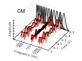
The filledcurves style is only available for 2d plots. But it can be used with some limitations with splot in 3d plots as well. In this entry we want to visualize an effect known from psychoacoustics, called comodulation masking release. The effect describes the possibility of our hearing system to perceive a masked tone (in this case at 700 Hz) easier in the presence of so called comodulated maskers present in other auditory filters. Comodulation describes the fact, that all maskers have the same envelope, as can be seen in Fig. 1.

CMR

Fig. 1 Visualization of the comodulation masking release using splot and filledcurves (code to produce this figure, gfb_loop.gnu, gfb.dat, sig.dat, noise.dat)

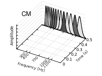
First we start with the gammatone filters. The values for them are stored in the gfb.dat file as one column per filter. In order to apply different colors to different filters the style function sty(x) is defined. The data(x) function is defined to be able to plot the filters in a particular order. This will result in the nice effect of overlapping filters shown in Fig. 2.

sty(x) = x<7 ? 1 : x<10 ? 2 : x<12 ? 1 : x==12 ? 3 : x<15 ? 1 : \
    x==15 ? 2 : 1
data(x) = x<12 ? x : 29-x

The filter bank itself is plotted by the gfb_loop.gnu function. There the data are plotted first as filledcurves and then as a line. This two step mechanism has to be used, because the filledcurves style is not able to draw an extra line in 3d. Hence it has to be done in the extra gfb_loop.gnu function, because the simple for iteration only works for a single plot and is not able to plot the line around the filters.

# gfb_loop.gnu
splot 'gfb.dat' u 2:1:(column(data(i))) w filledcurves \
    ls sty(data(i)), \
      ''        u 2:1:(column(data(i))) ls 4
i = i+1
if (i<maxi) reread
CMR

Fig. 2 Plotting gammatone filters with an extra loop file (code to produce this figure, gfb_loop.gnu, gfb.dat)

Thereafter the modulated noise and its envelope and the signal are plotted in different parts of the graph by explicitly giving the x position.
The result is shown in Fig. 1.

splot 'noise.dat' u  (300):1:2 ls 11, \
      ''          u  (300):1:3 ls 14, \
      ''          u  (400):1:2 ls 12, \
      ''          u  (400):1:3 ls 14, \
      ''          u  (700):1:2 ls 13, \
      ''          u  (700):1:3 ls 14, \
      ''          u (1000):1:2 ls 12, \
      ''          u (1000):1:3 ls 14, \
      ''          u (1100):1:2 ls 11, \
      ''          u (1100):1:3 ls 14
splot 'sig.dat'   u  (700):1:2 ls 14

June 7th, 2011 | 6 Comments

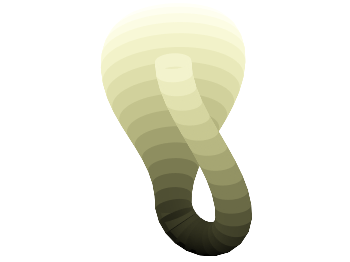
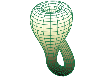
A Klein bottle is a non-orientable surface, which has no defined left and right, as stated on Wikipedia. There we can also find a Gnuplot plot of the bottle, which we want to fine-tune a little bit in order to reach the result in Fig. 1.

Klein bottle

Fig. 1 Klein bottle (code to produce this figure)

In order to reach Fig. 1 we start with the definition of the parametric functions given in Wikipedia and do a simple pm3d plot with them.

set parametric
x(u,v)= v<2*pi ? (2.5-1.5*cos(v))*cos(u) : \
        v<3*pi ? -2+(2+cos(u))*cos(v)    : \
                 -2+2*cos(v)-cos(u)
y(u,v)= v<2*pi ? (2.5-1.5*cos(v))*sin(u) : \
                sin(u)
z(u,v)= v<pi   ? -2.5*sin(v)             : \
        v<2*pi ? 3*v-3*pi                : \
        v<3*pi ? (2+cos(u))*sin(v)+3*pi  : \
                 -3*v+12*pi
splot x(u,v),y(u,v),-z(u,v) w pm3d

The result is shown in Fig. 2.

Klein bottle

Fig. 2 Klein bottle plotted only with pm3d (code to produce this figure)

Now we add some lines to the surface and hide parts, which are not visible in 3d.

set pm3d depthorder hidden3d 1
set hidden3d

Here the depthorder option takes care of the right positioning of the bottleneck going back into the bottle, which is not correct in Fig. 2. The hidden3d 1 option draws lines in the right order for a correctly looking 3d plot using line style 1. The additional set hidden3d command takes care of showing only those lines that are visible in 3d. These options will result in Fig. 3.

Klein bottle

Fig. 3 Klein bottle plotted only with pm3d and hidden3d (code to produce this figure)

In order to reach at Fig. 1 we just have to set the surface to be transparent, which can be done by the set style fill command.

set style fill transparent solid 0.65