July 29th, 2011 | 5 Comments
In one post we have used the parametric plot option to plot the world. Here we want to add some temperature data as a heat map to the world plots. The data show the temperature anomalies of the year 2005 in comparison to the baseline 1951-1980 and is part of the GISTEMP data set.
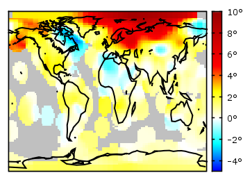
Fig. 1 A 2D heat map of the temperature anomalies in 2005 to the baseline 1951-1980 (code to produce this figure, temperature data, world data)
The first problem you face, if you want to create a heat map, is that the data has to be in a specific format shown in the Gnuplot example page for heat maps. Therefore we first arrange the data and end up with this temperature anomalies file. Unknown data points are given by 9999.0.
In order to plot this data to the 2D world map we have to add a reasonable cbrange and a color palette and the plot command for the map:
set cbrange [-5:10]
set palette defined (0 "blue",17 "#00ffff",33 "white",50 "yellow",\
    66 "red",100 "#990000",101 "grey")
plot 'temperature.dat' u 2:1:3 w image, \
     'world.dat' with lines linestyle 1
The trick with the wide range from 0 to 101 for the color bar is chosen in order to use grey for the undefined values (9999.0) without seeing the grey color in the color bar. The result is shown in Fig. 1.
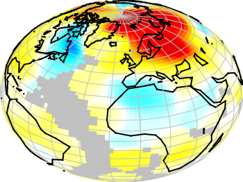
Fig. 2 A 3D heat map of the temperature anomalies in 2005 to the baseline 1951-1980 (code to produce this figure, temperature data, world data)
The same data can easily be applied to the 3D plot of the world. We have to add front to the hidden3d command in order to make the black world lines visible. In addition the radius must be given explicitly as third column to the plot command for the temperature data.
set hidden3d front
splot 'temperature.dat' u 2:1:(1):3 w pm3d, \
      r*cos(v)*cos(u),r*cos(v)*sin(u),r*sin(v) w l ls 2, \
      'world.dat' u 1:2:(1) w l ls 1
The result is shown in Fig. 2.
I’m very interested in heat map using pm3d. And I tried to make another one.
An example script producing Mollweide’s projection map is shown bellow. In this script, q(t,x,dx,n) solves nonlinear equation of auxiliary angle by using Newton-Raphson method.
Have a fun!
Very cool!
Here is the result.
I was wondering whether the same type of colour-coded parametric surface can be obtained for an analytic function?
Indeed, splot admits 4 using-specs to make a pm3d graph, but won’t accept a 4th coordinate in parametric mode:
>splot sin(u)*cos(v),sin(u)*sin(v),cos(u),cos(2*u) w pm3d
         parametric function not fully specified
Fortunately, the special filenames ‘+’ and ‘++’ allow to use the ‘using’ specification with analytic functions
However, in gnuplot 4.6-0 I am having bugs in the hidden3d rendering (surface at the back is over the one at the front in places), which I don’t get with a non-colour-coded plot.
Any thoughts or should I report a bug?
Mh, strange. Maybe you try this first with the newest version of gnuplot and then report a bug.
Hi,
do you have an example of Gnuplot heatmaps that resemble something shown here https://learnr.wordpress.com/2010/01/26/ggplot2-quick-heatmap-plotting/ ?
It seems unreasonably complex to realise something like that, but still..
I’ve tried with:
set term pdfcairo
set output “latency_heat.pdf”
load “../styles.inc”
set size 0.9,1.0
set lmargin 15
set rmargin 20
set pm3d #interpolate 0,100
set view map scale 1
set style func pm3d
set style data pm3d;
set dgrid3d
set pal defined ( 0 0 0 0, 1 1 1 1 )
set tic scale 0
set cblabel “Latency (ms)”
set datafile separator comma
splot “heatmap_latencies.txt” matrix rowheaders columnheaders using 1:2:3 with image title “”
Where the input file is:
,One,Two,Three
a,675.0, 1177.0, 1975.0
b,744.0, 13908.0, 20191.0
c,1767.0, 4374.0 ,5165.0
d,678.0, 1101.0 ,1888.0
e, 771.0, 13842.0 ,18648.0
f, 1372.0, 4264.0 ,5187.0
g,753.0 , 1541.0 ,1729.0
h,791.0 , 5832.0 ,20528.0
i,1310.0, 1225.0 ,5436.0
l,747.0, 1516.0 ,2118.0
m,825.0 , 16719.0 ,0
n,1341.0, 4427.0 ,9040.0
But due to the interpolation, result is not what I expect…