January 5th, 2012 | 16 Comments
This time another colormap plot. If you are using Matlab or Octave you are probably be familiar with Matlabs nice default colormap jet.
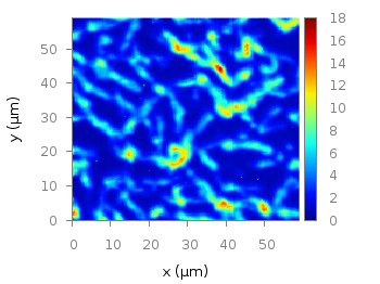
Fig. 1 Photoluminescence yield plotted with the jet colormap from Matlab (code to produce this figure, data)
In Fig.1, you see a photoluminescence yield in a given region, and as you can see Gnuplot is able to apply the jet colormap from Matlab. This can be achieved by defining the palette as follows.
set palette defined ( 0 '#000090',\
                      1 '#000fff',\
                      2 '#0090ff',\
                      3 '#0fffee',\
                      4 '#90ff70',\
                      5 '#ffee00',\
                      6 '#ff7000',\
                      7 '#ee0000',\
                      8 '#7f0000')
The numbers 0..8 are automatically rescaled to 0..1, which means you can employ arbitrary numbers here, only their difference counts.
If you want to use this colormap regularly, you can store it in the Gnuplot config file as a macro.
# ~/.gnuplot
set macros
MATLAB = "defined (0  0.0 0.0 0.5, \
                   1  0.0 0.0 1.0, \
                   2  0.0 0.5 1.0, \
                   3  0.0 1.0 1.0, \
                   4  0.5 1.0 0.5, \
                   5  1.0 1.0 0.0, \
                   6  1.0 0.5 0.0, \
                   7  1.0 0.0 0.0, \
                   8  0.5 0.0 0.0 )"
Here we defined the colors directly as rgb values in the range of 0..1, which can be alternatively used a color definition.
In order to apply the colormap, we now can simple write
set palette @MATLAB
Thank you for this great site!
I’m plotting contours from grid data:
#x y z
0.1 0.1 1
0.1. 0.2 2
0.1 0.3 1
0.1 0.4 0
etc.
….
the z column contains integer numbers.
Contour plots are fine but , however, as the z is integer
I’d like to define a “discontinuous” color palette, for example
1 corresponds to blue
2 corresponds to red
3 corresponds to purple
…..
using for instance NMAX colors
and I’d like also to “recycle” colors: if z > NMAX, use mod(z,NMAX).
Could you help me??
Thanks a lot!!!!!
I have written a new entry how to define palettes with discrete colors. This should work fine in your case. In addition, gnuplot comes with a modulo function (%) that you can use for your integer z values. For example:
Thanks!!!
Hello, can you help me?
I’m trying to make an image of the data obtained from a small radio telescope built. I need to assign a color to each data I got.
The data I get are similar to these:
http://www.nrao.edu/index.php/learn/radioastronomy/makeradioimage
http://www.nrao.edu/whatisra/dsheet1.html
I found this great site: http://www.gnuplotting.org/matlab-colorbar-with-gnuplot/ and I think that can solve my problem.
Can you explain this:
set palette defined ( 0 ‘#000090’,\
1 ‘#000fff’,\
2 ‘#0090ff’,\
3 ‘#0fffee’,\
4 ‘#90ff70’,\
5 ‘#ffee00’,\
6 ‘#ff7000’,\
7 ‘#ee0000’,\
8 ‘#7f0000’)
Why from 0 to 8? And why those colors?
What is the meaning of this:
plot ‘matlab_colormap.txt’ u ($1/3.0):($2/3.0):($3/1000.0) matrix with image
Regards
Rolando Paz
That the colors go from 0 to 8 is completely arbitrary. Gnuplot will assign the color of the lowest value to the lowest number you specify and the highest value to the color of the highest number you specify. The only thing which matters is the distance between the numbers. here I have chosen an equally spaced distance between them. And the choice of colors here, was to match the Jet colormap from Matlab.
The plot command divides the values from the first column of the data file ($1) by three and also the second column ($2), and finally the third column by 1000. This is only done to get the right scaling of the underlying data.
matrixtells Gnuplot that the data are stored as a matrix in the data file, andimageis the plotting mode to use.Thanks for your answer, I already understand the color asignation, but I still have a doubt about the division required in the first and second column by 3, and the third by 1000, what is the objetive to do this and what is the diference if I make the division by another number?
You are talking about three columns and the data file has 180 columns and 180 rows, Wich three columns are you talking about?
Regards
Rolando Paz
Thanks for this great post :)
hi,
i am trying to use another color map which i found here:
http://bastian.rieck.ru/blog/posts/2012/gnuplot_better_colour_palettes/.
this map goes from blue over grey to red (cool to warm map). but somehow gnuplot adds some new colors like green and yellow. does gnuplot somehow interpolate missing colors?
my data range is currently 0 to 4, do i have to care about that or will gnuplot automatically adapt the range of the colormap so that it fits the data range?
thanks for answers or helping ideas.
-johannes
Hi johannes.
For me it just works.
Fig. 2 Photoluminescence yield plotted with a blue-red-colormap (code to produce this figure, data)
The colors are automatically scaled to your data values or to the values you specify with
Thank you!
Thanks hagen, the »set cbrange« command was exactly what I was looking for.
Hye,
Hello,
Can someone help me how to extract colour from an image and display the extracted colour as colour palette?
You can use GIMP for this, there is a tool called color picker which does the job. This works for one color at once.
Hi,
I got an error message saying
error: invalid conversion from string to real N-d array
error: set: expecting graphics handle as first argument
would you please tell me what could happen here?
Hi Cindy.
Can you tell what command or file you run? The code for Fig. 1 runs fine for me.
I think this is a much better way to define the palette:
f(x)=1.5-4*abs(x)
set palette model RGB
set palette functions f(gray-0.75),f(gray-0.5),f(gray-0.25)