October 27th, 2010 | 11 Comments
If we have more than one graph that should be displayed in a figure, the multiplot command is the one to use in Gnuplot. But as we will see this is not a trivial task.
Let us consider we have four different functions that should be presented in the same figure as shown in Fig. 1.
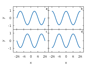
Fig. 1 A multiplot with reduced axes labeling and nicely arranged graphs (code to produce this figure)
The functions are given by:
# Functions (1/0 means not defined)
a = 0.9
f(x) = abs(x)<2*pi ? a*sin(x)           : 1/0
g(x) = abs(x)<2*pi ? a*sin(x+pi/2)      : 1/0
h(x) = abs(x)<2*pi ? a*sin(x+pi)        : 1/0
k(x) = abs(x)<2*pi ? a*sin(x+3.0/2*pi)  : 1/0
For an explanation of the used syntax to declare the functions have a look at the Defining piecewise functions article.
In a first attempt we just use the multiplot command:
### Start multiplot (2x2 layout)
set multiplot layout 2,2 rowsfirst
# --- GRAPH a
set label 1 'a' at graph 0.92,0.9 font ',8'
plot f(x) with lines ls 1
# --- GRAPH b
set label 1 'b' at graph 0.92,0.9 font ',8'
plot g(x) with lines ls 1
# --- GRAPH c
set label 1 'c' at graph 0.92,0.9 font ',8'
plot h(x) with lines ls 1
# --- GRAPH d
set label 1 'd' at graph 0.92,0.9 font ',8'
plot k(x) with lines ls 1
unset multiplot
### End multiplot
We also added a label to every graph in order to identify them easily in the figure. Note that we overwrite the label 1 for every graph. If we don’t do that, then on the last graph all four labels will be present. Using this simple approach we will get Fig. 2. As you can see this is not an ideal case to use the space in the figure. The xtics and the ytics are just the same in every graph and are not needed to be displayed on every graph.
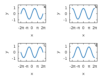
Fig. 2 A straightforward use of the multiplot command to plot four different functions (code to produce this figure)
But before we fix this we will introduce the use of macros in order to shorten the code a lot. As you can see in the code block above, the set label command contains the same position for every graph. We can shorten this by:
set macros
# Placement of the a,b,c,d labels in the graphs
POS = "at graph 0.92,0.9 font ',8'"
[...]
set label 1 'a' @POS
plot f(x) with lines ls 1
and so on for the other graphs.
But the macros are not only useful for the different labels, but also for the other settings of the multiplot.
First we want to remove the x/y-tics and labels, where they are not necessary. Here it is the same as with the label settings. Every graph uses the settings from the graph before, if we didn’t change these settings. In order to remove the xtics at a given graph we have to tell this explicitly. Therefore we define macros for the two cases label+tics vs. nolabel+notics:
# x- and ytics for each row resp. column
NOXTICS = "set xtics ('' -2*pi,'' -pi,'' 0,'' pi,'' 2*pi); \
          unset xlabel"
XTICS = "set xtics ('-2π' -2*pi,'-π' -pi,'0' 0,'π' pi,'2π' 2*pi);\
          set xlabel 'x'"
NOYTICS = "set format y ''; unset ylabel"
YTICS = "set format y '%.0f'; set ylabel 'y'"
These will then be used in the plotting section:
# --- GRAPH a
@NOXTICS; @YTICS
[...]
# --- GRAPH b
@NOXTICS; @NOYTICS
[...]
# --- GRAPH c
@XTICS; @YTICS
[...]
# --- GRAPH d
@XTICS; @NOYTICS
Applying the axes settings will result in Fig. 3.
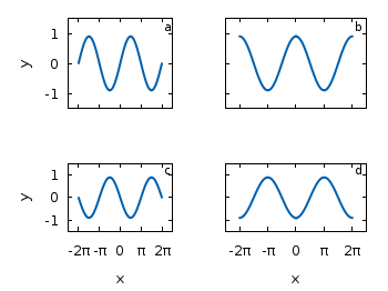
Fig. 3 A multiplot with reduced axes labeling (code to produce this figure)
Now the label etc. on the axes are done in a nice way, but the sizes and the spaces between the individual graphs are very bad. This comes from the fact that Gnuplot calculates the size of a graph depending on the presence of tics and labels. In order to have graphs with the same size and align them without spaces between them we have to set the margins of the individual graphs manually.
# Margins for each row resp. column
TMARGIN = "set tmargin at screen 0.90; set bmargin at screen 0.55"
BMARGIN = "set tmargin at screen 0.55; set bmargin at screen 0.20"
LMARGIN = "set lmargin at screen 0.15; set rmargin at screen 0.55"
RMARGIN = "set lmargin at screen 0.55; set rmargin at screen 0.95"
The trick is that we use the at screen command to arrange the margins absolutely in the figure. As you can see the bottom margin of the two figures in the top is placed at 0.55, the same value the top margin of the two lower graphs start.
These margins are then added in the same way to the multiplot command as the label settings and we get:
# --- GRAPH a
@TMARGIN; @LMARGIN
[...]
# --- GRAPH b
@TMARGIN; @RMARGIN
[...]
# --- GRAPH c
@BMARGIN; @LMARGIN
[...]
# --- GRAPH d
@BMARGIN; @RMARGIN
Having done all this we will finally get our desired figure which is shown in Fig. 1.
Cool. I search this type layout for 3 days. :)
The macros can not deal with the label with “{/Symbol l}”, because the it use the “. Is there any way to deal with this thing? Thx.
The problem mention before can use variable to avoid it.
xlabel_var = “{/Symbol l}”
# x- and ytics for each row resp. column
….
XTICS = “set xtics (‘-2?’ -2*pi,’-?’ -pi,’0′ 0,’?’ pi,’2?’ 2*pi);\
set xlabel xlabel_var”
….
how to plot 6 figures (3×2) of the same size (square) ? I have plotted using the logic above but the figures are coming rectangular but I need the figures to be square. I have tried to use set size 1.0, 1.5; but it is not working.
It depends on your overall size of the image and on the settings of the margins. For example, if you set the overall size to a square and use the same margins for left/right and bottom/top you get what you are looking for.
Fig. 4 A multiplot with reduced axes labeling and nicely arranged square graphs (code to produce this figure)
@Satyabrata, I think, you might have to define additional top and bottom margins for multiplot layout bigger than 2X2. For example, for 3X2 layout, you would have a top margin(T1) for the upper-most figure, similarly, T2 for middle figure, and finally bottom margin(B) for the bottom figure. However, this approach becomes ugly when you want to plot layouts of higher dimensions. @hagen, Is there any other nice solution to this ?
Tremendous !
Thanks a lot. Really helpful.
Great!!! Thanks!!!
Cool. This is one of the most valuable posts in terms of information given and clarity versus length of the post. Thanks!
But i cant manage horizontal spacing between two graphs in 5-1 plot, can anybody help me, Please.
You can put more than one label on each plot in multiplot mode also. Just try this:
set terminal postscript eps size 3.5,2.0 enhanced color font ‘Helvetica,20’ lw 2
set output ‘test.eps’
set multiplot layout 1,2 rowsfirst margins 0.12,0.98,0.22,0.96 spacing 0.1,0.1
set label 1 ‘Sample 1’ at graph 0.5,0.5
set label 2 ‘Sample 2’ at graph 0.15,0.25
set label 3 ‘(a)’ at graph 0.85,0.85
set xlabel ‘x-axis’ offset 0,0.5
set ylabel ‘y-axis’ offset 2
plot ‘diff.csv’ u 2:1 w l lw 2 lc ‘black’ notitle
set label 1 ‘Sample 3’ at graph 0.5,0.8
set label 2 ‘Sample 4’ at graph 0.5,0.25
set label 3 ‘(b)’ at graph 0.85,0.85
unset ylabel
set xlabel ‘x-axis 2’ offset 0,0.5
plot ‘conj.csv’ u 2:1 w l lw 2 lc ‘black’ notitle
unset label 1
unset label 2
unset label 3
unset multiplot