January 31st, 2014 | 3 Comments
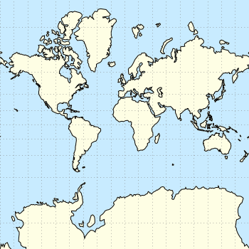
And another plot of the world. This time we are dealing with the raster data from Natural Earth. This data is normally available as tif-files. To use them in gnuplot we have to convert them first, then we can create a plot as shown in Fig. 1.
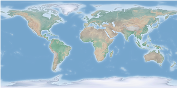
Fig. 1 Cross-blended hypsometric tint plot of the world. (code to produce this figure, data)
The conversion is done by the convert_natural_earth script. There the tif-file is first scaled down to the desired resolution using imagemagick. Afterwards it is converted to a text file and reordered for the splot command of gnuplot. The text file includes the longitude, latitude and three rgb color values.
You have to invoke the script in the following way.
$ ./convert_natural_earth $RES $FILE
where $RES is the desired resolution in pixel of your gnuplot plot and $FILE the input tif-file.
After finished we can plot the resulting text file simply by
set datafile separator ','
set size ratio -1
plot 'HYP_50M_SR_W_350px.txt' w rgbimage
which results in Fig. 1.
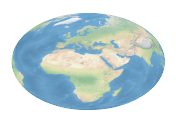
Fig. 2 Natural Earth II shaded relief and water plot of the world. (code to produce this figure, data)
The image can also be projected on a 3D figure of the world as shown in Fig. 2. To achieve this the three rgb values have to be summarized in one value and the rgb variable line color option has to be chosen together with pm3d.
rgb(r,g,b) = 65536 * int(r) + 256 * int(g) + int(b)
set mapping spherical
set angles degrees
splot 'NE2_50M_SR_W_700px.txt' u 1:2:(1):(rgb($3,$4,$5)) w pm3d lc rgb variable