Gnuplotting

Create scientific plots using gnuplot

February 17th, 2013 | 3 Comments

As you may have noticed some little changes have occurred. The width of the text area and the font size is larger now.
But the most noticeable change is the addition of the gnuplot manpage as a HTML side. That was part of the gnuplot documentation site for older versions of gnuplot, but disappeared with version 4.4. Now we have the manpage for version 4.6 directly integrated with this site. That gives the nice opportunity to directly link to the description in the manpage of some commands. For example have a look at the placing of a text label.
Another nice feature is the availability of all the code for the blog entries and the wordpress theme on github.

February 6th, 2013 | 8 Comments

Maybe you all know the nice example of gnuplots transparent fill style. I have replotted it slightly modified in Fig. 1.

Filledcurves with transparency

Fig. 1 Filledcurves with transparency settings as on the gnuplot demo site (code to reproduce this figure)

The interesting part in the code looks like this.

set style fill transparent solid 0.5 noborder
plot d1(x) fs solid 1.0 lc rgb "forest-green" title 'µ= 0.5 σ=0.5', \
     d2(x) lc rgb "gold" title 'µ= 2.0 σ=1.0', \
     d3(x) lc rgb "red" title 'µ=-1.0 σ=2.0'

The set style command sets the fill style to 50% transparency, which is overwritten by the explicit fs option to the first plotting command in order to plot the green curve without transparency.

Filledcurves with different transparency

Fig. 2 Filledcurves with different transparency settings (code to reproduce this figure)

Now the question is how to plot filled curves with different transparency settings? The simple answer is, by just using this explicit fs plot argument. The result is shown in Fig.2 and can be reached with the following code. Now we apply a transparency of 75%, 50%, and 25% going from the green to the red curve.

set style fill noborder
plot d1(x) fs transparent solid 0.75 lc rgb "forest-green" \
        title 'µ= 0.5σ=0.5', \
     d2(x) fs transparent solid 0.50 lc rgb "gold" \
        title 'µ= 2.0 σ=1.0', \
     d3(x) fs transparent solid 0.25 lc rgb "red" \
        title 'µ=-1.0 σ=2.0'

December 18th, 2012 | 48 Comments

More than a year ago, we draw a map of the world with gnuplot. But it has been pointed out the low resolution of the map data. For example, Denmark is totally missing in the original data file. The good thing is, there is other data available in the web. In this entry we will consider how to use the physical coastline data from http://www.naturalearthdata.com/downloads/ together with gnuplot.

Fig. 1 Plot of the world with the new data file and a resolution of 1:110m (code to produce this figure, data)

At the download page, three different resolutions of the data are available with a scale of 1:10m, 1:50m, or 1:110m. The data itself is stored as shape files on naturalearthdata.com. Hence I wrote a script that converts the data first to a csv file using the ogr2ogr program. Afterwards the data is shaped with sed into the form of the original world.dat file.
Here are the resulting files:

Fig.1 shows the result for a resolution of 1:110m. Note that we have to use linetype instead of linestyle in gnuplot 4.6 in order to set the colors of the grid and coast line.

In order to compare the different resolutions of the coast line files, we plot only the part of the map where Denmark is located (which is completely missing in the original data).
Here is the example code for a scale of 1:110m.

set xrange [7.5:13]
set yrange [54.5:58]
plot 'world_110m.txt' with filledcurves ls 1, \
    '' with l ls 2

Fig. 2 A plot of Denmark at a resolution of 1:110m. (code to produce this figure, data)

Fig. 3 A plot of Denmark at a resolution of 1:50m. (code to produce this figure, data)

Fig. 4 A plot of Denmark at a resolution of 1:10m. (code to produce this figure, data)

December 1st, 2012 | 7 Comments

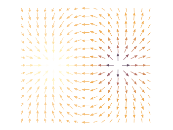
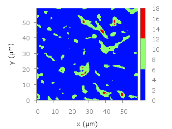
In an earlier entry we created a vector field from measured data. Now we will visualize functions with the vector plotting style. As functions we have two 1/r potentials which define the amplitude of the vectors, as can be seen in Fig. 1. It is often better to indicate the amplitude by a color instead of by the length of the single vectors, especially if there are big changes. For the exact functions have a look into the corresponding file.

Vector field showing two sources

Fig. 1 Vector field of two sources with the opposite charge. The color indicates the amplitude. (code to produce this figure)

By analogy to the data vector field we have again a dx, and dy function for the length of the vectors.

dx(x,y) = scaling*ex(x,y)/enorm(x,y)
dy(x,y) = scaling*ey(x,y)/enorm(x,y)

Now we need a trick, because we have to fill the u 1:2:3:4 for the vector style with our function data. The four columns are then x,y,dx,dy of the vectors, where dx, dy are the lengths of the vector in x and y direction. Here the special filename ++ is a big help. It gives us x and y points as a first and second column, which we could address by $1 and $2. The number of points for the two axes are handled by the samples and isosamples command.

set samples 17    # x-axis
set isosamples 15 # y-axis
plot '++' u ($1-dx($1,$2)/2.0):($2-dy($1,$2)/2.0):\
    (dx($1,$2)):(dy($1,$2)):(v($1,$2)) \
    with vectors head size 0.08,20,60 filled lc palette

To place the vector at the center of the single x, y points, we move the starting point of the vectors to x-dx/2, y-dy/2.

November 11th, 2012 | 8 Comments

The superb site not so Frequently Asked Questions from Kawano, which I read a lot at the beginning of my gnuplot journey is down at the moment.
Hence I changed the link to a backup mirror.

November 7th, 2012 | 6 Comments

Assume you have a data file describing a trajectory that you would like to animate like the spiral shown in Fig. 1.

moving spiral

Fig. 1 An animated spiral trajectory (code to produce this figure, data)

In order to create the animation we have to produce a set of png images and create the resulting gif animation with GIMP as shown in the Animation I – gif entry. Therefor, we have to tell gnuplot at which point of the data it has to stop for each image. This can be achieved by the every option. The point at the end of the line is just one data point. Here the start point and end point for every are just the same.

do for [ii=1:99] {
    splot 'spiral.txt' every ::1::ii w l ls 1, \
          'spiral.txt' every ::ii::ii w p ls 1
}

The downward spiral is created by running the loop in the other direction.

do for [ii=99:1:-1] {
    splot 'spiral.txt' every ::1::ii w l ls 1, \
          'spiral.txt' every ::ii::ii w p ls 1
}

By the way, I don’t know why the antialiasing of the output png images is not working in this example. If you have any idea, feel free to tell me.Assume you have a data file describing a trajectory that you would like to animate like the spiral shown in Fig. 1.

October 17th, 2012 | 5 Comments

Some data could be nicely visualized by representing them as arrows. For example, assume that we have done an experiment where we played something to a subject through three loudspeakers and the subject should name the direction where he or she perceived it. In Fig. 1 we show the named direction by the direction of the arrows. The color of the arrow indicates the deviation from the desired direction. A white and not visible arrow means no deviation and a dark red one a deviation of 40° or more.

Vector field showing localization data

Fig. 1 Vector field showing localization results. The arrows are pointing towards the direction the subject had named. The color indicates the deviation from the desired direction. (code to produce this figure, set_loudspeakers.gnu, data)

In gnuplot the with vectors command enables the arrows in the plot. It requires four parameters, x, y, dx, dy, where dx and dy controls the endpoint of the arrow as offset values to x,y. In our example the direction is stored as an angle, hence the following functions do the conversion to dx,dy. 0.1 defines the length of the arrows.

xf(phi) = 0.1*cos(phi/180.0*pi+pi/2)
yf(phi) = 0.1*sin(phi/180.0*pi+pi/2)

An optional fifth parameter controls the color of the vector together with the lc palette setting. The arrows start at x-dx,y-dy and point to x+dx,y+dy.

plot 'localization_data.txt' \
    u ($1-xf($3)):($2-yf($3)):(2*xf($3)):(2*yf($3)):4 \
    with vectors head size 0.1,20,60 filled lc palette

August 17th, 2012 | 7 Comments

As already mentioned gnuplot 4.6 overs an easier way to include loops in your code.
Here we are using it to create an animation of a set of head related impulse responses, which show differences in amplitude and arrival time at the left and right ear of a listener depending on the position of the source.

Fig. 1 Video animation of head related impulse responses (HRIRs) (code to produce this figure, data)

In comparison to the additional file for the loop in Animation I – gif, now all we need is this small code block.

do for [ii=1:181] {
    set output sprintf('hrir_frame%03.0f.png',ii)
    set multiplot layout 2,1
    [...]
    plot 'ir.txt' u ($1*1000):2*ii-1 w l ls 1
    [...]
    plot 'ir.txt' u ($1*1000):2*ii w l ls 1
    [...]
}

July 16th, 2012 | 32 Comments

Sometimes it can be helpful to visualize a third dimension by the color of the line in the plot. For example in Fig. 1 you see a logarithmic sweep going from 0 Hz to 100 Hz. Here the frequency is decoded by the color of the line.

Logarithmic sweep

Fig. 1 A logarithmic sweep ranging from 0 Hz to 100 Hz and decoding the frequency with the line color (code to produce this figure, data)

This can be easily achieved by adding a lc palette to the plot command, which uses the values specified in the third row of the data file.

plot 'logarithmic_sweep.txt' u 1:2:3 w l lc palette

The palette can be defined as shown in the Multiple lines with different colors entry. But it can be set in a more easy way, by only setting the start and end color and calculating the colors in between. Therefore, we are picking the two hue values in GIMP (the H entry in Fig. 2 and Fig. 3) for the starting and ending color.

Picking the first hue value

Fig. 2 Picking the HSV value corresponding to the given color of #09ad00.

Picking the second hue value

Fig. 3 Picking the HSV value corresponding to the given color of #0025ad.

These colors are then used to specify the palette in HSV mode. The S and V values can also directly be seen in GIMP.

# start value for H
h1 = 117/360.0
# end value for H
h2 = 227/360.0
# creating the palette by specifying H,S,V
set palette model HSV functions (1-gray)*(h2-h1)+h1,1,0.68

June 10th, 2012 | 8 Comments

In one off the last entries we defined a color palette similar to the default one in Matlab. Now we will use a color palette with only a few discrete colors, as shown in Fig. 1. This can be useful if we want to see all values from a measurement lying above a given threshold.

Palette with discrete colors

Fig. 1 Photoluminescence yield plotted with a palette with discrete colors (code to produce this figure, data)

The trick is to set maxcolors to the number of colors you want in your plot. In addition, the colors to use can be specified by the defined command. Note, that the absolute values you specify in the palette definition were automatically scaled to your min and max values (0 and 18 in this case).

set palette maxcolors 3
set palette defined ( 0 '#000fff',\
                      1 '#90ff70',\
                      2 '#ee0000')