June 21st, 2013 | 7 Comments
Sometimes a classical heat map will not be the best way to visualize your data in a two dimensional plane. This is especially the case, when only a few data points on the plane have different values. For example in Fig. 1 you find a projection from one vector to another to visualize its similarity. This is a method used in normal mode analysis of molecules to determine if two different
calculations yield similar results. As you can see only the data points near the diagonal vary, which is hard to see because of the small size of the points. In addition, points farer away from the diagonal having a small percentage value are more or less invisible – compare to Fig. 2.
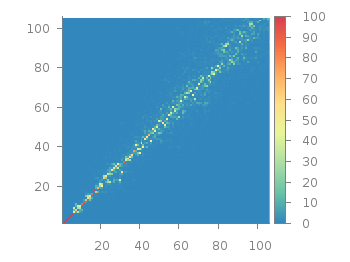
Fig. 1 Vector dot product expressed in percentage plotted with the image style (code to produce this figure, data)
In order to emphasize the data, we abounded the image plot style and use transparent circles as plotting style for visualizing the data as shown in Fig. 2.
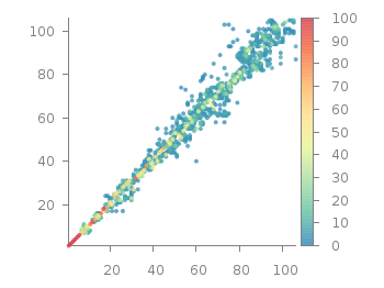
Fig. 2 Vector dot product expressed in percentage plotted with the circles style (code to produce this figure, data)
In order to do so, we remove all values from the plot that are 0, by setting them to 1/0. Further we set the transparency of the circles to 20%. Before plotting the data we are sorting them regarding their percentage value in order to plot the highest values above the lower ones.
f(x) = x>2 ? x : 1/0
set style fill transparent solid 0.8 noborder
plot '<sort -g -k3 vector_projection.txt' u 1:2:(1):(f($3)) w circles lc palette
[…] Plotting sparse data ::: Gnuplotting […]
I just spent hours trying to use variable point sizes, just to learn about ‘circles’ thanks to your post. Thank you for writing this.
Is it possible to plot data with transparent circles in 3d ? (or rather, with little transparent spheres)
That is not possible in gnuplot at the moment, at least not in an easy way.
Maybe you can achieve it by drawing little transparent spheres as I did with non-transparent cubes.
Thanks for the idea. I have figured out how to plot little spheres centered at datapoints with parametric equations. I wrote a python script which produces a gnuplot script with stuff like:
It is cumbersome, and certainly not very effective but it works.
Is it possible to color each sphere in it’s own color according the value of a variable (with pm3d maybe) like the circles in your 2D plot?
The parametric mode in gnuplot allows not for a fourth column specifying the color, but you could use
multiplotand change the used pm3d palette between every sphere.Thank you for this explanation. It was very useful. I miss more information about the use of the “sort” option on the internet. I still have a some doubts. “-k3” orders the highest values (of column 3) above the lower ones, and “-k3nr” would do the opposite (smallest on top). The problem is when there are negative and positive values and one wants to order them according to the absolute values. Is there a simple way to “sort” according to the absolute value of a column? Thank you very much!