December 18th, 2012 | 48 Comments
More than a year ago, we draw a map of the world with gnuplot. But it has been pointed out the low resolution of the map data. For example, Denmark is totally missing in the original data file. The good thing is, there is other data available in the web. In this entry we will consider how to use the physical coastline data from http://www.naturalearthdata.com/downloads/ together with gnuplot.
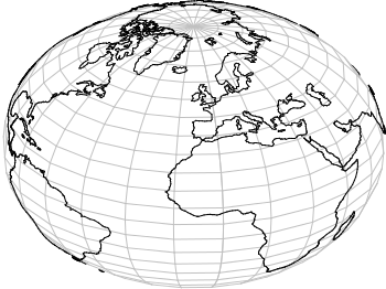
Fig. 1 Plot of the world with the new data file and a resolution of 1:110m (code to produce this figure, data)
At the download page, three different resolutions of the data are available with a scale of 1:10m, 1:50m, or 1:110m. The data itself is stored as shape files on naturalearthdata.com. Hence I wrote a script that converts the data first to a csv file using the ogr2ogr program. Afterwards the data is shaped with sed into the form of the original world.dat file.
Here are the resulting files:
- 1:10m: world_10m.txt
- 1:50m: world_50m.txt
- 1:110m: world_110m.txt
Fig.1 shows the result for a resolution of 1:110m. Note that we have to use linetype instead of linestyle in gnuplot 4.6 in order to set the colors of the grid and coast line.
In order to compare the different resolutions of the coast line files, we plot only the part of the map where Denmark is located (which is completely missing in the original data).
Here is the example code for a scale of 1:110m.
set xrange [7.5:13]
set yrange [54.5:58]
plot 'world_110m.txt' with filledcurves ls 1, \
    '' with l ls 2
Fig. 2 A plot of Denmark at a resolution of 1:110m. (code to produce this figure, data)
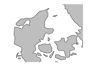
Fig. 3 A plot of Denmark at a resolution of 1:50m. (code to produce this figure, data)
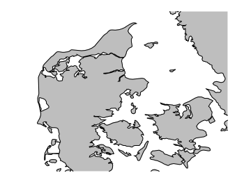
Fig. 4 A plot of Denmark at a resolution of 1:10m. (code to produce this figure, data)
Great! Thanks for sharing.
Sorry, could you recommend a good book about gnuplot?.
Thanks a lot.
I plot three maps of globe using the three resolutions respectively.
1:10m : http://d.pr/i/sCzt
1:50m : http://d.pr/i/eyL1
1:110m : http://d.pr/i/49v1
the first and third plot may have bugs. some place is blank.
@AlBundy: there are not that many gnuplot books. I know only two:
Gnuplot in Action: Understanding Data with Graphs from Philipp K. Janert
gnuplot Cookbook from Lee Phillips
@jack: yes there are some bugs regarding filledcurves plots with the data. That is mainly due to the order of the data in the file. For the 1:110m file I have corrected the data, for the 1:10m it need some work.
@hagen: thanks for reply. I have two more questions.
1. Could the heatmaps be interpolated?
http://gnuplot.sourceforge.net/demo_4.6/heatmaps.html
sometimes, smoothing plot looks better.
2. Could the zlabel of pm3d be rotated? if string of zlabel is long, it will take much width of plot.
1. I’m afraid you have to interpolate your data matrix in order to interpolate the image.
2. Labels can be rotated by
rotate by <degrees>I have corrected all data files in order to work correctly with the
filledcurvesoption.I have also added the Antarctica at the bottom of the files seperated by two blank lines in order to use the
indexoption to generate a plot with correct filling of the Antartica.If we plot by the following command, we will get Fig. 5.
plot 'world_110m.txt' with filledcurves ls 2, \
     '' w lines linestyle 1
Fig. 5 World with a resolution of 1:110m and filledcurves. (code to produce this figure, data)
If we use the
indexoption and set the reference of the filledcurves to the x-axis for the Antartica, we will get Fig. 6.plot 'world_110m.txt' i 0 with filledcurves ls 2, \ '' i 1 with filledcurves x1 ls 2, \ '' w lines linestyle 1Fig. 6 World with a resolution of 1:110m and filledcurves and correct Antartica. (code to produce this figure, data)
Hi, hagen. As heatmap can’t be interpolated. I use pm3d to complete interpolation.
ex: http://d.pr/i/BNqq
Also, I want to plot world on the same image. Would you please tell me how to do this?
That is a nice trick. I will write an entry about heat map interpolation.
For including the world, it is easy with the 3D version, there it just works. For the 2D version we need to align the 3D and 2D plot. That I will discuss also in an extra entry, sometime the next weeks.
Thanks. I created a 1:10m of southeast Asia and plotted the frequency of MODIS satellite passes per day (http://d.pr/i/SDXx). Not sure why my gridlines change from grey to black?
Mh, strange.
I have created a plot from the same region with the temperature data from the heat map entry and the grid looks fine.
Fig. 7 World with a resolution of 1:50m, some temperature data and a grey grid (code to produce this figure)
I have added the grid with the following code
What exact terminal and code for the grid did you use?
I used the PNG terminal and very similar code to yours. The code is here: http://d.pr/f/fJeq. The frequency data is here: http://d.pr/f/aDRG (20 Mbs). The coastline is here: http://d.pr/f/ApzY (3 Mbs)
I have found the error. You scaled up your tics in a way that they cover most of the graph, and they are in front of the grid.
I have changed
to
and now your grid looks fine.
Modis_coverage_20120823_32.png.
Don’t wonder that the MODIS data are not aligned, that is due to the fact that the range of the x and y values in your given data file are only in this region.
Thanks. It looks better now (http://d.pr/i/50bp) with the spatially correct frequency data file (http://d.pr/f/aoHT). Sorry I uploaded an earlier incorrect test data file. Look forward to your next entry.
Hi Hagen,
I am plotting a 3D plot of temperature map on a cylinder. My plot is created from a .dat file with four columns as well. Instead of your “world” I am plotting onto the temperatures the contour lines of the temperature field (how I have created those it is a long story and I can explain it in a further comment if you wish). My problem is that after plotting the temps pm3d + contours lines, the “theoretically” hidden contour lines can still be seen. In your 3D plots of the world temperatures this doesn’t happen. I am wondering if you can give me a hint. The only difference I can see so far is that I am not plotting the cylinder itself and that I am using cartesian cordinates to define the points for both, the temperatures and the contour lines.
Thanks a lot.
Oriol
If you plot both the contour lines and the temperature data, the order of the two commands matters. For example, above I plotted first the contour lines and in the second line the temperature data.
If this doesn’t help, I’m afraid I have to see your code in order to help.
Dear Hagen,
Thanks your for promt reply. I have been working on it and basically trying to do all the steps you did to make your plot. The hidden contours finally disapeared when using the “hidden3d front” and plotting the cylinder mesh. If any of those two is missing, the hidden contours appear again. As you showed in your code, first plot the temperature data, then the mesh and finally the contours.
My code is like this:
reset
set title "2D Temperature Fluctuations Random fields\nN=32,dt=0.050,fc=10.000,df=0.050,Vm=11.4:t=1.550s" offset 0,1
set zlabel "Axial distance(m)"
set cblabel "T.Fluctuations({/Symbol \260}C)" offset 1.0
set cbrange [-10:10]
unset key
set palette rgbformulae 22,13,10
set ticslevel 0.0
set mapping cylindrical
set angles radians
set hidden3d front
set parametric
set isosamples 10
set urange[0:2*pi]
set vrange[0:1.4000]
r=0.0700
r1=0.0693
set view 60,60
splot "Fluctuations.dat" u 2:($1)*r:(r):3 with pm3d, r1*sin(u),r1*cos(u),v w l lt 1 lc -1 , "contoursF.dat" u 2:($1)*r:(r):3 w l lt 1 lw 1
set term pngcairo enhanced
set output "3dF_0032.png"
replot
Now I have got a problem I never really knew how to solve. The length of my pipe (in z axis) is ten times the diameter (in xy plane). How can I fit everything in the screen?
Sorry, I forgot to say now I have added the “set view equal xyz” in order to set the same ratio on all axes. Then I can’t get the whole pipe within the terminal :)
Thanks!
If you want to stick with the
set view equal xyz, you could change the size of the terminal. For example tryif your z axis is ten times as large as the other ones.
After spending some time with the terminal or canvas size finally I found the way to fit the plot inside.
The “set size” command scales the plot relative to the canvas size, as said in the gnuplot instructions. And that did it! Then it is also necessary to play with “set origin”. Otherwise the plot is not located in the proper relative position.
Here is my final code:
reset
set terminal wxt size 400,1000 enhanced font 'Helvetica,10'

set size 1,0.27 #scales the plot relative to canvas size.
set origin 0,-0.03 #sets the origin of the plot within the canvas

set title "2D Temperature Random fields\nN=32,dt=0.050,fc=10.000,df=0.050,Vm=11.4:t=1.550s" offset 0,47
#set zlabel "Axial distance(m)" rotate by 90 font ",15" offset -3
set xtics 0.04 offset -2,0
set ytics 0.04 offset 1.0,0
set ztics offset 0,0.5
set cblabel "Temperature({/Symbol \260}C)" offset 1.0
set cbrange [15.0:30.0]
unset key
set palette rgbformulae 22,13,10
set mapping cylindrical
set angles radians
set hidden3d front
set parametric
set isosamples 10
set urange[0:2*pi]
set vrange[0:1.4000]
r=0.0700
r1=0.0693
set view equal xyz
set view 60,60
set ticslevel 0.0
splot "Temperatures.dat" u 2:($1)*r:(r):3 with pm3d, \
r1*sin(u),r1*cos(u),v w l lt 1 lc -1 , \
"contoursT.dat" u 2:($1)*r:(r):3 w l lt 1 lw 1
set terminal pngcairo size 400,1000 enhanced font 'Helvetica,10'
set output "test.png"
replot
Thanks for your help!
Hi Hagen,
I used your map for Mediterranean region and noticed that the Italic and Greek islands (Sizilien, Rhodes, etc) are not filled with a color. Could you please correct the case?
And now a question. I’ve changed to the Mercator projection (it looks more natural) with
plot 'world_10m.txt' using 1:((log(1.0/cos($2*pi/180)+tan($2*pi/180)))*180/pi) with filledcurves ls 1, \
    '' using 1:((log(1.0/cos($2*pi/180)+tan($2*pi/180)))*180/pi) with l ls 2
but in this case the axes have also changed somehow. The longitude sis OK but the latitudes are now corrupt (with about 3 degree). Could youl please help me to solve the problem?
Thank you in advance,
Irina
Hi Irina.
To use only a little region works not always out of the box with filledcurves. The islands seem to be ok for me. Here is a plot of the Mediterranean region.
set xrange [5:35]
set yrange [25:50]
plot 'world_10m.txt' w filledcu ls 1, \
     ''              w l ls 2
Fig. 8 A map of the Mediterranean region (code to produce this figure, data)
But if we do the same with Italy, we get a corrupted picture.
set xrange [8:19]
set yrange [35:48]
plot 'world_10m.txt' w filledcu ls 1, \
     ''              w l ls 2
Fig. 9 A corrupted map of Italy (code to produce this figure, data)
Now we have to plot different regions at different times and set different reference lines for filledcurves.
region1_x(x,y) = (x<11.3 && y<37.5) ? 1/0 : x
region1_y(x,y) = (x<11.3 && y<37.5) ? 1/0 : y
region2_x(x,y) = (x<11.3 && y<37.5) ? x : 1/0
region2_y(x,y) = (x<11.3 && y<37.5) ? y : 1/0
plot 'world_10m.txt' \
        u (region1_x($1,$2)):(region1_y($1,$2)) \
        with filledcurves below y1=50 ls 1, \
    '' u (region2_x($1,$2)):(region2_y($1,$2)) \
        with filledcurves above y1=25 ls 1, \
    '' with l ls 2
Fig. 10 A map of Italy (code to produce this figure, data)
For the Mercator projection I think you can solve your problem by looking at this comment. But thank you for the idea, I have created a new entry discussing the Mercator projection.
Hello,
what is the best way to put a set of points (given as latitude,longitude)
on top of this revised world plot ? I don’t need plot an heatmap, more simply a set of landmarks.
A code example would be greatly helpful.
thanks
Hi,
that’s relatively easy if you have the points already as latitude, longitude pairs.
For example assume a file containing the following random points somewhere in Denmark.
Now you can add them to the world plot by
plot 'world_10m.txt' with filledcurves ls 1, \
     '' with l ls 2, \
     'points.txt' w p ls 3
That will give you Fig. 11 as result.
Fig. 11 Random points somewhere in Denmark. (code to produce this figure, world data, point data.)
Should be the same for the 3D plot with splot.
Hi,
I wanted to mention, that the current development version of gnuplot fixes some clipping issues related to the ‘filledcurves’ plotting style. The image italy.png created in hagen’s comment will be plotted correctly.
This will be very cool, and helps a lot to use gnuplot for cartographic plots.
Hi, Hagen.
Is there a way to plot a 3d globe with color (ocean as blue, land as green, and Antarctica as white)?
Thanks!
Hi JJ,
unfortunately this is not easy. The filledcurves option is not working for 3D plots. The only way to do it seems to be to have data points for every point on the globe which specify in a third column a value that can be used to choose a color. The data file from this post specifies only points between land and water and is not suitable for such a task.
Hi. I ended up making a file containing coordinates and their colors (first I produced a 2d png picture using the ‘world_110m.dat’ file; then converted it to bitmap; and then used a hex editor to extract the colors for each pixel).
Now, how do I go about plotting it as a globe with color (couldn’t figure it out)?
Thanks
If you have a file with points and colors you have to add a fourth column, something like
splot 'file.dat' u 1:2:3:4, as you can find in this example plotting temperature data on the globe.Hi, i’m trying to plot a list of points which represent a cyclone trajectory. I was able to plot the correct map but now i’m getting trouble while reading data from an external output file (fort.2). How can i modify the script suggested by you to Valerio Schiavoni for plotting columns 3,4 of this fort.2 file (and maybe pressure from column 2 with points…)
Hi Guido,
you just have to specifiy which column to use
plot 'world_10m.txt' with filledcurves ls 1, \
     '' with l ls 2, \
     'fort.2' u 3:4 w p ls 3
And if you like to color the points accordingly to the pressure value, you can use
lc palette, see also this entryplot 'world_10m.txt' with filledcurves ls 1, \ '' with l ls 2, \ 'fort.2' u 3:4:2 w p lc paletteHi and thanks for the help! I succeeded in the “drawing trajectory problem” without your help, i’m so proud of myself ;) but now i have some other problem.. I’m trying to plot simple point on the map, i have a file with coordinates of the station (http://guidocioni.altervista.org/coordinate.txt) that i’m trying to plot using this script.
I’m able to get only the map.. what i’m doing wrong?
Hi Guido.
You have to check what are longitude and what latitude data.
By switching your last line to
I was able to plot the points.
god, no.. i was raging all the time , and it was so simple…. I feel so stupid right now.
Thank you very much!
Hi, i have another good question. I’m trying to plot on the same map, 2 point trajectories (i have done that) and 2 contour maps. I have 2 txt files formatted as “latitude longitude value” and i’d like to play that value as contour on the same map of the trajectories. Do i have to interpolate the data? Is there a simple way to do this?
The final image would eventually have the earth basemap (plotted as suggested here in this article), the 2 trajectories (already plotted) and 2 contour map (maybe one filled and one not in order to differentiate).
Thanks a lot for your help.
Hi..
I want to express day and night on this 3d globe. Just want some area shaded in gray. For the nighty area of the half earth. Is it also too difficult? If it’s possible, I want some code snippets. Given area (lon0, lon1) and (lat0, lat1)
Is there any update to include the great lakes in N. America? Some of th emaps look rather odd with them filled in.
Also, how do you get the Caspian sea to show up as blue?
Thanks
the contents of this page is certainly very interesting, esp to someone who his new to geo as myself. my question is about the actual data geo shape file (the one that contains lat, lon points one point per record). is there some implied ‘winding rule’ in terms of the sequence of how the points are defined, relative to how the geo renderer (gnuplot in this case) will render these connect-a-dot renderings? if so, can anyone explain in simple to understand terms? my desire with this technology is to draw a world map with a single lat.lon point highlighted. but IN ADDITION, to then overlay yet another geo shape file that would draw the outline of the country in which the single point resides. this brings up yet another question, but where can one obtain the data geo shape file for country outlines at the 10meter precision? must one pay for such data, or are there free sources? any help with this would be greatly apprciated.
I wonder if it is possible to 1) draw the map of the world WITH country/border nations, including USA states, and 2) highlight some of those countries with different (filling) color.
Initially the areas inside the borders can be white.
Has anyone ever tried something like this with Gnuplot ?
How to plot the map of Earth in 3D format with points only, without colorized surface??
I don’t know
Hi All,
following all valuable examples available on this site I’ve successfully plot the world map, either in 2d or in 3d. While plotting 3d world map using “set view” command I was able to center the map on a specific region; is there available an equivalent command to center a 2d world map on a specific meridian position? In other words: is it possible to have Americas in the central part of the map with Europe on the right and Japan on the left?
Thanks in advance for any input!
Hi all,
following my previous request I’ve tried to put together the following script:
It works but output is always including some wrong lines crossing the whole chart.
Any hint on how to solve this issue?
I’ve improved my solution adding a rounding function.
Now the script is working properly with shifting =0.0 or >180.0 or <-180.0.
In all other cases one or more spurious lines are included into the generated chart.
Latest script is the following:
Any hint on how to solve this issue?
I am sorry but the reported script was somehow truncated !!! Sorry for that…
Hope is more clear now…
Hi, I have a matrix of numbers which correspond to pixels in an image. The file is in
https://www.dropbox.com/s/kkklktk82nvd20b/pher-of-1365.txt?dl=0
I have made a heatmap with them
set encoding iso_8859_1
# set terminal postscript eps enhanced color “Helvetica” 16 #size 3.5in,3in
set term postscript eps enhanced color size 4.7in,4in
# WORKS 1 Density
set xlabel “longitude”
set ylabel “latitude”
set output “test0.eps”
set size square
set title “Pher” font “Helvetica, 16”
# format the lateral bar
set format cb “%2.0t{/Symbol \327}10^{%L}”
set autoscale fix
set key
unset xtics
unset ytics
set yrange [:] reverse
set view map
splot ‘pher-of-1365.txt’ matrix with image
this image correspond with streets of a city with a squared area of N, S, E, W each 525 m from location point 51.05660 N, 3.721500 E.
I would like to plot a map of this place overlayed with my file which should match with the streets.
Any idea of how I could compound an image like this or how I could get a squared map of the coordinates above and then overlay my image on it?
OMG, I live in Capri island and the 10m map just doesn’t feature it.
(BTW Ischia is there).
Very Interesting.
I have a further question. I would display satellite tracks with lines (not points) overplotted on earthmap, how I can avoid the -180 180 jump in longitude?
Thank you