Gnuplotting

Create scientific plots using gnuplot

March 2nd, 2015 | 4 Comments

If you are a regular gnuplot user you most probably want to reuse some common settings. I normally avoid it on this blog to have easy scripts that run as standalone files, but during my work I use a lot of small config files.

Bessel functions

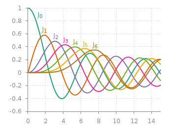
Fig. 1 Bessel functions from order zero up to six plotted with the dark2 line colors. (code to produce this figure, dark2.pal, xyborder.cfg, grid.cfg, mathematics.cfg)

Let us start with the Bessel function example from the last blog entry. As you can see in Fig. 1, it is a 2D plot, including axes, a grid, line colors, and definitions of higher order Bessel functions. All of those could be easily stored in small config files and reused in other plots.
As an example I will start with the axes. Here, I have four different config files, called xyborder.cfg, xborder, yborder.cfg, noborder.cfg, which do exactly what their names would suggest. Here are the first and last file:

# xyborder.cfg
set style line 101 lc rgb '#808080' lt 1 lw 1
set border 3 front ls 101
set tics nomirror out scale 0.75
set format '%g'
# noborder.cfg
set border 0
set style line 101 lc rgb '#808080' lt 1 lw 1
unset xlabel
unset ylabel
set format x ''
set format y ''
set tics scale 0

In the main plotting file I then just have to load the setting I like to have and I’m done. The same can be done for adding a grid, the right line color definitions and the extra Bessel functions leading to the following excerpt from the main plotting file:

# set path of config snippets
set loadpath './config'
# load config snippets
load 'dark2.pal'
load 'xyborder.cfg'
load 'grid.cfg'
load 'mathematics.cfg'

The set loadpath command tells gnuplot the directory where it can find all the configuration snippets. If you want to see an overview, look at my gnuplot configuration snippets and at the collection of palettes and line colors.

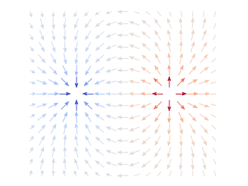
If you want to include more complicated settings, you have to use the macro setting of gnuplot. Fig. 2 is a reproduction of an earlier entry plotting a vector field with arrows. It included an lenghty definition of how to plot these arrows. If you want to do it several time and define the arrows in the same way every time you should also put it into a config file, this time as a variable (macro). In our example it looks like

color_arrows = 'u ($1-dx($1,$2)/2.0):($2-dy($1,$2)/2.0):(dx($1,$2)):(dy($1,$2)):\
(v($1,$2)) with vectors head size 0.08,20,60 filled lc palette'

In the main file the only thing we have then to do is

set macros
load 'noborder.cfg'
load 'moreland.pal'
load 'arrows.cfg'

# [...] 

plot '++' @color_arrows

Important is the first line that enables the use of macros in gnuplot which is disabled by default.

February 21st, 2014 | 5 Comments

For the measurement of distances T-shaped arrows are often used to highlight the length. In gnuplot there is an easy way to achieve this.

Diffraction on a slit

Fig. 1 Diffraction of light for a slit with the length d. (code to produce this figure)

Have a look at Fig. 1 which tries to explain the diffraction phenomenon of a slit with the length d. At a distance a the diffraction pattern is drawn. The different distances, the distance between the first minima of the diffraction pattern, and the wave length are indicated by T-shaped arrows. This kind of arrays can be achieved in gnuplot with the following code.

Theads = 'heads size 0.5,90 front ls 201'
set arrow from -24,-2 to -24, 2       @Theads
set arrow from -22, 2 to -21.44,1.92  @Theads
set arrow from 1.5,-pi to 1.5,pi      @Theads
set arrow from -22,2.5*pi to 0,2.5*pi @Theads

Here, 90 is the relevant entry after size as it describes the opening angle of the arrow head.
In addition, an open circle is drawn to indicate the angle θ. This is achieved by specifying the opening angle for the circle object.

set object circle at -22,0 size 6 arc [-8:0]

March 15th, 2012 | 8 Comments

Suppose you have an image and wanted to add some lines, arrows, a scale or whatever to it. Of course you can do this easily with Gnuplot as you can see in Fig. 1.

jpg image

Fig. 1 Plotting a jpg image within your graph and adding a scale (code to produce this figure, image data). Image source: © SFTEP.

To plot the jpg image of the longnose hawkfish you have to tell the plot command that you have binary data, the filetype, and choose rgbimage as a plotting style. Also we ensure that the image axes are in the right relation to each other by setting ratio to -1.

set size ratio -1
plot 'fish.jpg' binary filetype=jpg with rgbimage

The scale needs a little more work, because Gnuplot can not plot a axis with tics to both directions of it. Hence we are using a bunch of arrows to achieve the same result. The text is than set by labels to the axis.

set arrow from 31,40 to 495,40 nohead front ls 1
set for [ii=0:11] arrow from 31+ii*40,35 to 31+ii*40,45 nohead \
   front ls 1
# set number and unit as different labels in order
# to get a smaller distance between them
set label '0'  at  25,57 front tc ls 1
set label 'cm' at  37,57 front tc ls 1
set label '5'  at 225,57 front tc ls 1
set label 'cm' at 237,57 front tc ls 1
set label '10' at 420,57 front tc ls 1
set label 'cm' at 442,57 front tc ls 1

January 22nd, 2012 | No Comments

Axis with arrow

Fig. 1 Plot of a sinusoid with arrows on the axes (code to produce this figure, data)

You can easily add arrows to the end of the x- and y-axis using the set arrow command. The two last values of the size option determines the opening and closing angles of the arrows.

set arrow from graph 1,0 to graph 1.05,0 size screen 0.025,15,60 \
    filled ls 11
set arrow from graph 0,1 to graph 0,1.05 size screen 0.025,15,60 \
    filled ls 11