Gnuplotting

Create scientific plots using gnuplot

March 15th, 2012 | 8 Comments

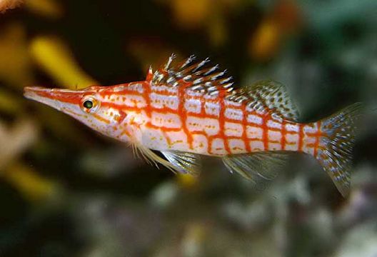
Suppose you have an image and wanted to add some lines, arrows, a scale or whatever to it. Of course you can do this easily with Gnuplot as you can see in Fig. 1.

jpg image

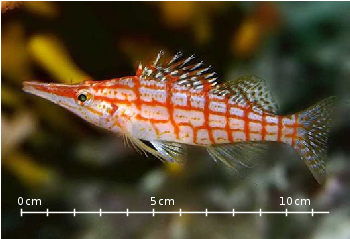
Fig. 1 Plotting a jpg image within your graph and adding a scale (code to produce this figure, image data). Image source: © SFTEP.

To plot the jpg image of the longnose hawkfish you have to tell the plot command that you have binary data, the filetype, and choose rgbimage as a plotting style. Also we ensure that the image axes are in the right relation to each other by setting ratio to -1.

set size ratio -1
plot 'fish.jpg' binary filetype=jpg with rgbimage

The scale needs a little more work, because Gnuplot can not plot a axis with tics to both directions of it. Hence we are using a bunch of arrows to achieve the same result. The text is than set by labels to the axis.

set arrow from 31,40 to 495,40 nohead front ls 1
set for [ii=0:11] arrow from 31+ii*40,35 to 31+ii*40,45 nohead \
   front ls 1
# set number and unit as different labels in order
# to get a smaller distance between them
set label '0'  at  25,57 front tc ls 1
set label 'cm' at  37,57 front tc ls 1
set label '5'  at 225,57 front tc ls 1
set label 'cm' at 237,57 front tc ls 1
set label '10' at 420,57 front tc ls 1
set label 'cm' at 442,57 front tc ls 1

September 26th, 2011 | 8 Comments

If you have not only some data points or a line to plot but a whole matrix, you could plot its values using different colors as shown in the example plot in Fig. 1. Here a 2D slice of the 3D modulation transfer function of a digital breast tomosynthesis system is presented, thanks to Nicholas Marshall from UZ Gasthuisberg (Leuven) for sharing the data.

Color map

Fig. 1 A simple color map (code to produce this figure, data)

All we need to create such a plot is the image plot style, and of course the data have to be in a proper format. Suppose the following matrix which represents z-values of a measurement.

0 1 2 3 4 3 2 1 0
0 1 2 3 4 3 2 1 0
0 1 2 3 4 3 2 1 0
0 1 2 3 4 3 2 1 0
0 1 2 3 4 3 2 1 0
0 1 2 3 4 3 2 1 0
0 1 2 3 4 3 2 1 0
0 1 2 3 4 3 2 1 0
0 1 2 3 4 3 2 1 0

In order to plot these values in different gray color tones, we specify the corresponding palette. In addition we apply the above mentioned image plot style and the matrix format option. The result is shown in Fig. 2.

set palette grey
plot 'color_map.dat' matrix with image
Color map

Fig. 2 A simple color map (code to produce this figure, data)

One remaining problem with Fig. 2 is, that the values on the x- and y-axis are probably not the one which you want, but the corresponding row and column numbers. One way to get the desired values is the use command, which can also be used with image. See Fig. 3 for the result.

plot 'color_map.dat' u (($1-4)/10):2:3 matrix w image
Color map

Fig. 3 A color map with a scaled x-axis (code to produce this figure, data)

Another way is to store the axes vectors together with the data. Therefore the data has to be stored as a binary matrix. The format of this matrix has to be the following:

<M>  <y1>   <y2>   <y3>   ... <yN>
<x1> <z1,1> <z1,2> <z1,3> ... <z1,N>
<x2> <z2,1> <z2,2> <z2,3> ... <z2,N>
 :      :      :      :   ...    :
<xM> <zM,1> <zM,2> <zM,3> ... <zM,N>

In Matlab/Octave the binary matrix can be stored using this m-file. The stored binary matrix can then be plotted by adding the binary indicator to the plot command.

plot 'color_map.bin' binary matrix with image

Note that in principle a color map can also be created by the splot command:

set pm3d map
splot 'data.dat' matrix

But if you create vector graphics with this command you will get a really big output file, because every single point will be drawn separately. For example check the graph from Fig. 1 as pdf created with plot and image and as pdf created with splot and pm3d map.