October 24th, 2013 | 4 Comments
If you want to put labels into a graph using the epslatex terminal you are probably interested in using a smaller font for these labes than for the rest of the figure. An example is presented in Fig. 1.
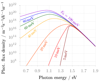
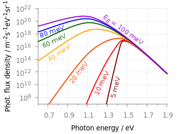
Fig. 1 Photon flux density for different characteristic tail state energies E0 dependent on the photon energy. (code to produce this figure, data)
Figure 1 shows again the photon flux density from one of the last posts, but this time plotted with the epslatex terminal. The label size is changed by setting it to \footnotesize with the following code. First we introduce a abbreviation for the font size by adding a command definition to the header of our latex file.
set terminal epslatex size 9cm,7cm color colortext standalone header \
   "\\newcommand{\\ft}[0]{\\footnotesize}"
After the definition of the abbreviation we can use it for every label we are interested in.
set label 2 '\ft $5$\,meV'         at 1.38,4e9     rotate by  78.5 center tc ls 1
set label 3 '\ft $10$\,meV'        at 1.24,2e10    rotate by  71.8 center tc ls 2
set label 4 '\ft $20$\,meV'        at 1.01,9e11    rotate by  58.0 center tc ls 3
set label 5 '\ft $40$\,meV'        at 0.81,1e15    rotate by  43.0 center tc ls 4
set label 6 '\ft $60$\,meV'        at 0.76,9e16    rotate by  33.0 center tc ls 5
set label 7 '\ft $80$\,meV'        at 0.74,2.5e18  rotate by  22.0 center tc ls 6
set label 8 '\ft $E_0 = 100$\,meV' at 1.46,5e18    rotate by -40.5 center tc ls 7