Gnuplotting

Create scientific plots using gnuplot

January 8th, 2015 | 9 Comments

Some time ago I discussed how to get the jet colormap from Matlab in gnuplot. Since Matlab R2014b jet is no longer the default colormap. Now parula is the new default colormap. It was introduced together with new default line colors.

The changes in the default colormap address some of the points that were criticized of jet by Moreland and corrected by his colormap.

Matlab parula colormap

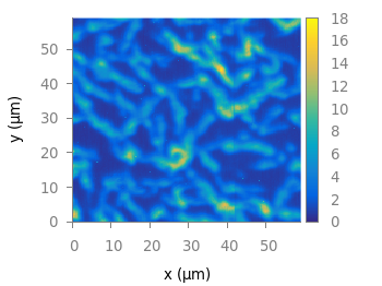
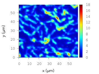
Fig. 1 Photoluminescence yield plotted with the parula colormap from Matlab (code to produce this figure, parula.pal, data)

A colormap similar to the original is stored in the parula.pal file, which is also part of the gnuplot-palettes repository on github. An example application of the colormap is presented in Fig. 1.

In order to apply the colormap you can simply load the file.

load 'parula.pal'

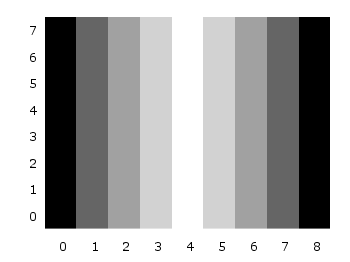
The parula.pal file also includes definitions of line styles. The first line styles (1-9) corresponds to the colors of the parula palette, the line styles 11-17 correspond to the new Matlab line colors, see Fig. 2.

Bessel functions

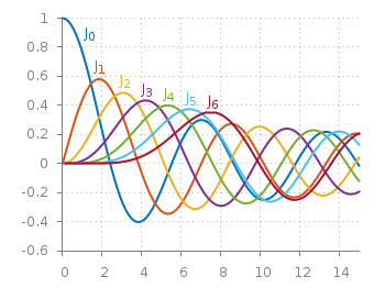
Fig. 2 Bessel functions from order zero up to six plotted with the new default Matlab line colors. (code to produce this figure, parula.pal, data)

set style line 11 lt 1 lc rgb '#0072bd' # blue
set style line 12 lt 1 lc rgb '#d95319' # orange
set style line 13 lt 1 lc rgb '#edb120' # yellow
set style line 14 lt 1 lc rgb '#7e2f8e' # purple
set style line 15 lt 1 lc rgb '#77ac30' # green
set style line 16 lt 1 lc rgb '#4dbeee' # light-blue
set style line 17 lt 1 lc rgb '#a2142f' # red

If you want to use only the palette and not the line colors, you should remove them from the parula.pal file.

January 5th, 2012 | 16 Comments

This time another colormap plot. If you are using Matlab or Octave you are probably be familiar with Matlabs nice default colormap jet.

Matlab colorbar

Fig. 1 Photoluminescence yield plotted with the jet colormap from Matlab (code to produce this figure, data)

In Fig.1, you see a photoluminescence yield in a given region, and as you can see Gnuplot is able to apply the jet colormap from Matlab. This can be achieved by defining the palette as follows.

set palette defined ( 0 '#000090',\
                      1 '#000fff',\
                      2 '#0090ff',\
                      3 '#0fffee',\
                      4 '#90ff70',\
                      5 '#ffee00',\
                      6 '#ff7000',\
                      7 '#ee0000',\
                      8 '#7f0000')

The numbers 0..8 are automatically rescaled to 0..1, which means you can employ arbitrary numbers here, only their difference counts.

If you want to use this colormap regularly, you can store it in the Gnuplot config file as a macro.

# ~/.gnuplot
set macros
MATLAB = "defined (0  0.0 0.0 0.5, \
                   1  0.0 0.0 1.0, \
                   2  0.0 0.5 1.0, \
                   3  0.0 1.0 1.0, \
                   4  0.5 1.0 0.5, \
                   5  1.0 1.0 0.0, \
                   6  1.0 0.5 0.0, \
                   7  1.0 0.0 0.0, \
                   8  0.5 0.0 0.0 )"

Here we defined the colors directly as rgb values in the range of 0..1, which can be alternatively used a color definition.
In order to apply the colormap, we now can simple write

set palette @MATLAB

September 26th, 2011 | 8 Comments

If you have not only some data points or a line to plot but a whole matrix, you could plot its values using different colors as shown in the example plot in Fig. 1. Here a 2D slice of the 3D modulation transfer function of a digital breast tomosynthesis system is presented, thanks to Nicholas Marshall from UZ Gasthuisberg (Leuven) for sharing the data.

Color map

Fig. 1 A simple color map (code to produce this figure, data)

All we need to create such a plot is the image plot style, and of course the data have to be in a proper format. Suppose the following matrix which represents z-values of a measurement.

0 1 2 3 4 3 2 1 0
0 1 2 3 4 3 2 1 0
0 1 2 3 4 3 2 1 0
0 1 2 3 4 3 2 1 0
0 1 2 3 4 3 2 1 0
0 1 2 3 4 3 2 1 0
0 1 2 3 4 3 2 1 0
0 1 2 3 4 3 2 1 0
0 1 2 3 4 3 2 1 0

In order to plot these values in different gray color tones, we specify the corresponding palette. In addition we apply the above mentioned image plot style and the matrix format option. The result is shown in Fig. 2.

set palette grey
plot 'color_map.dat' matrix with image
Color map

Fig. 2 A simple color map (code to produce this figure, data)

One remaining problem with Fig. 2 is, that the values on the x- and y-axis are probably not the one which you want, but the corresponding row and column numbers. One way to get the desired values is the use command, which can also be used with image. See Fig. 3 for the result.

plot 'color_map.dat' u (($1-4)/10):2:3 matrix w image
Color map

Fig. 3 A color map with a scaled x-axis (code to produce this figure, data)

Another way is to store the axes vectors together with the data. Therefore the data has to be stored as a binary matrix. The format of this matrix has to be the following:

<M>  <y1>   <y2>   <y3>   ... <yN>
<x1> <z1,1> <z1,2> <z1,3> ... <z1,N>
<x2> <z2,1> <z2,2> <z2,3> ... <z2,N>
 :      :      :      :   ...    :
<xM> <zM,1> <zM,2> <zM,3> ... <zM,N>

In Matlab/Octave the binary matrix can be stored using this m-file. The stored binary matrix can then be plotted by adding the binary indicator to the plot command.

plot 'color_map.bin' binary matrix with image

Note that in principle a color map can also be created by the splot command:

set pm3d map
splot 'data.dat' matrix

But if you create vector graphics with this command you will get a really big output file, because every single point will be drawn separately. For example check the graph from Fig. 1 as pdf created with plot and image and as pdf created with splot and pm3d map.