Gnuplotting

Create scientific plots using gnuplot

June 23rd, 2014 | 8 Comments

Occasionally it is a good idea to create a zoom of some part of your main plot, especially if you have a small part of your plot where the data is hiding each other.

Including a zoom with multiplot

Fig. 1 Including a zoom into your figure to emphasize some data. (code to produce this figure, data)

In Fig. 1 the interaural time difference between a sound signal reaching the two ears of a listener is plotted with different colors for different frequencies. The data is very dense around 0°, so we include a zoom into this region in the same figure at a free place.

This can be done via multiplot and the plotting of the same data in a smaller figure.

set origin 0.12,0.17
set size 0.45,0.4
set xrange [-10:0]
set yrange [0:0.1]
plot for [n=2:13] 'itd.txt' u 1:(column(n)*1000) w lines ls n

The tricky part is that we have a grid in our main figure and if we do nothing the grid will also be visible in the zoomed in version as shown in Fig. 2.

Including a zoom with multiplot without grid correction

Fig. 2 Including a zoom into your figure, without correcting the grid. (code to produce this figure, data)

To avoid this we have to hide the grid in the background of the zoomed graph. This is done with the trick of placing an empty white rectangle at the place the zoom plot should appear in the figure.

set object 1 rect from -88,0.03 to -49,0.41
set object 1 rect fc rgb 'white' fillstyle solid 0.0 noborder

This will then finally lead to the desired result presented in Fig. 1.

December 21st, 2013 | 2 Comments

After plotting the world several times we will concentrate on a smaller level this time. Ben Johnson was so kind to convert the part dealing with the USA of the 10m states and provinces data set from natural earth to something useful for gnuplot. The result is stored in the file usa.txt.

USA election

Fig. 1 Election results of single U.S. states. (code to produce this figure, USA data, election data)

Two double lines divide the single states. This allows us to plot a single state with the help of the index command. At the end of this post the corresponding index numbers for every state are listed.
In addition to the state border data we have another file that includes results from an example election and strings with the names of the states. The election result can be 1 or 2 – corresponding to blue and red. With the help of these two data sets we are able to create Fig. 1 and Fig. 2.
For drawing a single state in red or blue we first collect the results for every single state in the string variable ELEC. The stats command is suitable for this, because it parses all the data but doesn’t try to plot any of them. During the parsing of every line the election result stored in the second column will be added at the end of the ELEC variable.

ELEC=''
stats 'election.txt' u 1:(ELEC = ELEC.sprintf('%i',$2))

In a second step we plot the state borders and color the states with the help of the ELECstring. ELEC[1:1] will return the election result for the state with the index 0.

plot for [idx=0:48] 'usa.txt' i idx u 2:1 w filledcurves ls ELEC[idx+1:idx+1],\
                    ''              u 2:1 w l ls 3

Alaska and Hawaii are then added with additional plot commands and the help of multiplot.

The data file with the election results includes also the names of the single states and a coordinates to place them. This allows us to put them in the map as well, as you can see in Fig. 2.

USA election

Fig. 2 Names and election results of single U.S. states. (code to produce this figure, USA data, election data)

The plotting of the state names is easily achieved by the labels plotting style:

plot for [idx=0:48] 'usa.txt' i idx u 2:1 w filledcurves ls ELEC[idx+1:idx+1],\
                    ''              u 2:1 w l ls 3,\
                    'election.txt'  u 6:5:3 w labels tc ls 3

At the end we provide the list with the index numbers and the corresponding states. If you want to plot a subset of states – as in Fig. 2 – you should adjust the xrange and yrange values accordingly.

0  Massachusetts
1  Minnesota
2  Montana
3  North Dakota
4  Idaho
5  Washington
6  Arizona
7  California
8  Colorado
9  Nevada
10 New Mexico
11 Oregon
12 Utah
13 Wyoming
14 Arkansas
15 Iowa
16 Kansas
17 Missouri
18 Nebraska
19 Oklahoma
20 South Dakota
21 Louisiana
22 Texas
23 Connecticut
24 New Hampshire
25 Rhode Island
26 Vermont
27 Alabama
28 Florida
29 Georgia
30 Mississippi
31 South Carolina
32 Illinois
33 Indiana
34 Kentucky
35 North Carolina
36 Ohio
37 Tennessee
38 Virginia
39 Wisconsin
40 West Virginia
41 Delaware
42 District of Columbia
43 Maryland
44 New Jersey
45 New York
46 Pennsylvania
47 Maine
48 Michigan
49 Hawaii
50 Alaska

March 5th, 2012 | 3 Comments

If you want to compare some time series of data with each other it could be a good idea to plot them just onto a grid without anything else. Here we will generate a scale paper like grid and plot two simple functions on it.

colored lines

Fig. 1 Plotting some time data on scale paper like grid (code to produce this figure)

In Fig. 1, two harmonic tone complexes are shown, plotted within the multiplot environment. But the thing to consider here is the grid below them. In order to get such a grid, we have to remove all borders and tics. This is done by the following code.

set style line 11 lc rgb '#ffffff' lt 1
set border 0 back ls 11
set tics out nomirror scale 0,0.001
set format ''

The second number of scale for the tics corresponds to the minor tics and must be greater than zero, otherwise no minor tics will appear.

In the last step we enable minor tics on both axes, set the style for the grid and define the grid itself.

set mxtics
set mytics
set style line 12 lc rgb '#ddccdd' lt 1 lw 1.5
set style line 13 lc rgb '#ddccdd' lt 1 lw 0.5
set grid xtics mxtics ytics mytics back ls 12, ls 13

October 27th, 2010 | 11 Comments

If we have more than one graph that should be displayed in a figure, the multiplot command is the one to use in Gnuplot. But as we will see this is not a trivial task.
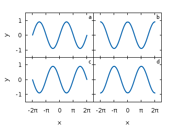
Let us consider we have four different functions that should be presented in the same figure as shown in Fig. 1.

nice multiplot

Fig. 1 A multiplot with reduced axes labeling and nicely arranged graphs (code to produce this figure)

The functions are given by:

# Functions (1/0 means not defined)
a = 0.9
f(x) = abs(x)<2*pi ? a*sin(x)           : 1/0
g(x) = abs(x)<2*pi ? a*sin(x+pi/2)      : 1/0
h(x) = abs(x)<2*pi ? a*sin(x+pi)        : 1/0
k(x) = abs(x)<2*pi ? a*sin(x+3.0/2*pi)  : 1/0

For an explanation of the used syntax to declare the functions have a look at the Defining piecewise functions article.

In a first attempt we just use the multiplot command:

### Start multiplot (2x2 layout)
set multiplot layout 2,2 rowsfirst
# --- GRAPH a
set label 1 'a' at graph 0.92,0.9 font ',8'
plot f(x) with lines ls 1
# --- GRAPH b
set label 1 'b' at graph 0.92,0.9 font ',8'
plot g(x) with lines ls 1
# --- GRAPH c
set label 1 'c' at graph 0.92,0.9 font ',8'
plot h(x) with lines ls 1
# --- GRAPH d
set label 1 'd' at graph 0.92,0.9 font ',8'
plot k(x) with lines ls 1
unset multiplot
### End multiplot

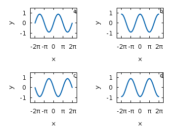
We also added a label to every graph in order to identify them easily in the figure. Note that we overwrite the label 1 for every graph. If we don’t do that, then on the last graph all four labels will be present. Using this simple approach we will get Fig. 2. As you can see this is not an ideal case to use the space in the figure. The xtics and the ytics are just the same in every graph and are not needed to be displayed on every graph.

simple multiplot

Fig. 2 A straightforward use of the multiplot command to plot four different functions (code to produce this figure)

But before we fix this we will introduce the use of macros in order to shorten the code a lot. As you can see in the code block above, the set label command contains the same position for every graph. We can shorten this by:

set macros
# Placement of the a,b,c,d labels in the graphs
POS = "at graph 0.92,0.9 font ',8'"
[...]
set label 1 'a' @POS
plot f(x) with lines ls 1

and so on for the other graphs.

But the macros are not only useful for the different labels, but also for the other settings of the multiplot.
First we want to remove the x/y-tics and labels, where they are not necessary. Here it is the same as with the label settings. Every graph uses the settings from the graph before, if we didn’t change these settings. In order to remove the xtics at a given graph we have to tell this explicitly. Therefore we define macros for the two cases label+tics vs. nolabel+notics:

# x- and ytics for each row resp. column
NOXTICS = "set xtics ('' -2*pi,'' -pi,'' 0,'' pi,'' 2*pi); \
          unset xlabel"
XTICS = "set xtics ('-2π' -2*pi,'-π' -pi,'0' 0,'π' pi,'2π' 2*pi);\
          set xlabel 'x'"
NOYTICS = "set format y ''; unset ylabel"
YTICS = "set format y '%.0f'; set ylabel 'y'"

These will then be used in the plotting section:

# --- GRAPH a
@NOXTICS; @YTICS
[...]
# --- GRAPH b
@NOXTICS; @NOYTICS
[...]
# --- GRAPH c
@XTICS; @YTICS
[...]
# --- GRAPH d
@XTICS; @NOYTICS

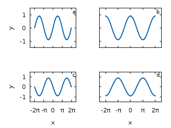
Applying the axes settings will result in Fig. 3.

multiplot

Fig. 3 A multiplot with reduced axes labeling (code to produce this figure)

Now the label etc. on the axes are done in a nice way, but the sizes and the spaces between the individual graphs are very bad. This comes from the fact that Gnuplot calculates the size of a graph depending on the presence of tics and labels. In order to have graphs with the same size and align them without spaces between them we have to set the margins of the individual graphs manually.

# Margins for each row resp. column
TMARGIN = "set tmargin at screen 0.90; set bmargin at screen 0.55"
BMARGIN = "set tmargin at screen 0.55; set bmargin at screen 0.20"
LMARGIN = "set lmargin at screen 0.15; set rmargin at screen 0.55"
RMARGIN = "set lmargin at screen 0.55; set rmargin at screen 0.95"

The trick is that we use the at screen command to arrange the margins absolutely in the figure. As you can see the bottom margin of the two figures in the top is placed at 0.55, the same value the top margin of the two lower graphs start.
These margins are then added in the same way to the multiplot command as the label settings and we get:

# --- GRAPH a
@TMARGIN; @LMARGIN
[...]
# --- GRAPH b
@TMARGIN; @RMARGIN
[...]
# --- GRAPH c
@BMARGIN; @LMARGIN
[...]
# --- GRAPH d
@BMARGIN; @RMARGIN

Having done all this we will finally get our desired figure which is shown in Fig. 1.