October 17th, 2012 | 5 Comments
Some data could be nicely visualized by representing them as arrows. For example, assume that we have done an experiment where we played something to a subject through three loudspeakers and the subject should name the direction where he or she perceived it. In Fig. 1 we show the named direction by the direction of the arrows. The color of the arrow indicates the deviation from the desired direction. A white and not visible arrow means no deviation and a dark red one a deviation of 40° or more.
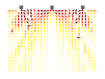
Fig. 1 Vector field showing localization results. The arrows are pointing towards the direction the subject had named. The color indicates the deviation from the desired direction. (code to produce this figure, set_loudspeakers.gnu, data)
In gnuplot the with vectors command enables the arrows in the plot. It requires four parameters, x, y, dx, dy, where dx and dy controls the endpoint of the arrow as offset values to x,y. In our example the direction is stored as an angle, hence the following functions do the conversion to dx,dy. 0.1 defines the length of the arrows.
xf(phi) = 0.1*cos(phi/180.0*pi+pi/2)
yf(phi) = 0.1*sin(phi/180.0*pi+pi/2)
An optional fifth parameter controls the color of the vector together with the lc palette setting. The arrows start at x-dx,y-dy and point to x+dx,y+dy.
plot 'localization_data.txt' \
    u ($1-xf($3)):($2-yf($3)):(2*xf($3)):(2*yf($3)):4 \
    with vectors head size 0.1,20,60 filled lc palette
What structure is contained in the localization_data.txt?
Nevermind, I see the example file now. Thanks!
Thanks for the great example. I’m curious if gnuplot can also show a scale for arrow fill palette.
Hi Doug.
I do not exactly know what you mean with “scale for arrow foll palette”, but you can try to change the line
to
This will add a colorbox to your figure (have a look at this example) showing the scale used for the color of the arrows.
Hi All, This example is a so valuable one. I want to make a box around the graph. And is there anyway to change the color of the arrow based on the magnitude of vectors. Can anyone help for me please. thanks. Nira.