December 1st, 2012 | 7 Comments
In an earlier entry we created a vector field from measured data. Now we will visualize functions with the vector plotting style. As functions we have two 1/r potentials which define the amplitude of the vectors, as can be seen in Fig. 1. It is often better to indicate the amplitude by a color instead of by the length of the single vectors, especially if there are big changes. For the exact functions have a look into the corresponding file.
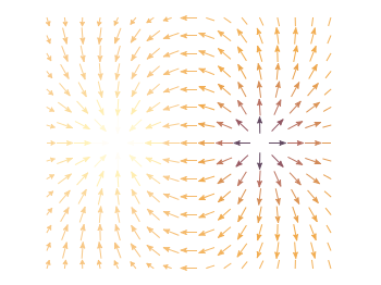
Fig. 1 Vector field of two sources with the opposite charge. The color indicates the amplitude. (code to produce this figure)
By analogy to the data vector field we have again a dx, and dy function for the length of the vectors.
dx(x,y) = scaling*ex(x,y)/enorm(x,y)
dy(x,y) = scaling*ey(x,y)/enorm(x,y)
Now we need a trick, because we have to fill the u 1:2:3:4 for the vector style with our function data. The four columns are then x,y,dx,dy of the vectors, where dx, dy are the lengths of the vector in x and y direction. Here the special filename ++ is a big help. It gives us x and y points as a first and second column, which we could address by $1 and $2. The number of points for the two axes are handled by the samples and isosamples command.
set samples 17    # x-axis
set isosamples 15 # y-axis
plot '++' u ($1-dx($1,$2)/2.0):($2-dy($1,$2)/2.0):\
    (dx($1,$2)):(dy($1,$2)):(v($1,$2)) \
    with vectors head size 0.08,20,60 filled lc palette
To place the vector at the center of the single x, y points, we move the starting point of the vectors to x-dx/2, y-dy/2.
[…] Vector field from function Gnuplot è la cosa migliore che ho scoperto quest’anno ::: Gnuplotting […]
Perfect !
I have a question though, in the case where the background is transparent the white arrows may be visible, even if they’re linked to a low magnitude.
Is there a way to define a palette with transparent value ?
I’m afraid that there is no possibility to get transparent arrows directly in gnuplot. What can be set to transparency is the fillstyle, which is possible for some of the plotting styles. For example have a look at circles
the script is very simple and complete
very useful for my homework
thank you very much!!
Very useful. How can I make it so it reads the 4 columns directly from a .dat file?
Hi Juan,
it depends on what directly you mean with a .dat file. If it is a text file with four columns conatining the needed information you could do something like
plot 'data.dat' u 1:2:3:4:(v($1,$2)) with vectors head size 0.08,20,60 filled lc palette.If the text files contains the positions of the vectors and their directions, you might have a look at http://www.gnuplotting.org/vector-field-from-data-file/
hi,
Thanks for the example, but it’s a bit non-physical. Electric field’s magnitude should obviously be visualized with enorm(x,y), not by the potential. For some reason I cannot make these “palettes” work in the correct case – I just don’t understand how colors in a palette react to these or those values of the plotted function. Back to RTFM :)