Gnuplotting

Create scientific plots using gnuplot

November 14th, 2011 | No Comments

Sometimes it can be useful to be able to invert the entries of the legend. For example in Fig. 1 we have a plot of two frequency responses with the black one plotted as second one in order to stay in front of the gray one.

Three points

Fig. 1 Plot of two frequency responses (code to produce this figure, data)

In order to make the order of the entries in the legend more intuitive we can simple tell Gnuplot to invert them. The result is shown in Fig. 2.

set key invert
Three points

Fig. 2 Plot of two frequency responses (code to produce this figure, data)

October 21st, 2011 | 11 Comments

For presentation or teaching purposes it can be useful to show not only a figure, but an animation to illustrate something more clear. There exists different possibilities to do this in Gnuplot. Today we will have a look at how to create a gif animation.

Bessel function

Fig. 1 Animation of Bessel function (code to produce this figure, loop)

Fig. 1 shows a gif animation of a Bessel function of first kind and zeroth order. Gnuplot has a gif output terminal, but the result will be smoother if we first create png files with Gnuplot and then the animated gif file with another program. In order to create a set of png files we have to loop through the time value t and different output files.

# initializing values for the loop and start the loop
t = 0
end_time = 1
system('mkdir -p animation')
load 'bessel.plt'

The above code sets a start value for the running time variable t and the end_time variable at which the looping should be stopped. Then a folder for the output png files is created and the loop file bessel.plt is loaded. The content of this loop file is shown below.

# bessel loop
t = t + 0.02
outfile = sprintf('animation/bessel%03.0f.png',50*t)
set output outfile
splot u*sin(v),u*cos(v),bessel(u,t) w pm3d ls 1
if(t<end_time) reread;

Here we update the time t, create a file name with a different number and plot out Bessel function. Finally the last line checks if our time t is smaller than the end_time variable, and executes the loop again if this is the case.

After we have created the png files in the animation folder, we start GIMP and load all the files as layers (File > Open as Layers). After this we save all layers together as an animated gif file.

October 10th, 2011 | No Comments

In the last entry we have seen how to use a color map to represent matrix data. Another way to visualize such kind of data is to code their values not as color, but as height information using so called pseudo 3D plots.

Pseudo 3D plot

Fig. 1 Pseudo 3D plot of basilar membrane activity (code to produce this figure, data)

Suppose we have some data like spectra with different parameters, slightly shifted and plotted into the same figure, or different oscillations over time as shown in Fig. 1. There, the movement of the basilar membrane to an input stimuli dependent on the center frequency in ERB is plotted over time. The movement on the basilar membrane is dependent on the frequency of the incoming stimulus, with different frequencies acting on different places along the membrane. In order to plot this kind of data the for command of Gnuplot can be used to iterate through the data. The pseudo 3D effect is realized by shifting the data in every iteration one ERB by the +ii part and the usage of filledcurves to overwrite not visible parts of the plot with white color.

set style fill solid 1.0 border rgb 'black'
plot for [ii=25:1:-1] 'bmm.txt' u (f(column(ii))+ii) \
    w filledcu y1=-2 ls 1

The amplitude of the data was originally stored in order to fit in a plot given in Hz. Hence, we have to convert the data into ERB. This is done by the function f. As arguments to the function the values of each column are given in the iteration. Therefore, the column number is indexed by the column function.

September 26th, 2011 | 8 Comments

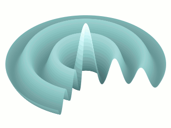
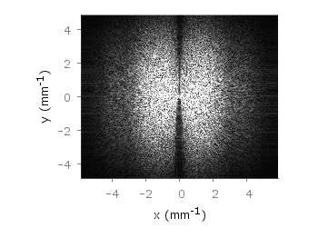
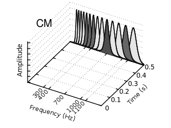
If you have not only some data points or a line to plot but a whole matrix, you could plot its values using different colors as shown in the example plot in Fig. 1. Here a 2D slice of the 3D modulation transfer function of a digital breast tomosynthesis system is presented, thanks to Nicholas Marshall from UZ Gasthuisberg (Leuven) for sharing the data.

Color map

Fig. 1 A simple color map (code to produce this figure, data)

All we need to create such a plot is the image plot style, and of course the data have to be in a proper format. Suppose the following matrix which represents z-values of a measurement.

0 1 2 3 4 3 2 1 0
0 1 2 3 4 3 2 1 0
0 1 2 3 4 3 2 1 0
0 1 2 3 4 3 2 1 0
0 1 2 3 4 3 2 1 0
0 1 2 3 4 3 2 1 0
0 1 2 3 4 3 2 1 0
0 1 2 3 4 3 2 1 0
0 1 2 3 4 3 2 1 0

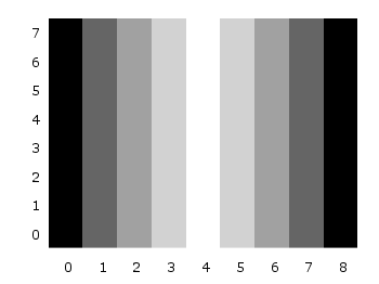
In order to plot these values in different gray color tones, we specify the corresponding palette. In addition we apply the above mentioned image plot style and the matrix format option. The result is shown in Fig. 2.

set palette grey
plot 'color_map.dat' matrix with image
Color map

Fig. 2 A simple color map (code to produce this figure, data)

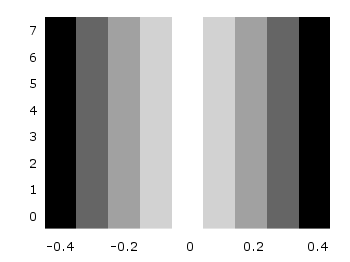
One remaining problem with Fig. 2 is, that the values on the x- and y-axis are probably not the one which you want, but the corresponding row and column numbers. One way to get the desired values is the use command, which can also be used with image. See Fig. 3 for the result.

plot 'color_map.dat' u (($1-4)/10):2:3 matrix w image
Color map

Fig. 3 A color map with a scaled x-axis (code to produce this figure, data)

Another way is to store the axes vectors together with the data. Therefore the data has to be stored as a binary matrix. The format of this matrix has to be the following:

<M>  <y1>   <y2>   <y3>   ... <yN>
<x1> <z1,1> <z1,2> <z1,3> ... <z1,N>
<x2> <z2,1> <z2,2> <z2,3> ... <z2,N>
 :      :      :      :   ...    :
<xM> <zM,1> <zM,2> <zM,3> ... <zM,N>

In Matlab/Octave the binary matrix can be stored using this m-file. The stored binary matrix can then be plotted by adding the binary indicator to the plot command.

plot 'color_map.bin' binary matrix with image

Note that in principle a color map can also be created by the splot command:

set pm3d map
splot 'data.dat' matrix

But if you create vector graphics with this command you will get a really big output file, because every single point will be drawn separately. For example check the graph from Fig. 1 as pdf created with plot and image and as pdf created with splot and pm3d map.

September 8th, 2011 | 3 Comments

In the last entry about attractive plots we introduced the usage of gray borders and tics in order to emphasize the content of the figure.
If we want to do the same in the epslatex terminal, we had to add the color of the text directly with some LaTeX code:

set terminal epslatex size 10.4cm,6.35cm color colortext standalone \
'phv,9' header '\definecolor{tics}{rgb}{0.5,0.5,0.5}'
set format '\color{tics}$%g$'

The problem is that the output looks not the way it should be, but like the one in Fig. 1.
It appears that all the letters we have written in the format string are used for the calculation of the size of the tics.

nice plot

Fig. 1 Colored tics plotted with Gnuplot version <4.4.3 (code to produce this figure)

An easy solution to that problem is to use Gnuplot 4.4.3, because the size calculation has been updated. Fig. 2 shows the result if we use Gnuplot 4.4.3 to create the figure. But still there is some room for improvements.

nice plot

Fig. 2 Colored tics plotted with Gnuplot 4.4.3 (code to produce this figure)

The length of the color name has still an influence on the calculated tics size. Hence we use only one letter for the color definition:

set terminal epslatex size 10.4cm,6.35cm color colortext standalone \
'phv,9' header '\definecolor{t}{rgb}{0.5,0.5,0.5}'
set format '\color{t}$%g$'

The final result is shown in Fig. 3.

nice plot

Fig. 3 Colored tics plotted with Gnuplot 4.4.3 (code to produce this figure)

August 19th, 2011 | No Comments

I have updated the epslatex section in the introduction regarding output-terminals. Now it contains a hint how to deal with the problem of the right size of your plot and the font of the figure in a LaTeX document.

In addition I corrected some links to the Gnuplot documentation. Due to the fact that for the newer versions of Gnuplot no HTML-documentation is anymore available I had to link to the general documentation side instead of directly linking to the topic. It’s a pity and I will try to compile the documentation as HTML by myself and add it to this site.

August 11th, 2011 | 6 Comments

As you surely have noticed I don’t use the default colors and line styles from Gnuplot, but define them myself. The simple reason is that the default colors are not optimized to be very pleasant, but are simply primary colors. I just stumbled over an blog entry of Brighten Godfrey, which deals with some thoughts on beautiful plots.
He suggest to create scientific plots like the way he created his figure which I have reproduced more or less accurate in Fig. 1.

nice plot

Fig. 1 Nice plot with the pngcairo terminal (code to produce this figure, data)

In Fig. 2 the default output of the pngcairo terminal is shown. I think the difference is quiet obvious.

not so nice plot

Fig. 2 Default output of the pngcairo terminal (code to produce this figure, data)

In the following I will have a look at the things we have to do to reach Fig. 1 and why we should do this:

1) change the default colors to more pleasant ones and make the lines a little bit thicker

set style line 1 lc rgb '#8b1a0e' pt 1 ps 1 lt 1 lw 2 # --- red
set style line 2 lc rgb '#5e9c36' pt 6 ps 1 lt 1 lw 2 # --- green

2) put the border more to the background by applying it only on the left and bottom part and put it and the tics in gray

set style line 11 lc rgb '#808080' lt 1
set border 3 back ls 11
set tics nomirror

3) add a slight grid to make it easier to follow the exact position of the curves

set style line 12 lc rgb '#808080' lt 0 lw 1
set grid back ls 12

The last thing I would like to mention is the problem, that the output of the svg terminal is slightly different from the pngcairo terminal. Especially the dashed line of the grid is not created in the right way, even though the dashed option is used for the terminal. This and a solution to convert the lines to dashed versions is also mentioned in the plotting the world entry.

nice plot with svg terminal

Fig. 1 Nice plot with the svg terminal (code to produce this figure, data)

July 29th, 2011 | 5 Comments

In one post we have used the parametric plot option to plot the world. Here we want to add some temperature data as a heat map to the world plots. The data show the temperature anomalies of the year 2005 in comparison to the baseline 1951-1980 and is part of the GISTEMP data set.

Heat map

Fig. 1 A 2D heat map of the temperature anomalies in 2005 to the baseline 1951-1980 (code to produce this figure, temperature data, world data)

The first problem you face, if you want to create a heat map, is that the data has to be in a specific format shown in the Gnuplot example page for heat maps. Therefore we first arrange the data and end up with this temperature anomalies file. Unknown data points are given by 9999.0.

In order to plot this data to the 2D world map we have to add a reasonable cbrange and a color palette and the plot command for the map:

set cbrange [-5:10]
set palette defined (0 "blue",17 "#00ffff",33 "white",50 "yellow",\
    66 "red",100 "#990000",101 "grey")
plot 'temperature.dat' u 2:1:3 w image, \
     'world.dat' with lines linestyle 1

The trick with the wide range from 0 to 101 for the color bar is chosen in order to use grey for the undefined values (9999.0) without seeing the grey color in the color bar. The result is shown in Fig. 1.

Heat map

Fig. 2 A 3D heat map of the temperature anomalies in 2005 to the baseline 1951-1980 (code to produce this figure, temperature data, world data)

The same data can easily be applied to the 3D plot of the world. We have to add front to the hidden3d command in order to make the black world lines visible. In addition the radius must be given explicitly as third column to the plot command for the temperature data.

set hidden3d front
splot 'temperature.dat' u 2:1:(1):3 w pm3d, \
      r*cos(v)*cos(u),r*cos(v)*sin(u),r*sin(v) w l ls 2, \
      'world.dat' u 1:2:(1) w l ls 1

The result is shown in Fig. 2.

July 8th, 2011 | 1 Comment

The last entry has plotted all its data from data files, even the signal at 700Hz. In this entry we will see how to plot the signal as a function using the special-filenames property of Gnuplot.

CMR

Fig. 1 Visualization of the comodulation masking release using splot and special-filenames (code to produce this figure, gfb_loop.gnu, gfb.dat, noise.dat)

In Fig. 1 the end result is seen. What we have done is to replace the last splot command from the cmr.gnu file with the following code.

set samples 500
# Define the sinusoid signal to be plotted
sig(y) = y>0.1 && y<0.4 ? 0.45*sin(2*pi*100*y)+2 : 2
# The desired range is 0:0.5, but the samples were created for the
# x-axis, which has a range of 0:1400, therefore we calculate an
# factor to do the plot
fact = 1400/0.5
splot '+' u (700):($1/fact):(sig($1/fact)) w l ls 14

We define the function sig(y) which is a 100Hz sinusoid centered at 2 for values of y between 0.1 and 0.4 and constant 2 else. In order to place this two dimensional function in our 3D plot we use the special-filenames property from Gnuplot, in this case the '+' variant. This tells Gnuplot to use the xrange, apply a sampling of it and return it as first column for the plot command. But for our plot we need the y-axis and not the x-axis, because the x values should be constant at 700 and are therefore given by (700) at the splot command. The values of the first column, given by $1 are scaled by fact in order to match the two axis and are then directly used as y values and given to the sig(y) function for the z values.

June 24th, 2011 | No Comments

The filledcurves style is only available for 2d plots. But it can be used with some limitations with splot in 3d plots as well. In this entry we want to visualize an effect known from psychoacoustics, called comodulation masking release. The effect describes the possibility of our hearing system to perceive a masked tone (in this case at 700 Hz) easier in the presence of so called comodulated maskers present in other auditory filters. Comodulation describes the fact, that all maskers have the same envelope, as can be seen in Fig. 1.

CMR

Fig. 1 Visualization of the comodulation masking release using splot and filledcurves (code to produce this figure, gfb_loop.gnu, gfb.dat, sig.dat, noise.dat)

First we start with the gammatone filters. The values for them are stored in the gfb.dat file as one column per filter. In order to apply different colors to different filters the style function sty(x) is defined. The data(x) function is defined to be able to plot the filters in a particular order. This will result in the nice effect of overlapping filters shown in Fig. 2.

sty(x) = x<7 ? 1 : x<10 ? 2 : x<12 ? 1 : x==12 ? 3 : x<15 ? 1 : \
    x==15 ? 2 : 1
data(x) = x<12 ? x : 29-x

The filter bank itself is plotted by the gfb_loop.gnu function. There the data are plotted first as filledcurves and then as a line. This two step mechanism has to be used, because the filledcurves style is not able to draw an extra line in 3d. Hence it has to be done in the extra gfb_loop.gnu function, because the simple for iteration only works for a single plot and is not able to plot the line around the filters.

# gfb_loop.gnu
splot 'gfb.dat' u 2:1:(column(data(i))) w filledcurves \
    ls sty(data(i)), \
      ''        u 2:1:(column(data(i))) ls 4
i = i+1
if (i<maxi) reread
CMR

Fig. 2 Plotting gammatone filters with an extra loop file (code to produce this figure, gfb_loop.gnu, gfb.dat)

Thereafter the modulated noise and its envelope and the signal are plotted in different parts of the graph by explicitly giving the x position.
The result is shown in Fig. 1.

splot 'noise.dat' u  (300):1:2 ls 11, \
      ''          u  (300):1:3 ls 14, \
      ''          u  (400):1:2 ls 12, \
      ''          u  (400):1:3 ls 14, \
      ''          u  (700):1:2 ls 13, \
      ''          u  (700):1:3 ls 14, \
      ''          u (1000):1:2 ls 12, \
      ''          u (1000):1:3 ls 14, \
      ''          u (1100):1:2 ls 11, \
      ''          u (1100):1:3 ls 14
splot 'sig.dat'   u  (700):1:2 ls 14