April 27th, 2010 | 54 Comments
Plotting data like measurement results is probably the most used method of plotting in gnuplot. It works basically like the plotting of functions. But in this case we need a data file and some commands to manipulate the data. First, we will start with the basic plotting of simple data and thereafter look at the plotting of data with errors.
Simple data
At first we will have a look at a data file. This can be a text file containing the datapoints as columns.
# plotting_data1.dat
# X   Y
  1   2
  2   3
  3   2
  4   1
You can plot these by writing
# Set linestyle 1 to blue (#0060ad)
set style line 1 \
    linecolor rgb '#0060ad' \
    linetype 1 linewidth 2 \
    pointtype 7 pointsize 1.5

plot 'plotting_data1.dat' with linespoints linestyle 1
Here we also set the point type (pt) and the point size (ps) to use. For the available point styles you can have a look at the ps_symbols file. The resulting plot is presented in Fig. 1.
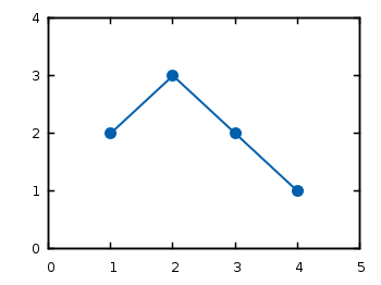
Fig. 1 Plot of the data from plotting_data1.dat (code to produce this figure)
If you have data points that aren’t continuous you can simply tell gnuplot this by inserting one blank line between the data.
# plotting_data2.dat
# X   Y
  1   2
  2   3

  3   2
  4   1
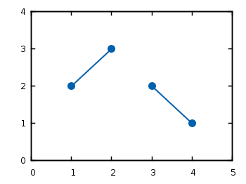
Fig. 2 Plot of the data from plotting_data2.dat as a non-continuous line (code to produce this figure)
If you want to use another color for the second data and still want to have it in the same file, you can insert a second blank line. You then have to index the data block starting by 0.
# plotting_data3.dat
# First data block (index 0)
# X   Y
  1   2
  2   3


# Second index block (index 1)
# X   Y
  3   2
  4   1
# Set first two line styles to blue (#0060ad) and red (#dd181f)
set style line 1 \
    linecolor rgb '#0060ad' \
    linetype 1 linewidth 2 \
    pointtype 7 pointsize 1.5
set style line 2 \
    linecolor rgb '#dd181f' \
    linetype 1 linewidth 2 \
    pointtype 5 pointsize 1.5

plot 'plotting_data3.dat' index 0 with linespoints linestyle 1, \
     ''                   index 1 with linespoints linestyle 2
As you can see, we have added another color and point type and plotted the two datasets by using index and separated the plots by a comma. To reuse the last filename we can just type ''. The result is shown in Fig. 3.
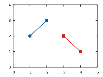
Fig. 3 Plot of the data from plotting_data3.dat in two different styles (code to produce this figure)
Data with errors
Another common task is to plot data with errorbars. Therefore we use the battery.dat file from gnuplots demo files that contains data about the dependence of the power of the battery on the resistance.
Here we want not only to plot the data, but also show the error for the y value (the data is stored in the format: x, y, xerror, yerror).
set xrange [-2:52]
set yrange [0:0.12]
set format y '%.0s'
plot 'battery.dat' using 1:2:4 with yerrorbars linestyle 1, \
     ''                        with lines linestyle 1
The power values are stored in Watt in the data file, but only has values lower than 1. That’s why we want to use mW as unit. Therefore we set the format option to tell gnuplot to use “mantissa to base of current logscale”, see gnuplot’s documentation. Then in the plot command using tells gnuplot which columns from the data file it should use. Since we want to plot the y errors and the data we need three columns in the first line of the plot command. Using the yerrorbars plotting style it is not possible to combine the points by a line. Therefore we add a second line to the plot command to combine the points with a line. This will give us the resulting Fig. 4.
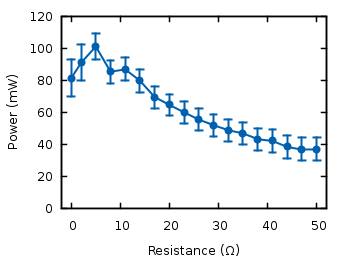
Fig. 4 Plot of the data from battery.dat with y errors (code to produce this figure)
We can avoid the set format command in the last plot by directly manipulating the input data:
set yrange [0:120]
plot 'battery.dat' using 1:($2*1000):($4*1000) with yerrorbars linestyle 1
For achieving this we have to set brackets around the expression and reference the column data with $column_number.
In the last plot we will add theoretical data and a legend to the graph:
# Legend
set key at 50,112
# Theoretical curve
P(x) = 1.53**2 * x/(5.67+x)**2 * 1000
plot 'battery.dat' using 1:($2*1000):($4*1000) \
                   title 'Power' with yerrorbars linestyle 2, \
     P(x) title 'Theory' with lines linestyle 1
Generally the legend is enabled by the set key command. In addition to that, its position can be specified by set key top left etc. You can also set it directly to one point as we have done it here in order to have enough space between the key and the tics. The title keyword within the plot command specifies the text to be displayed in the legend.
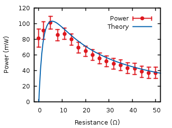
Fig. 5 Plot of the data from battery.dat with y errors and a theoretical curve (code to produce this figure)
Now you should be able to plot your own data with gnuplot. You may also want to look at how to plot functions, or dealing with gnuplot’s different output terminals.
I have a dataset say as follows :
1 0 0.9 8.569 1587.5
1 0 0.9 9.515 975
1 0 0.9 10.494 600
1 0 0.9 11.485 382.5
1 0 0.9 12.711 219.375
1 0 0.9 14.206 115
1 0 0.9 16.329 52.5625
1 0 0.9 21.77 8.6875
1 0 0.9 35.03 0.4875
1 0 0.9 52.7 0.04375
1 0.9 1.2 8.524 327.5
1 0.9 1.2 9.491 193.75
1 0.9 1.2 10.921 93.75
1 0.9 1.2 13.312 31
1 0.9 1.2 18.95 3.3
1 0.9 1.2 34.7 0.08375
1 1.2 1.6 6.771 177.25
1 1.2 1.6 7.268 132
1 1.2 1.6 7.756 104
1 1.2 1.6 8.255 73
1 1.2 1.6 8.748 56
1 1.2 1.6 9.486 36.75
1 1.2 1.6 10.478 21
1 1.2 1.6 11.475 13.2
1 1.2 1.6 13.293 5.675
1 1.2 1.6 18.84 0.58
1 1.2 1.6 34.9 0.02
1 1.6 2.1 6.776 38.5
1 1.6 2.1 7.129 28.65
1 1.6 2.1 7.374 25.2
1 1.6 2.1 7.752 18.8
1 1.6 2.1 8.247 13.35
1 1.6 2.1 8.745 10.9
1 1.6 2.1 9.474 7.5
1 1.6 2.1 10.474 4.2
1 1.6 2.1 11.475 2.56
1 1.6 2.1 13.273 1.16
1 1.6 2.1 18.71 0.11
I wish to plot column 4 as x and column 5 as y such that symbols will be chosen from column 2 and 3. That is, if column 2 is 0 and column 3 is 0.9 then point symbol will be say circle.
How may I do that?
Thanks
[…] The splot command allows you to plot 3D surfaces using the same basic information as the gnuplot plot command for 2D plots. In this case, I used the first 3 columns of the data.dat file to plot 3D data, with […]
(%i21) load(draw);
draw2d(
color = blue,
explicit(Gd2(x),x,0,1)
);
(%o20) “C:/maxima-5.44.0/share/maxima/5.44.0/share/draw/draw.lisp”
(%o21) [gr2d(explicit)]
This command does not draw the graph of this function!
Bolches yarboclos
This worked as a charm!!!
Just what I was searching for.