April 27th, 2010 | 54 Comments
Plotting data like measurement results is probably the most used method of plotting in gnuplot. It works basically like the plotting of functions. But in this case we need a data file and some commands to manipulate the data. First, we will start with the basic plotting of simple data and thereafter look at the plotting of data with errors.
Simple data
At first we will have a look at a data file. This can be a text file containing the datapoints as columns.
# plotting_data1.dat
# X   Y
  1   2
  2   3
  3   2
  4   1
You can plot these by writing
# Set linestyle 1 to blue (#0060ad)
set style line 1 \
    linecolor rgb '#0060ad' \
    linetype 1 linewidth 2 \
    pointtype 7 pointsize 1.5

plot 'plotting_data1.dat' with linespoints linestyle 1
Here we also set the point type (pt) and the point size (ps) to use. For the available point styles you can have a look at the ps_symbols file. The resulting plot is presented in Fig. 1.
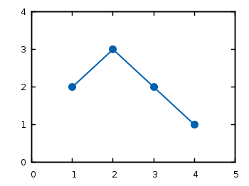
Fig. 1 Plot of the data from plotting_data1.dat (code to produce this figure)
If you have data points that aren’t continuous you can simply tell gnuplot this by inserting one blank line between the data.
# plotting_data2.dat
# X   Y
  1   2
  2   3

  3   2
  4   1
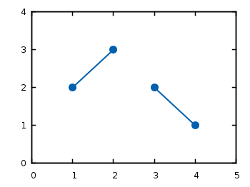
Fig. 2 Plot of the data from plotting_data2.dat as a non-continuous line (code to produce this figure)
If you want to use another color for the second data and still want to have it in the same file, you can insert a second blank line. You then have to index the data block starting by 0.
# plotting_data3.dat
# First data block (index 0)
# X   Y
  1   2
  2   3


# Second index block (index 1)
# X   Y
  3   2
  4   1
# Set first two line styles to blue (#0060ad) and red (#dd181f)
set style line 1 \
    linecolor rgb '#0060ad' \
    linetype 1 linewidth 2 \
    pointtype 7 pointsize 1.5
set style line 2 \
    linecolor rgb '#dd181f' \
    linetype 1 linewidth 2 \
    pointtype 5 pointsize 1.5

plot 'plotting_data3.dat' index 0 with linespoints linestyle 1, \
     ''                   index 1 with linespoints linestyle 2
As you can see, we have added another color and point type and plotted the two datasets by using index and separated the plots by a comma. To reuse the last filename we can just type ''. The result is shown in Fig. 3.
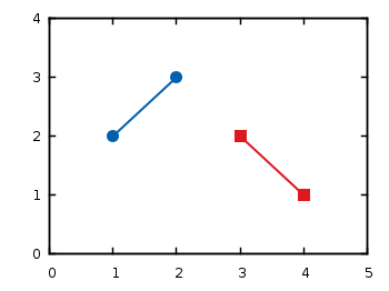
Fig. 3 Plot of the data from plotting_data3.dat in two different styles (code to produce this figure)
Data with errors
Another common task is to plot data with errorbars. Therefore we use the battery.dat file from gnuplots demo files that contains data about the dependence of the power of the battery on the resistance.
Here we want not only to plot the data, but also show the error for the y value (the data is stored in the format: x, y, xerror, yerror).
set xrange [-2:52]
set yrange [0:0.12]
set format y '%.0s'
plot 'battery.dat' using 1:2:4 with yerrorbars linestyle 1, \
     ''                        with lines linestyle 1
The power values are stored in Watt in the data file, but only has values lower than 1. That’s why we want to use mW as unit. Therefore we set the format option to tell gnuplot to use “mantissa to base of current logscale”, see gnuplot’s documentation. Then in the plot command using tells gnuplot which columns from the data file it should use. Since we want to plot the y errors and the data we need three columns in the first line of the plot command. Using the yerrorbars plotting style it is not possible to combine the points by a line. Therefore we add a second line to the plot command to combine the points with a line. This will give us the resulting Fig. 4.
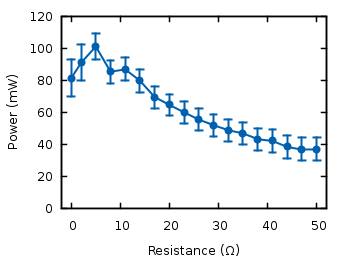
Fig. 4 Plot of the data from battery.dat with y errors (code to produce this figure)
We can avoid the set format command in the last plot by directly manipulating the input data:
set yrange [0:120]
plot 'battery.dat' using 1:($2*1000):($4*1000) with yerrorbars linestyle 1
For achieving this we have to set brackets around the expression and reference the column data with $column_number.
In the last plot we will add theoretical data and a legend to the graph:
# Legend
set key at 50,112
# Theoretical curve
P(x) = 1.53**2 * x/(5.67+x)**2 * 1000
plot 'battery.dat' using 1:($2*1000):($4*1000) \
                   title 'Power' with yerrorbars linestyle 2, \
     P(x) title 'Theory' with lines linestyle 1
Generally the legend is enabled by the set key command. In addition to that, its position can be specified by set key top left etc. You can also set it directly to one point as we have done it here in order to have enough space between the key and the tics. The title keyword within the plot command specifies the text to be displayed in the legend.
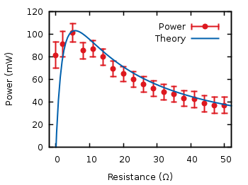
Fig. 5 Plot of the data from battery.dat with y errors and a theoretical curve (code to produce this figure)
Now you should be able to plot your own data with gnuplot. You may also want to look at how to plot functions, or dealing with gnuplot’s different output terminals.
Nice site on gnuplot, always very helpful to see any program in action.
Minor: resitance should be resistance
Thanks for the resistance hint ;)
[…] give me some more data for gnuplot practise. I’m going to use the excellent tutorial I found here to make some nice plots of this […]
Hi,
since this part of the blog is regarding data-sets i was wondering if you could come up with a solution for the follwing:
When plotting from datasets (large entries; >2000) and using the “with filledcurves”-option to overlap them- the overlapped area is full of artefacts from the lines in the background.
It seems like the the stripes forming the filled area have very small gaps but since the amount of data is very dense, it creates some sort of transparency for the background.
Any idea? Would be really awesome.
Btw: very good site on gnuplot!!
Matthias
I can’t reproduce this. In 3D plots I know this problem, but not in 2D plots.
Can you give me more details or sent me your data?
Nice tutorial on gnuplot.
I would like to know if there is a way to automatically change color while plotting multiple columns in a data file.
> plot “filename” w lp
generates a bunch of curves, one for each col, all with the same color. I would like the color to cycle through instead of staying at the default color in the default linestyle (red, in my case)
Separately, it would be nice if you could add a section on plotting data that is saved row-wise instead of column wise. For instance,
>plot “filename” matrix w lp
generates bunch of curves, one for each row of data.
Interesting that
> plot “filename” w lp
creates a bunch of lines in your case. For me it always plots only one line using the first two columns. But you can get the desired result by applying:
> plot for [n=2:10] “filename” u 1:n w lp
This will create 9 curves with different colors, using the first column in your data file as x-axis and the nths column as y-axis.
I noticed that, in contrast to gnuplot 4.4 (Windows 32 bit), gnuplot 4.6 (3/2012) pads automatically the x and y axis ranges by ~10%. Is there a set parameter to eliminate the padding for the xrange so that the rightmost point is the xrange?
I have tested this with the battery.dat data from above by plotting it with
but didn’t get any difference between Gnuplot 4.4 and 4.6.
Can you post an example were a difference occurs?
how can i plot the data for his please help me out , for a text file .txt
x=-0012 y=-0003 z= +0068
@ anvesh kumar –
gnuplot expects and prefers data with just numbers, no text.
You can tell it to ignore rows by inserting a preceding #, like BASH.
The best approach would be to have the program logging your data to skip logging the text. Use colrm if you know your data is always logged exactly the same. otherwise it’s a trivial job for sed.
http://www.grymoire.com/Unix/Sed.html
Great website! thx!
THANKS! fortunately there’re people like you who cares about ignorant people like me! XD
I want to know when and how to use set table command?
The set table command is useful to create data points with a plot command and do the actual plotting of the data with another command. For example have a look at the entry where I created equipotential lines with the set table command. You may also have a look in the manpage.
Hello i have some questions. i use this command “gnuplot -persist -e “plot ‘data.dat'” loop.plt” in the shell.
and the file is like
0 1000
1 2000
3 3000
I want to change that in to a file that has
0 1000 2000
1 2000 3000
3 3000 4000
that will use the 1:2 and 1:3 and has two deferent lines. how i can do that?
Hi Christos,
if you have changed the file, the following will work
If the third column should be always +1000, than you could just use the first file with
I believe you are missing a ” ls 1″ after “plot ‘plotting-data1.dat’ with linespoints” in your second code box. If you run the commands without the ls you’ll get the default red line with crosses.
Yes, thank you very much, I have corrected it.
Hi! How did u manage to get errorbars with filled circles in the middle? I think i can only get a line crossing the error bar to show where the point is. I didn’t find any info about styling error bars also. Thanks for your help!!
Hi Gonza.
All this is done by setting and using a line style.
For example the plot of the errorbars in Fig. 5 is done by
where
ls 2is short forlinestyle 2. Above the plotting command the corresponding line style 2 is set bywhere
pt 7is short forpointtype 7, which is a circle. Have also a look at the overview of available line and point types.Mighty gnuplotter, how can I specify border _and_ fill colours for points? Combining a solid point type (ex. pt 7 in ps term) with a “transparent” point (ex. pt 65) will work for just a few points, but with large number of points, the border points will merge into a dark mess since they are plotted after the solid points. Ideally, one would want a point type that allowed setting both fill colour and border colour, with at least the fill colour variable from input data. I guess one could hack the ps source, but how?
set term post plot "-" w p pt 7 ps 3,\ "-" p pt 65 ps 3 1 2 2 4 3 6Hi dotter, I know this problem and I find it very annoying myself. I haven’t found a solution so far and modify the plot afterwards in Inkscape. But you are right there should be the possibility to modify the postscript code. I will try to have a look at a solution in the next weeks.
I resolved things by hacking the postscipt file with a python script. Here’s what I did:
Consider an eps file generated with:
set term post color eps
set out "example.eps"
set pointsize 10
set xrange [0:4]
set yrange [0:4]
plot "-" w p pt 7  lc rgb "red"   not, \
     "-" w p pt 65 lc rgb "black" t "Example"
1 2
1.1 2.1
e
1 2
1.1 2.1
e
unset out
Clearly, the black circles are drawn on top of the red dots, so we need to draw them right after their red dot. Looking at the postscript source, we have the interesting part between the labels “% Begin plot #1” (the dots) and “% End plot #2” (the circles):
We can move the circles to where dots are drawn, except for the circle in the legend (I wanted it unfilled, since I colored the dots based on data). New source with changes indicated (replace and look at the difference!):
% Begin plot #1
10.000 UP
1.000 UL
LT0
1.00 0.00 0.00 C 2146 2576 CircleF       % red dot
    0.00 0.00 0.00 C 2146 2576 CircE     % black circle (moved)
    1.00 0.00 0.00 C                     % red color (added)
2306 2690 CircleF                        % red dot
    0.00 0.00 0.00 C                     % black color (added)
    2306 2690 CircE                      % black circle (moved)
% End plot #1
% Begin plot #2
LT1                                      % key
0.00 0.00 0.00 C LCb setrgbcolor         % |
5729 4415 M                              % |
(Example) Rshow                          % V
    % lines moved
6296 4415 CircE                          % black circle in legend
% End plot #2
Postscript gurus can probably redefine either the CircE or the CircleF functions, but I’m not there yet. The “circled dot” should really be a builtin pointtype, if you ask me.
Hi Hagen,
thank you for the contents of the web site. I’m wondering if you know a method to plot the curve continuously instead of a non-continuous line, although having the data separated in blocks.
Regards and thanks !
Hi Juan.
There is no internal solution I’m aware of. What you can do is to use another command to remove the blank lines during plotting. For example, to plot the data from Fig. 2 continuously, just execute the following code and you will end up with Fig. 6.
Fig. 6 Plot of the data from plotting_data2.dat as a continuous line by removing blank lines during plotting with sed (code to produce this figure)
Dear Experts,
I use V 4.6 for plotting of files with several hundreds of data:
8.08.2014   13:06:34  14.9  0.116  26.2  9.0  14.853  0.000  3.9  0.120	 106
08.08.2014  13:07:33  14.9  0.115  26.2	 8.8  14.803  0.000  4.0  0.120	 105
08.08.2014  13:08:32  14.9  0.115  26.2	 8.1  14.815  0.000  4.0  0.120	 106
08.08.2014  13:09:32  14.9  0.115  26.2	 8.7  14.862  0.000  4.0  0.120  105
08.08.			 {last data line random corrupted}
For plotting I use the comments:
My question: if the last data line is corrupted, the error “Illegal month” occurs and GNUplot stops.
I tried every and index without success. I guess, a procedure, which skips the last data line would fix the problem.
Do You have a solution?
I would like to plot each point in a file with different color or point type or both. Rather than arranging them in a single row as a long column, and then plotting each column, is there a simple way to use different color/point type for each data point in a file?
Hi. Thanks for your tutorial, it’s cool and useful.
But, please, fix FATAL error in first example.
Your filename is *plotting_data1.dat*
but then in the code you are using `plot ‘plotting-data1.dat’ ….`
So, names are different. It gives me an error, like
gnuplot> plot 'plotting-data1.dat' with linespoints ls 1
         warning: Skipping unreadable file "plotting-data1.dat"
         No data in plot
And I spent a lot of time to figure it out :(
P.s. how to use any formating in comments? I see no help about that
Hi Frodox,
thanks for pointing that error out, I corrected it.
Don’t worry about the formatting I add it normally to the comments after they are submitted. If you want to do it yourself, you can use
<code>your code<⁄code>for inline code or<pre>your code<⁄pre>for complete lines as above in your comment. If you use<pre class="prettyprint">it will use the color highlighting.Hi, I have a question with my dataset. My data set looks like
1.3      a11 a12 a13 a14
           a21 a22 a23 a23
           a31 a32
1.301  a11 a12 a13 a14
           a21 a22 a23 a23
           a31 a32
1.302  a11 a12 a13 a14
           a21 a22 a23 a23
           a31 a32
I want to plot 1st column (1.3, 1.301, 1.302,….) on x axis and a23 on Y axis. Other thing is that my dataset is too large. Please help me out.
Hi Moon.
It is not completely obvious how the format of your data file looks like. If you want to plot the first and eight column of your data file, you can do it like this:
If you have very large data files you should have a look at gnuplots handling of binary files, see also the blog entry on binary data matrices.
[…] that, you can create gnuplot dict to plot the data located in .xy file you created with sample. http://www.gnuplotting.org/plotting-data/ __________________ […]
Hi,
is there a way to do the
command from a file? I would like to loop through different columns of the file and set objects based on the different values contained in the different lines in each column.
Would really appreciate any Help!
Hi Artur.
You could have a look at Object placement using a data file or the Plotting cubes example. In both cases objects are placed/colored based on values read from a file.
where can I load the file?
warning: Cannot find or open file “plotting_data1.dat”
Hi Ricardo.
For every data file, you find a link for download in the caption of the corresponding figure. In your case: http://www.gnuplotting.org/data/plotting_data1.dat
just wondering ..can we plot the graph within the same data file ….? so that the data and graph can be in the same file.
hi there,
This is my script of a file named make_plot.gnu;
it is not plotting, says, ‘;’ expected
please help me out. thank you
Hello,
I have data file with two columns also in the x axix I have to put letters wich we know their positions,
I need please the code,Thank you in advance.
Hi badr,
for plotting labels inside the figure you might want to look at http://www.gnuplotting.org/us-states-and-election-results/
For reading x-axis labels from the data file you might want to have a look at http://www.gnuplotting.org/plotting-simple-statistical-data/
[…] samalla gnuplotia, ideana että statistiikkoja plottaisi png-kuvaksi joita sitten esittää vaikka nettisivulla. […]
Minor thing: Therotecial -> Theoretical in the last code snippet
Thank you, I fixed it.
The gnuplottting.org is a wonderful tutorial of real application of gnuplot with many practical examples!
I learned much from this site and I can now use gnuplot much more efficient.
Thank you and keep going on!
I do not see any answer to Raj from October 28, 2014 at 5:22 pm. However it would be very nice if it were possible to plot different data points in the same column with different point types, so as to link them with lines but have a discrimination (in my case one point over two should be in a specific style, the rest should have no type as in “with line”).
Thanks for the website !
May I suggest replacing the short keywords in the first code block, i.e.,
with their explicit counterparts? This webpage is the first result for “gnuplot plot data” on Google and so it is the very first page I landed on when I started to learn gnuplot (yesterday :-)
When I first saw that
set style line 1 lc rgb '#0060ad' lt 1 lw 2 pt 7 ps 1.5 # --- blueline I thought “better find something simpler”, instead it’s easy to understand when all thelc,lt… are replaced with the explicit keywords.Btw, how can I markup code (both in line and in blocks) in the comments?
Hi Andrea,
thanks for your suggestions I updated all the code in the introduction setting to long setting names.
Regarding the markup it is very old fashioned (and not documented) as the web site is around for a long time. Most of the time I have simply edited the comments to include highlighting. So, finally here the documentation on how you can do it yourself:
Inline code can be written as
which results in:
Use the
linetypesettingA data listing can be best posted as
which results in
A code listing including syntax highlighting with
which will result in
Hi, I have a set of values x1,y1,t1, x2,y2,t1…then x3,y3,t2 &x4,y4,t3,.. and so on ‘n’ times… x1,y1 and x2,y2 represents 2D coordinates of a line with its thickness being t1… and similarly x3,y3 – x4,y4 with its thickness t2… how do i plot this in 2D with thickness represented as per their corresponding value.. thanks