Gnuplotting

Create scientific plots using gnuplot

September 29th, 2014 | 6 Comments

Some time ago I introduced already a waterfall plot, which I named a pseudo-3D-plot. In the meantime, I have been asked several times for a colored version of such a plot. In this post we will revisit the waterfall plot and add some color to it.

Colored waterfall plot

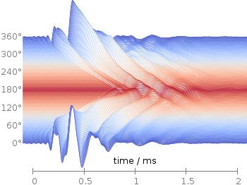
Fig. 1 Waterfall plot of head related impulse responses. (code to produce this figure, color palette, data)

In Fig. 1 the same head related impulse responses we animated already are displayed in a slightly different way. They describe the transmission of sound from a source to a receiver placed in the ear canal dependent on the position of the source. Here, we show the responses for all incident angles of the sound at once. At 0° the source was placed at the same side of the head as the receiver.

The color is added by applying the Moreland color palette, which we discussed earlier. The palette is defined in an extra file and loaded, this enables easy reuse of defined palettes. In the plotting command the palette is enabled with the lc palette command, that tells gnuplot to use the palette as line color depending on the value of the third column, which is given by color(angle).

load 'moreland.pal'
set style fill solid 0.0 border
limit360(x) = x180?360-x:x
amplitude_scaling = 200
plot for [angle=360:0:-2] 'head_related_impulse_responses.txt' \
    u 1:(amplitude_scaling*column(limit360(angle)+1)+angle):(color(angle)) \
    w filledcu y1=-360 lc palette lw 0.5

To achieve the waterfall plot, we start with the largest angle of 360° and loop through all angles until we reach 0°. The column command gives us the corresponding column the data is stored in the data file, amplitude_scaling modifies the amplitude of the single responses, and +angle shifts the data of the single responses along the y-axis to achieve the waterfall.

Even though the changing color in the waterfall plot looks nice you should always think if it really adds some additional information to the plot. If not, a single color should be used. In the following the same plot is repeated, but only with black lines and different angle resolutions which also have a big influence on the final appearance of the plot.

Colored waterfall plot

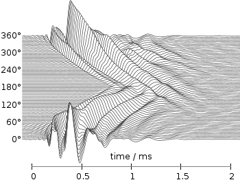
Fig. 2 Waterfall plot of head related impulse responses with a resolution of 5°. (code to produce this figure, data)

Colored waterfall plot

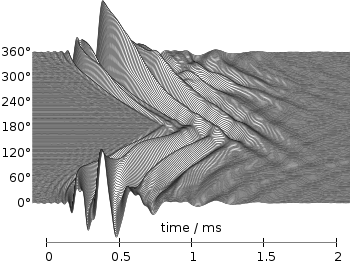
Fig. 3 Waterfall plot of head related impulse responses with a resolution of 2°. (code to produce this figure, data)

Colored waterfall plot

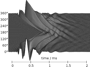
Fig. 4 Waterfall plot of head related impulse responses with a resolution of 1°. (code to produce this figure, data)

June 23rd, 2014 | 8 Comments

Occasionally it is a good idea to create a zoom of some part of your main plot, especially if you have a small part of your plot where the data is hiding each other.

Including a zoom with multiplot

Fig. 1 Including a zoom into your figure to emphasize some data. (code to produce this figure, data)

In Fig. 1 the interaural time difference between a sound signal reaching the two ears of a listener is plotted with different colors for different frequencies. The data is very dense around 0°, so we include a zoom into this region in the same figure at a free place.

This can be done via multiplot and the plotting of the same data in a smaller figure.

set origin 0.12,0.17
set size 0.45,0.4
set xrange [-10:0]
set yrange [0:0.1]
plot for [n=2:13] 'itd.txt' u 1:(column(n)*1000) w lines ls n

The tricky part is that we have a grid in our main figure and if we do nothing the grid will also be visible in the zoomed in version as shown in Fig. 2.

Including a zoom with multiplot without grid correction

Fig. 2 Including a zoom into your figure, without correcting the grid. (code to produce this figure, data)

To avoid this we have to hide the grid in the background of the zoomed graph. This is done with the trick of placing an empty white rectangle at the place the zoom plot should appear in the figure.

set object 1 rect from -88,0.03 to -49,0.41
set object 1 rect fc rgb 'white' fillstyle solid 0.0 noborder

This will then finally lead to the desired result presented in Fig. 1.

June 3rd, 2014 | No Comments

Suppose we have a file containing the following data from the plotting data tutorial:

# absolute_data.txt
# X   Y
1   2
2   3
3   2
4   1
Plotting absolute data

Fig. 1 Plotting absolute data points. (code to produce this figure, data)

This can be plotted in a straightforward manner and will result in Fig. 1. Now suppose we have the same data points stored as relative coordinates in our data file, resulting in:

# relative_data.txt
# deltaX deltaY
1   2
1   1
1   -1
1   -1

If we want to plot that data in gnuplot we have to keep track of the current position manually by storing its (x,y) value as variables by

x=0.; y=0.
plot 'relative_data.txt' u (x=x+$1):(y=y+$2) w p ls 1

Here, we define the starting point to be (0,0) and add to it the values from the first and second column for every line of the data file. By doing so, this results again in Fig. 1. Note, that the addition is always performed first, before the resulting point is plotted which means we get no point at (0,0). Now assume that we also want to add steps going from point to point as shown in Fig. 2. Gnuplot has the steps plotting style to achieve this, but we have to be carefully regarding our (x,y) variables.

Plotting relative data

Fig. 2 Plotting relative data points. (code to produce this figure, data)

Every single line of a plotting command is executed after each other which means our (x,y) pair will not be set to (0,0), but to (4,1) at the beginning of the second line of the plotting command. To avoid this we introduce another (a,b) pair for the second line and get finally.

x=0.; y=0.
a=0.; b=0.
plot 'relative_data.txt' u (x=x+$1):(y=y+$2) w steps ls 2,\
     ''                  u (a=a+$1):(b=b+$2) w points ls 1

December 21st, 2013 | 2 Comments

After plotting the world several times we will concentrate on a smaller level this time. Ben Johnson was so kind to convert the part dealing with the USA of the 10m states and provinces data set from natural earth to something useful for gnuplot. The result is stored in the file usa.txt.

USA election

Fig. 1 Election results of single U.S. states. (code to produce this figure, USA data, election data)

Two double lines divide the single states. This allows us to plot a single state with the help of the index command. At the end of this post the corresponding index numbers for every state are listed.
In addition to the state border data we have another file that includes results from an example election and strings with the names of the states. The election result can be 1 or 2 – corresponding to blue and red. With the help of these two data sets we are able to create Fig. 1 and Fig. 2.
For drawing a single state in red or blue we first collect the results for every single state in the string variable ELEC. The stats command is suitable for this, because it parses all the data but doesn’t try to plot any of them. During the parsing of every line the election result stored in the second column will be added at the end of the ELEC variable.

ELEC=''
stats 'election.txt' u 1:(ELEC = ELEC.sprintf('%i',$2))

In a second step we plot the state borders and color the states with the help of the ELECstring. ELEC[1:1] will return the election result for the state with the index 0.

plot for [idx=0:48] 'usa.txt' i idx u 2:1 w filledcurves ls ELEC[idx+1:idx+1],\
                    ''              u 2:1 w l ls 3

Alaska and Hawaii are then added with additional plot commands and the help of multiplot.

The data file with the election results includes also the names of the single states and a coordinates to place them. This allows us to put them in the map as well, as you can see in Fig. 2.

USA election

Fig. 2 Names and election results of single U.S. states. (code to produce this figure, USA data, election data)

The plotting of the state names is easily achieved by the labels plotting style:

plot for [idx=0:48] 'usa.txt' i idx u 2:1 w filledcurves ls ELEC[idx+1:idx+1],\
                    ''              u 2:1 w l ls 3,\
                    'election.txt'  u 6:5:3 w labels tc ls 3

At the end we provide the list with the index numbers and the corresponding states. If you want to plot a subset of states – as in Fig. 2 – you should adjust the xrange and yrange values accordingly.

0  Massachusetts
1  Minnesota
2  Montana
3  North Dakota
4  Idaho
5  Washington
6  Arizona
7  California
8  Colorado
9  Nevada
10 New Mexico
11 Oregon
12 Utah
13 Wyoming
14 Arkansas
15 Iowa
16 Kansas
17 Missouri
18 Nebraska
19 Oklahoma
20 South Dakota
21 Louisiana
22 Texas
23 Connecticut
24 New Hampshire
25 Rhode Island
26 Vermont
27 Alabama
28 Florida
29 Georgia
30 Mississippi
31 South Carolina
32 Illinois
33 Indiana
34 Kentucky
35 North Carolina
36 Ohio
37 Tennessee
38 Virginia
39 Wisconsin
40 West Virginia
41 Delaware
42 District of Columbia
43 Maryland
44 New Jersey
45 New York
46 Pennsylvania
47 Maine
48 Michigan
49 Hawaii
50 Alaska

October 24th, 2013 | 4 Comments

If you want to put labels into a graph using the epslatex terminal you are probably interested in using a smaller font for these labes than for the rest of the figure. An example is presented in Fig. 1.

Photo density flux

Fig. 1 Photon flux density for different characteristic tail state energies E0 dependent on the photon energy. (code to produce this figure, data)

Figure 1 shows again the photon flux density from one of the last posts, but this time plotted with the epslatex terminal. The label size is changed by setting it to \footnotesize with the following code. First we introduce a abbreviation for the font size by adding a command definition to the header of our latex file.

set terminal epslatex size 9cm,7cm color colortext standalone header \
   "\\newcommand{\\ft}[0]{\\footnotesize}"

After the definition of the abbreviation we can use it for every label we are interested in.

set label 2 '\ft $5$\,meV'         at 1.38,4e9     rotate by  78.5 center tc ls 1
set label 3 '\ft $10$\,meV'        at 1.24,2e10    rotate by  71.8 center tc ls 2
set label 4 '\ft $20$\,meV'        at 1.01,9e11    rotate by  58.0 center tc ls 3
set label 5 '\ft $40$\,meV'        at 0.81,1e15    rotate by  43.0 center tc ls 4
set label 6 '\ft $60$\,meV'        at 0.76,9e16    rotate by  33.0 center tc ls 5
set label 7 '\ft $80$\,meV'        at 0.74,2.5e18  rotate by  22.0 center tc ls 6
set label 8 '\ft $E_0 = 100$\,meV' at 1.46,5e18    rotate by -40.5 center tc ls 7

July 30th, 2013 | 1 Comment

If you have more than one line or data set in your figure, they has to be named somehow. I’m not a big fan of a legend but prefer to put the names directly to the corresponding curves. That makes it easier for the reader. But as an author of the figure you have to find space to place the labels in the figure, and it could be that you have to rotate the labels to stick them to the lines.

Photo density flux

Fig. 1 Photon flux density for different characteristic tail state energies E0 dependent on the photon energy. (code to produce this figure, data)

Figure 1 shows the theoretical curves of photon flux density dependent on the photon energy for different characteristic tail state energies E0. E0 is an indicator for disorder in a crystalline system. To reduce the amount of trail and error for placing the E0 labels, we get the rotation directly from the data by fitting a linear function to the corresponding part of the data.

It is a little bit tricky, because we have a logarithmic y-axis. This can be handled by applying the logarithm to the y data by log($2) and than do the linear fiting.

f(x) = a*x+b
fit [1.30:1.34] [*:*] f(x) 'PL_spectrum_mu_1.0eV_E0_05meV_300K.dat' \
    u 1:(log($2)) via a,b

The first bracket is the range on the x-axis and the second sets the corresponding y range to auto. After we have the value of the slope we convert it to a rotation in degree with the r() function and set our label.

set label 2 '5 meV' at 1.38,4e9 rotate by r(a) center tc ls 1

The conversion to rotation is the most tricky part, because it depends on the range of your axes and the ratio between them. it would be trivial if both axes would go from, for example 1:10 and are equal in length in the figure. Otherwise we have to correct for the ranges and ratio.

# get the relation of x- and y-range
dx = xmax-xmin
dy = log(ymax)-log(ymin)
s1 = dx/dy
# get ratio of axes
s2 = 5/6.7
# helper function for getting the rotation angle of the labels in degree
deg(x) = x/pi*180.0
r(x) = deg(atan(s1*s2*x))

June 21st, 2013 | 7 Comments

Sometimes a classical heat map will not be the best way to visualize your data in a two dimensional plane. This is especially the case, when only a few data points on the plane have different values. For example in Fig. 1 you find a projection from one vector to another to visualize its similarity. This is a method used in normal mode analysis of molecules to determine if two different
calculations yield similar results. As you can see only the data points near the diagonal vary, which is hard to see because of the small size of the points. In addition, points farer away from the diagonal having a small percentage value are more or less invisible – compare to Fig. 2.

Sparse data with image plot style

Fig. 1 Vector dot product expressed in percentage plotted with the image style (code to produce this figure, data)

In order to emphasize the data, we abounded the image plot style and use transparent circles as plotting style for visualizing the data as shown in Fig. 2.

Sparse data with circles plot style

Fig. 2 Vector dot product expressed in percentage plotted with the circles style (code to produce this figure, data)

In order to do so, we remove all values from the plot that are 0, by setting them to 1/0. Further we set the transparency of the circles to 20%. Before plotting the data we are sorting them regarding their percentage value in order to plot the highest values above the lower ones.

f(x) = x>2 ? x : 1/0
set style fill transparent solid 0.8 noborder
plot '<sort -g -k3 vector_projection.txt' u 1:2:(1):(f($3)) w circles lc palette

May 21st, 2013 | 1 Comment

As you may have noted, gnuplot and Matlab have different default color maps. Designing such a default map is not easy, because they should handle a lot of different things (Moreland, 2009):
– The map yields images that are aesthetically pleasing
– The map has a maximal perceptual resolution
– Interference with the shading of 3D surfaces is minimal
– The map is not sensitive to vision deficiencies
– The order of the colors should be intuitively the same for all people
– The perceptual interpolation matches the underlying scalars of the map

In his paper Moreland developed a new default color map that was mentioned already in a user comment. In Fig. 1 the map is used to replot the photoluminescence yield plotted in an earlier entry.

Default color map after Moreland, 2009

Fig. 1 Photoluminescence yield plotted with the default color map after Moreland, 2009 (code to produce this figure, data)

To use the default color map proposed by Moreland, just download default.plt and store it to a path, that is available to gnuplot. For example store it under /home/username/.gnuplotting/default.plt and add the following line to your .gnuplot file.

set loadpath "/home/username/.gnuplotting"

After that you can just load the palette before your plot command via

load 'default.plt'
Default gnuplot color palette

Fig. 2 Photoluminescence yield plotted with gnuplots default color palette (code to produce this figure, data)

In Fig. 2 the same plot is shown using the default color map from gnuplot, which is a little bit dark in my opinion.

Default Matlab color palette

Fig. 3 Photoluminescence yield plotted with Matlabs default color palette (code to produce this figure, data)

Figure 3 shows the jet color map from Matlab, which is a classical rainbow map with all its pros and cons.

April 3rd, 2013 | 3 Comments

In one of the last posts, we came up with an updated data set representing the world. One way to plot this data set is with a 2D plot, as shown in Fig. 2. But if you compare the output with the one you see for example at Google Maps you will noticed a difference. That is due to the fact that Google uses the Mercator projection of the data. This projection preserves the angles around any point on the map, what is useful if you have a close look at some streets. The disadvantage of the Mercator projection is the inaccuracy of the sizes of the countries near to the poles. For example the size of Greenland is completely overemphasized as you can see in Fig. 1.

Mercator projection

Fig. 1 Mercator projection of the world (code to produce this figure, data)

In order to achieve the Mercator projection, we apply the following function.

set angles degrees
mercator(latitude) = log( tan(180/4.0 + latitude/2.0) )
set yrange [-3.1:3.1]
plot 'world_110m.txt' u 1:(mercator($2)) w filledcu ls 2
Equirectangular projection

Fig. 2 Equirectangular projection of the world (code to produce this figure, data)

By just plotting the data as we have done for Fig. 2, we have the Equirectangular projection with constant spacing between the latitudes and meridians. The blue background color in the first two figures can be achieved directly with a terminal setting.

set terminal pngcairo size background '#c8ebff'
Heat map

Fig. 3 Mapping of the Mercator projection (code to produce this figure)

In Fig. 3 the Mercator projection function is shown as an input-output-function of the latitude values. The placing of the latitude values on the y-axis can be easily done with a loop.

set ytics 0
do for [angle=-80:80:20] {
    set ytics add (sprintf('%.0f',angle) mercator(angle))
}

December 18th, 2012 | 48 Comments

More than a year ago, we draw a map of the world with gnuplot. But it has been pointed out the low resolution of the map data. For example, Denmark is totally missing in the original data file. The good thing is, there is other data available in the web. In this entry we will consider how to use the physical coastline data from http://www.naturalearthdata.com/downloads/ together with gnuplot.

Fig. 1 Plot of the world with the new data file and a resolution of 1:110m (code to produce this figure, data)

At the download page, three different resolutions of the data are available with a scale of 1:10m, 1:50m, or 1:110m. The data itself is stored as shape files on naturalearthdata.com. Hence I wrote a script that converts the data first to a csv file using the ogr2ogr program. Afterwards the data is shaped with sed into the form of the original world.dat file.
Here are the resulting files:

Fig.1 shows the result for a resolution of 1:110m. Note that we have to use linetype instead of linestyle in gnuplot 4.6 in order to set the colors of the grid and coast line.

In order to compare the different resolutions of the coast line files, we plot only the part of the map where Denmark is located (which is completely missing in the original data).
Here is the example code for a scale of 1:110m.

set xrange [7.5:13]
set yrange [54.5:58]
plot 'world_110m.txt' with filledcurves ls 1, \
    '' with l ls 2

Fig. 2 A plot of Denmark at a resolution of 1:110m. (code to produce this figure, data)

Fig. 3 A plot of Denmark at a resolution of 1:50m. (code to produce this figure, data)

Fig. 4 A plot of Denmark at a resolution of 1:10m. (code to produce this figure, data)