Gnuplotting

Create scientific plots using gnuplot

April 16th, 2014 | 17 Comments

Gnuplot comes with the possibility of plotting histograms, but this requires that the data in the individual bins was already calculated. Here, we start with an one dimensional set of data that we want to count and plot as an histogram, similar to the hist() function we find in Octave.

Histogram of angle data

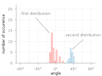
Fig. 1 Two different distributions of measured angles. (code to produce this figure, hist.fct, data)

In Fig. 1 you see two different distributions of measured angles. They were both given as one dimensional data and plotted with a defined macro that is doing the histogram calculation. The macro is defined in an additional file hist.fct and loaded before the plotting command.

binwidth = 4
binstart = -100
load 'hist.fct'
plot 'histogram.txt' i 0 @hist ls 1,\
     ''              i 1 @hist ls 2

The content of hist.fct, including the definition of @hist looks like this

# set width of single bins in histogram
set boxwidth 0.9*binwidth
# set fill style of bins
set style fill solid 0.5
# define macro for plotting the histogram
hist = 'u (binwidth*(floor(($1-binstart)/binwidth)+0.5)+binstart):(1.0) smooth freq w boxes'

For a detailed discussion on why @hist calculates a histogram you should have a look at this discussion and the documentation about the smooth freq which basically counts points with the same x-value. The other settings in the file define the width of a single bin plotted as a box and its fill style.

Histogram of angle data

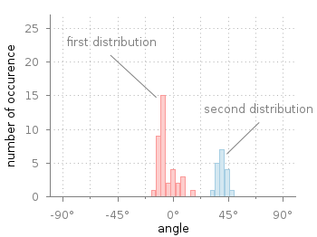
Fig. 2 Two different distributions of measured angles. The bins of the histograms are shifted to be centered around 0°. (code to produce this figure, hist.fct, data)

It is important that the two values binwidth and binstart are defined before loading the hist.fct file. These define the width of the single bins and at what position the left border of a single bin should be positioned. For example, let us assume that we want to have the bins centered around 0° as shown in Fig. 2. This can be achieved by settings the binstart to half the binwidth:

binwidth = 4
binstart = -2
load 'hist.fct'
plot 'histogram.txt' i 0 @hist ls 1,\
     ''              i 1 @hist ls 2

December 21st, 2013 | 2 Comments

After plotting the world several times we will concentrate on a smaller level this time. Ben Johnson was so kind to convert the part dealing with the USA of the 10m states and provinces data set from natural earth to something useful for gnuplot. The result is stored in the file usa.txt.

USA election

Fig. 1 Election results of single U.S. states. (code to produce this figure, USA data, election data)

Two double lines divide the single states. This allows us to plot a single state with the help of the index command. At the end of this post the corresponding index numbers for every state are listed.
In addition to the state border data we have another file that includes results from an example election and strings with the names of the states. The election result can be 1 or 2 – corresponding to blue and red. With the help of these two data sets we are able to create Fig. 1 and Fig. 2.
For drawing a single state in red or blue we first collect the results for every single state in the string variable ELEC. The stats command is suitable for this, because it parses all the data but doesn’t try to plot any of them. During the parsing of every line the election result stored in the second column will be added at the end of the ELEC variable.

ELEC=''
stats 'election.txt' u 1:(ELEC = ELEC.sprintf('%i',$2))

In a second step we plot the state borders and color the states with the help of the ELECstring. ELEC[1:1] will return the election result for the state with the index 0.

plot for [idx=0:48] 'usa.txt' i idx u 2:1 w filledcurves ls ELEC[idx+1:idx+1],\
                    ''              u 2:1 w l ls 3

Alaska and Hawaii are then added with additional plot commands and the help of multiplot.

The data file with the election results includes also the names of the single states and a coordinates to place them. This allows us to put them in the map as well, as you can see in Fig. 2.

USA election

Fig. 2 Names and election results of single U.S. states. (code to produce this figure, USA data, election data)

The plotting of the state names is easily achieved by the labels plotting style:

plot for [idx=0:48] 'usa.txt' i idx u 2:1 w filledcurves ls ELEC[idx+1:idx+1],\
                    ''              u 2:1 w l ls 3,\
                    'election.txt'  u 6:5:3 w labels tc ls 3

At the end we provide the list with the index numbers and the corresponding states. If you want to plot a subset of states – as in Fig. 2 – you should adjust the xrange and yrange values accordingly.

0  Massachusetts
1  Minnesota
2  Montana
3  North Dakota
4  Idaho
5  Washington
6  Arizona
7  California
8  Colorado
9  Nevada
10 New Mexico
11 Oregon
12 Utah
13 Wyoming
14 Arkansas
15 Iowa
16 Kansas
17 Missouri
18 Nebraska
19 Oklahoma
20 South Dakota
21 Louisiana
22 Texas
23 Connecticut
24 New Hampshire
25 Rhode Island
26 Vermont
27 Alabama
28 Florida
29 Georgia
30 Mississippi
31 South Carolina
32 Illinois
33 Indiana
34 Kentucky
35 North Carolina
36 Ohio
37 Tennessee
38 Virginia
39 Wisconsin
40 West Virginia
41 Delaware
42 District of Columbia
43 Maryland
44 New Jersey
45 New York
46 Pennsylvania
47 Maine
48 Michigan
49 Hawaii
50 Alaska

September 23rd, 2010 | 5 Comments

In the last entry we had mean and standard variation data for five different conditions. Now let us assume that we have only two different conditions, but have measured with three different instruments A, B and C. We have used a ANOVA to verify that the data for the two conditions are significant different. As a result the plot in Fig. 1 should be created.

statistics

Fig. 1 Plot the mean and variance of the given data (code to produce this figure)

Therefore we store our data in a format, that can be used by the index command in Gnuplot. Note that the data have two empty lines between the blocks in the real data file:

# mean      std
# A
0.77671    0.20751
0.33354    0.30969
 
 
# B
0.64258    0.22984
0.19621    0.22597
 
 
# C
0.49500    0.31147
0.14567    0.21857

Now every instrument is stored in a different data block containing both conditions as columns.

The color definitions and axes settings are done in a similar way as in the previous blog entry. Note that we have to define two more colors for the boxes, because we use three different colors. Also we define a black line to plot the significance indicator (arrow).

set style line 1 lc rgb 'gray30' lt 1 lw 2
set style line 2 lc rgb 'gray40' lt 1 lw 2
set style line 3 lc rgb 'gray70' lt 1 lw 2
set style line 4 lc rgb 'gray90' lt 1 lw 2
set style line 5 lc rgb 'black' lt 1 lw 1.5
set style fill solid 1.0 border rgb 'grey30'

The significance indicator is created by three black arrows and a text label:

# Draw line for significance test
set arrow 1 from 0,1 to 1,1 nohead ls 5
set arrow 2 from 0,1 to 0,0.95 nohead ls 5
set arrow 3 from 1,1 to 1,0.95 nohead ls 5
set label '**' at 0.5,1.05 center

For the plot the index command is used to plot first condition A, then B and then C by using block 0,1, and 2 respectively. The x-position of the boxes for instrument A are slightly shifted to the left, the ones for C to the right by subtracting or adding the value of bs. The value of bs has the width of one box in order to plot the boxes side by side.

# Size of one box
bs = 0.2
# Plot mean with variance (std^2) as boxes with yerrorbar
plot 'statistics.dat' i 0 u ($0-bs):1:($2**2) notitle w yerrorb ls 1, \
     ''               i 0 u ($0-bs):1:(bs) t 'A' w boxes ls 2, \
     ''               i 1 u 0:1:($2**2) notitle w yerrorb ls 1, \
     ''               i 1 u 0:1:(bs) t 'B' w boxes ls 3, \
     ''               i 2 u ($0+bs):1:($2**2) notitle w yerrorb ls 1, \
     ''               i 2 u ($0+bs):1:(bs) t 'C' w boxes ls 4