Gnuplotting

Create scientific plots using gnuplot

June 5th, 2013 | 7 Comments

If you are looking for nice color maps which are especially prepared to work with cartographic like plots you should have a look at colorbrewer2.org. On that site hosted by Cynthia Brewer you can pick from a large set of well balanced color maps. The maps are ordered regarding their usage. Figure 1 shows example color maps for three different use cases.

Colorbrew color maps

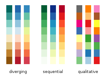
Fig. 1 Examples of color maps from colorbrewer2.org ordered in three categories (code to produce this figure, data)

The diverging color maps are for data with extremes at both points of a neutral value, for example like the below and above sea level. The sequential color maps are for data ordered from one point to another and the qualitative color maps are for categorically-grouped data with now explicit ordering.
Thanks to Anna Schneider there is an easy way to include them (at least the ones with eight colors each) into gnuplot. Just go to her gnuplot-colorbrewer github site and download the color maps. Place them in the same path as your plotting file, or add the three pathes of the repository to your load pathes, for example by adding the following to your .gnuplot file.

set loadpath '~/git/gnuplot-colorbrewer/diverging' \
    '~/git/gnuplot-colorbrewer/qualitative' \
    '~/git/gnuplot-colorbrewer/sequential'
YlGnBu color map from colorbrewer

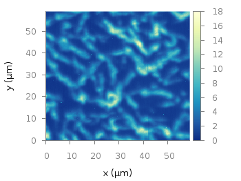
Fig. 2 Photoluminescence yield plotted with the YlGnBu color map from colorbrewer2.org (code to produce this figure, data)

After this you can pick the right color map for you on colorbrewer2.org, keep its name and load it before your plot command. For example in Fig. 2 we are plotting again the photoluminescence yield with the sequential color map named YlGnBu. First we load the color map, then switch the two poles of the color map by setting the palette to negative, and finally plotting the data.

load 'YlGnBu.plt'
set palette negative
plot 'matlab_colormap.txt' u ($1/3.0):($2/3.0):($3/1000.0) matrix with image
Paired color map from colorbrewer

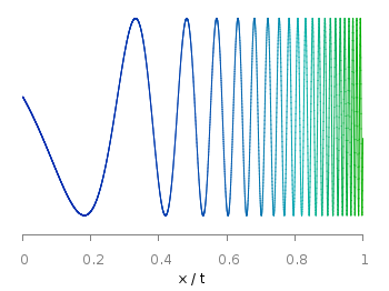
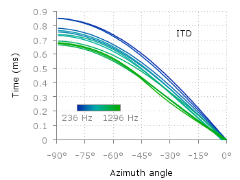
Fig. 3 Eight lines plotted with the Paired color map from colorbrewer2.org (code to produce this figure)

The nice thing of the palettes coming with gnuplot-colorbrewer is that they also include the corresponding line colors. In Fig. 3 you see the Paired qualitative color map in action with lines.

load 'Paired.plt'
plot for [ii=1:8] f(x,ii) ls ii lw 2

July 16th, 2012 | 32 Comments

Sometimes it can be helpful to visualize a third dimension by the color of the line in the plot. For example in Fig. 1 you see a logarithmic sweep going from 0 Hz to 100 Hz. Here the frequency is decoded by the color of the line.

Logarithmic sweep

Fig. 1 A logarithmic sweep ranging from 0 Hz to 100 Hz and decoding the frequency with the line color (code to produce this figure, data)

This can be easily achieved by adding a lc palette to the plot command, which uses the values specified in the third row of the data file.

plot 'logarithmic_sweep.txt' u 1:2:3 w l lc palette

The palette can be defined as shown in the Multiple lines with different colors entry. But it can be set in a more easy way, by only setting the start and end color and calculating the colors in between. Therefore, we are picking the two hue values in GIMP (the H entry in Fig. 2 and Fig. 3) for the starting and ending color.

Picking the first hue value

Fig. 2 Picking the HSV value corresponding to the given color of #09ad00.

Picking the second hue value

Fig. 3 Picking the HSV value corresponding to the given color of #0025ad.

These colors are then used to specify the palette in HSV mode. The S and V values can also directly be seen in GIMP.

# start value for H
h1 = 117/360.0
# end value for H
h2 = 227/360.0
# creating the palette by specifying H,S,V
set palette model HSV functions (1-gray)*(h2-h1)+h1,1,0.68

February 20th, 2012 | 1 Comment

Most of you will probably know the problem of visualizing more than two dimensions of data. In the past we have seen some solutions to this problem by using color maps, or pseudo 3D plots. Here is another solution which will just plot a bunch of lines, but varying their individual colors.

colored lines

Fig. 1 Plot of interaural time differences for different frequency channels, indicated by different colors (code to produce this figure, data)

For this we first define the colors we want to use. Here we create a transition from blue to green by varying the hue in equal steps. The values can be easily calculated with GIMP or any other tool that comes with a color chooser.

set style line 2  lc rgb '#0025ad' lt 1 lw 1.5 # --- blue
set style line 3  lc rgb '#0042ad' lt 1 lw 1.5 #      .
set style line 4  lc rgb '#0060ad' lt 1 lw 1.5 #      .
set style line 5  lc rgb '#007cad' lt 1 lw 1.5 #      .
set style line 6  lc rgb '#0099ad' lt 1 lw 1.5 #      .
set style line 7  lc rgb '#00ada4' lt 1 lw 1.5 #      .
set style line 8  lc rgb '#00ad88' lt 1 lw 1.5 #      .
set style line 9  lc rgb '#00ad6b' lt 1 lw 1.5 #      .
set style line 10 lc rgb '#00ad4e' lt 1 lw 1.5 #      .
set style line 11 lc rgb '#00ad31' lt 1 lw 1.5 #      .
set style line 12 lc rgb '#00ad14' lt 1 lw 1.5 #      .
set style line 13 lc rgb '#09ad00' lt 1 lw 1.5 # --- green

Then we plot our data with these colors and get Figure 1 as a result.

plot for [n=2:13] 'itd.txt' u 1:(column(n)*1000) w lines ls n

There the interaural time difference (ITD) between the right and left ear for different frequency channels ranging from 236 Hz to 1296 Hz is shown. As can be seen the ITD varies depending on the incident angle (azimuth angle) of the given sound.

Another possibility to indicate the frequency channels given by the different colors is to add a colorbox to the graph as shown in Figure 2.

Colored lines

Fig. 2 Plot of interaural time differences for different frequency channels, indicated by different colors as shown in the colorbox (code to produce this figure, data)

To achieve this we have to set the origin and size of the colorbox ourselves. Note, that the notation is not the same as for a rectangle object and uses only the screen coordinates which is a little bit nasty. In addition we have to define our own color palette, as has been discussed already in another colorbox entry. In a last step we add a second phantom plot to our plot command by plotting 1/0 using the image style in order to get the colorbox drawn onto the graph.

set colorbox user horizontal origin 0.32,0.385 size 0.18,0.035 front
set cbrange [236:1296]
set cbtics ('236 Hz' 236,'1296 Hz' 1296) offset 0,0.5 scale 0
set palette defined (\
    1  '#0025ad', \
    2  '#0042ad', \
    3  '#0060ad', \
    4  '#007cad', \
    5  '#0099ad', \
    6  '#00ada4', \
    7  '#00ad88', \
    8  '#00ad6b', \
    9  '#00ad4e', \
    10 '#00ad31', \
    11 '#00ad14', \
    12 '#09ad00' \
    )
plot for [n=2:13] 'itd.txt' u 1:(column(n)*1000) w lines ls n, \
   1/0 w image