Gnuplotting

Create scientific plots using gnuplot

March 12th, 2013 | 12 Comments

We discussed already the plotting of heat maps at more than one occasions. Here we will add the possibility to interpolate the data in a heat map figure.

Heat map

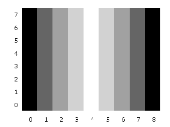
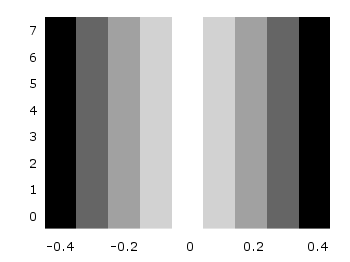
Fig. 1 A simple heat map (code to produce this figure, data)

Suppose we have the following data matrix, stored in heat_map_data.txt.

6 5 4 3 1 0
3 2 2 0 0 1
0 0 0 0 1 0
0 0 0 0 2 3
0 0 1 2 4 3
0 1 2 3 4 5

The normal way of plotting them would be with

plot 'heat_map_data.txt' matrix with image

But to be able to interpolate the data we have to use splot and pm3d instead.

set pm3d map
splot 'heat_map_data.txt' matrix

In Fig. 1 the result of plotting the data just with splot, without interpolation is shown. Note, that the result differs already from the plot command. The plot command would have created six points, whereas the splot command comes up with only five different regions for every axis.

Interpolated heat map

Fig. 2 A heat map interpolated to use twice as much points on every axis (code to produce this figure, data)

Now if we want to double the number of visible points, we can tell pm3d easily to interpolate the data by the interpolate command.

set pm3d interpolate 2,2

The two numbers 2,2 are the number of additional points along the x- and y-axis.
The resulting plot can be found in Fig. 2.

Strong interpolated heat map

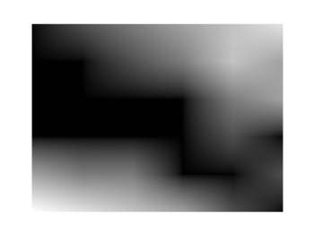
Fig. 3 A heat map interpolated with an optimal number of points (code to produce this figure, data)

In addition to explicitly setting the number of points we can tell gnuplot to choose the correct number of interpolation points by itself, by setting them to 0.

set pm3d interpolate 0,0

Now gnuplot decides by itself how to interpolate, which leads to the result in Fig. 3.

November 29th, 2011 | 3 Comments

A spectrogram is a time-frequency representation that shows how the spectral content of a signal varies with time. In Fig. 1 the spectrogram of the German sentence “Achte auf die Autos” is shown.

Spectrogram

Fig. 1 Spectrogram plotted with plot (code to produce this figure, data)

The spectrogram is plotted as mentioned in the color maps entry.

plot 'spec.dat' binary matrix with image

In addition the letters were putted on the graph at their corresponding time of occurrence. The letters itself and their positions are stored in the two lists syl and xpos. In order to access the single entries of these lists within a for loop the function word is needed.

# Adding the syllables
syl  = 'A    ch   te   a    u    f    d    ie   A    u    t    \
o    s   '
xpos = '0.15 0.22 0.36 0.44 0.49 0.56 0.62 0.66 0.89 1.01 1.16 \
1.26 1.42'
set for [n=1:words(syl)] label word(syl,n) at word(xpos,n),6800

Another way to plot the spectrogram is by using splot which will result in a different kind of smoothing algorithm of the spectrogram, as can be seen in Fig. 2.

Spectrogram

Fig. 2 Spectrogram plotted with splot (code to produce this figure, data)

But to get this result we have to fix some of the margins, because plot is two-dimensinal and splot is three-dimensional which is not desired here.

set border 10 front ls 11
set tmargin at screen 0.75
set bmargin at screen 0.25
set rmargin at screen 0.95
set lmargin at screen 0.15

September 26th, 2011 | 8 Comments

If you have not only some data points or a line to plot but a whole matrix, you could plot its values using different colors as shown in the example plot in Fig. 1. Here a 2D slice of the 3D modulation transfer function of a digital breast tomosynthesis system is presented, thanks to Nicholas Marshall from UZ Gasthuisberg (Leuven) for sharing the data.

Color map

Fig. 1 A simple color map (code to produce this figure, data)

All we need to create such a plot is the image plot style, and of course the data have to be in a proper format. Suppose the following matrix which represents z-values of a measurement.

0 1 2 3 4 3 2 1 0
0 1 2 3 4 3 2 1 0
0 1 2 3 4 3 2 1 0
0 1 2 3 4 3 2 1 0
0 1 2 3 4 3 2 1 0
0 1 2 3 4 3 2 1 0
0 1 2 3 4 3 2 1 0
0 1 2 3 4 3 2 1 0
0 1 2 3 4 3 2 1 0

In order to plot these values in different gray color tones, we specify the corresponding palette. In addition we apply the above mentioned image plot style and the matrix format option. The result is shown in Fig. 2.

set palette grey
plot 'color_map.dat' matrix with image
Color map

Fig. 2 A simple color map (code to produce this figure, data)

One remaining problem with Fig. 2 is, that the values on the x- and y-axis are probably not the one which you want, but the corresponding row and column numbers. One way to get the desired values is the use command, which can also be used with image. See Fig. 3 for the result.

plot 'color_map.dat' u (($1-4)/10):2:3 matrix w image
Color map

Fig. 3 A color map with a scaled x-axis (code to produce this figure, data)

Another way is to store the axes vectors together with the data. Therefore the data has to be stored as a binary matrix. The format of this matrix has to be the following:

<M>  <y1>   <y2>   <y3>   ... <yN>
<x1> <z1,1> <z1,2> <z1,3> ... <z1,N>
<x2> <z2,1> <z2,2> <z2,3> ... <z2,N>
 :      :      :      :   ...    :
<xM> <zM,1> <zM,2> <zM,3> ... <zM,N>

In Matlab/Octave the binary matrix can be stored using this m-file. The stored binary matrix can then be plotted by adding the binary indicator to the plot command.

plot 'color_map.bin' binary matrix with image

Note that in principle a color map can also be created by the splot command:

set pm3d map
splot 'data.dat' matrix

But if you create vector graphics with this command you will get a really big output file, because every single point will be drawn separately. For example check the graph from Fig. 1 as pdf created with plot and image and as pdf created with splot and pm3d map.