Gnuplotting

Create scientific plots using gnuplot

April 13th, 2015 | 3 Comments

Instead of using a legend it is often a good idea to label your data directly in the graph. If you use a grid it can happen that you want to use a white background with your labels. This would improve the readability of the labels as it reduces interaction with the grid. To add a background is not straightforward, especially if you have rotated labels. In the following, we will have a look how to solve the problem for LaTeX terminals. Thanks to V. Mózer for the idea and the data for the plot. Fig. 1 presents the desired result.

Fire severity

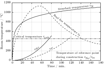
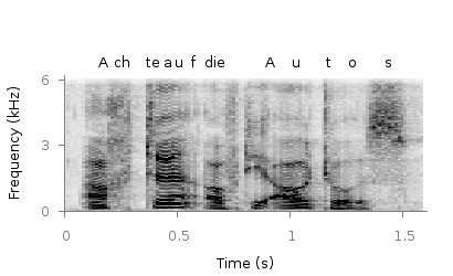
Fig. 1 Fire severity as given by the fire temperature over time for a real vs. normalized fire. Click on the figure to see the original PDF version. (code to produce this figure, data)

To add a background to the labels we use the colorbox command, which we include in our terminal definition via the header option.

set terminal cairolatex standalone pdf size 16cm,10.5cm dashed transparent \
monochrome header monochrome \
header '\newcommand{\hl}[1]{\setlength{\fboxsep}{0.75pt}\colorbox{white}{#1}}'

In addition, we specify the size of the background area with the \setlength{\fboxsep}{0.75pt} command. This is quite handy as the default background size of \colorbox is a little to large for labels.

For the labels themselves, we only have to highlight them with the \hl{} command to get the desired background.

set label 1 at  50, 250 '\hl{\small $t_\textrm{Nc}$}' center rotate by 45 front
Fire severity

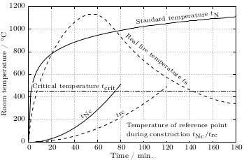
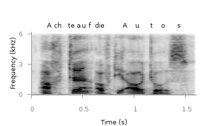
Fig. 2 Fire severity as given by the fire temperature over time for a real vs. normalized fire. Click on the figure to see the original PDF version.(code to produce this figure, data)

If you have a label with a line break, you have to decide if you want to apply the background to every part of the line break, as shown in Fig. 1

set label 2 at  90, 100 '\small \shortstack[l]{\hl{Temperature of reference '.\
                        'point} \\ \hl{during construction $t_\textrm{Nc} / '.\
                        't_\textrm{rc}$}}' front

or if you want to highlight the whole label without seeing some grid between the lines

set label 2 at  90, 100 '\hl{\small \shortstack[l]{Temperature of '.\
                        'reference point \\ during construction '.\
                        '$t_\textrm{Nc} / t_\textrm{rc}$}}' front

Fig. 2 shows the result for that one.

October 24th, 2013 | 4 Comments

If you want to put labels into a graph using the epslatex terminal you are probably interested in using a smaller font for these labes than for the rest of the figure. An example is presented in Fig. 1.

Photo density flux

Fig. 1 Photon flux density for different characteristic tail state energies E0 dependent on the photon energy. (code to produce this figure, data)

Figure 1 shows again the photon flux density from one of the last posts, but this time plotted with the epslatex terminal. The label size is changed by setting it to \footnotesize with the following code. First we introduce a abbreviation for the font size by adding a command definition to the header of our latex file.

set terminal epslatex size 9cm,7cm color colortext standalone header \
   "\\newcommand{\\ft}[0]{\\footnotesize}"

After the definition of the abbreviation we can use it for every label we are interested in.

set label 2 '\ft $5$\,meV'         at 1.38,4e9     rotate by  78.5 center tc ls 1
set label 3 '\ft $10$\,meV'        at 1.24,2e10    rotate by  71.8 center tc ls 2
set label 4 '\ft $20$\,meV'        at 1.01,9e11    rotate by  58.0 center tc ls 3
set label 5 '\ft $40$\,meV'        at 0.81,1e15    rotate by  43.0 center tc ls 4
set label 6 '\ft $60$\,meV'        at 0.76,9e16    rotate by  33.0 center tc ls 5
set label 7 '\ft $80$\,meV'        at 0.74,2.5e18  rotate by  22.0 center tc ls 6
set label 8 '\ft $E_0 = 100$\,meV' at 1.46,5e18    rotate by -40.5 center tc ls 7

July 30th, 2013 | 1 Comment

If you have more than one line or data set in your figure, they has to be named somehow. I’m not a big fan of a legend but prefer to put the names directly to the corresponding curves. That makes it easier for the reader. But as an author of the figure you have to find space to place the labels in the figure, and it could be that you have to rotate the labels to stick them to the lines.

Photo density flux

Fig. 1 Photon flux density for different characteristic tail state energies E0 dependent on the photon energy. (code to produce this figure, data)

Figure 1 shows the theoretical curves of photon flux density dependent on the photon energy for different characteristic tail state energies E0. E0 is an indicator for disorder in a crystalline system. To reduce the amount of trail and error for placing the E0 labels, we get the rotation directly from the data by fitting a linear function to the corresponding part of the data.

It is a little bit tricky, because we have a logarithmic y-axis. This can be handled by applying the logarithm to the y data by log($2) and than do the linear fiting.

f(x) = a*x+b
fit [1.30:1.34] [*:*] f(x) 'PL_spectrum_mu_1.0eV_E0_05meV_300K.dat' \
    u 1:(log($2)) via a,b

The first bracket is the range on the x-axis and the second sets the corresponding y range to auto. After we have the value of the slope we convert it to a rotation in degree with the r() function and set our label.

set label 2 '5 meV' at 1.38,4e9 rotate by r(a) center tc ls 1

The conversion to rotation is the most tricky part, because it depends on the range of your axes and the ratio between them. it would be trivial if both axes would go from, for example 1:10 and are equal in length in the figure. Otherwise we have to correct for the ranges and ratio.

# get the relation of x- and y-range
dx = xmax-xmin
dy = log(ymax)-log(ymin)
s1 = dx/dy
# get ratio of axes
s2 = 5/6.7
# helper function for getting the rotation angle of the labels in degree
deg(x) = x/pi*180.0
r(x) = deg(atan(s1*s2*x))

March 15th, 2012 | 8 Comments

Suppose you have an image and wanted to add some lines, arrows, a scale or whatever to it. Of course you can do this easily with Gnuplot as you can see in Fig. 1.

jpg image

Fig. 1 Plotting a jpg image within your graph and adding a scale (code to produce this figure, image data). Image source: © SFTEP.

To plot the jpg image of the longnose hawkfish you have to tell the plot command that you have binary data, the filetype, and choose rgbimage as a plotting style. Also we ensure that the image axes are in the right relation to each other by setting ratio to -1.

set size ratio -1
plot 'fish.jpg' binary filetype=jpg with rgbimage

The scale needs a little more work, because Gnuplot can not plot a axis with tics to both directions of it. Hence we are using a bunch of arrows to achieve the same result. The text is than set by labels to the axis.

set arrow from 31,40 to 495,40 nohead front ls 1
set for [ii=0:11] arrow from 31+ii*40,35 to 31+ii*40,45 nohead \
   front ls 1
# set number and unit as different labels in order
# to get a smaller distance between them
set label '0'  at  25,57 front tc ls 1
set label 'cm' at  37,57 front tc ls 1
set label '5'  at 225,57 front tc ls 1
set label 'cm' at 237,57 front tc ls 1
set label '10' at 420,57 front tc ls 1
set label 'cm' at 442,57 front tc ls 1

February 20th, 2012 | 1 Comment

Most of you will probably know the problem of visualizing more than two dimensions of data. In the past we have seen some solutions to this problem by using color maps, or pseudo 3D plots. Here is another solution which will just plot a bunch of lines, but varying their individual colors.

colored lines

Fig. 1 Plot of interaural time differences for different frequency channels, indicated by different colors (code to produce this figure, data)

For this we first define the colors we want to use. Here we create a transition from blue to green by varying the hue in equal steps. The values can be easily calculated with GIMP or any other tool that comes with a color chooser.

set style line 2  lc rgb '#0025ad' lt 1 lw 1.5 # --- blue
set style line 3  lc rgb '#0042ad' lt 1 lw 1.5 #      .
set style line 4  lc rgb '#0060ad' lt 1 lw 1.5 #      .
set style line 5  lc rgb '#007cad' lt 1 lw 1.5 #      .
set style line 6  lc rgb '#0099ad' lt 1 lw 1.5 #      .
set style line 7  lc rgb '#00ada4' lt 1 lw 1.5 #      .
set style line 8  lc rgb '#00ad88' lt 1 lw 1.5 #      .
set style line 9  lc rgb '#00ad6b' lt 1 lw 1.5 #      .
set style line 10 lc rgb '#00ad4e' lt 1 lw 1.5 #      .
set style line 11 lc rgb '#00ad31' lt 1 lw 1.5 #      .
set style line 12 lc rgb '#00ad14' lt 1 lw 1.5 #      .
set style line 13 lc rgb '#09ad00' lt 1 lw 1.5 # --- green

Then we plot our data with these colors and get Figure 1 as a result.

plot for [n=2:13] 'itd.txt' u 1:(column(n)*1000) w lines ls n

There the interaural time difference (ITD) between the right and left ear for different frequency channels ranging from 236 Hz to 1296 Hz is shown. As can be seen the ITD varies depending on the incident angle (azimuth angle) of the given sound.

Another possibility to indicate the frequency channels given by the different colors is to add a colorbox to the graph as shown in Figure 2.

Colored lines

Fig. 2 Plot of interaural time differences for different frequency channels, indicated by different colors as shown in the colorbox (code to produce this figure, data)

To achieve this we have to set the origin and size of the colorbox ourselves. Note, that the notation is not the same as for a rectangle object and uses only the screen coordinates which is a little bit nasty. In addition we have to define our own color palette, as has been discussed already in another colorbox entry. In a last step we add a second phantom plot to our plot command by plotting 1/0 using the image style in order to get the colorbox drawn onto the graph.

set colorbox user horizontal origin 0.32,0.385 size 0.18,0.035 front
set cbrange [236:1296]
set cbtics ('236 Hz' 236,'1296 Hz' 1296) offset 0,0.5 scale 0
set palette defined (\
    1  '#0025ad', \
    2  '#0042ad', \
    3  '#0060ad', \
    4  '#007cad', \
    5  '#0099ad', \
    6  '#00ada4', \
    7  '#00ad88', \
    8  '#00ad6b', \
    9  '#00ad4e', \
    10 '#00ad31', \
    11 '#00ad14', \
    12 '#09ad00' \
    )
plot for [n=2:13] 'itd.txt' u 1:(column(n)*1000) w lines ls n, \
   1/0 w image

December 18th, 2011 | 12 Comments

In physics equipotential lines describe lines in space which are at the same potential, for example of the electric field.

Equipotential lines

Fig. 1 Equipotential lines of a plate with electric charges (code to produce this figure)

In Fig. 1 equipotential lines for the electric field of six charges equally spaced on a plate are shown. In order to get these lines we need the function of the potential v(x,y) and make a contour plot with splot to a file to save the positions of the lines.

# calculate and save equipotential lines
set view map
unset surface
set contour base
# distance between contour lines according to 1/r
# => equal distance between lines
set cntrparam levels discrete 4,5,6.67,10
set isosam 31,31
set table 'equipotential_lines.txt'
splot v(x,y) w l ls 1
unset table

plot 'equipotential_lines.txt' u 1:2 w l ls 1

The positions of the lines are given by the cntrparam levels which are chosen in a way, to get equally spaced lines in the far field. The set table command stores the contour lines to a file, and finally the last command plots the stored lines.

In addition to the equipotential lines the value of the contour is stored as a third column in the equipotential_lines.txt file and can be plotted on the graph, too. This is shown in Fig. 2.

Equipotential lines with labels

Fig. 2 Equipotential lines of a plate with electric charges with labels (code to produce this figure)

To get the label of the contour we have to choose a x-position which is given by lx0 in the following. The labels(x,y) function sets a string to the value of the third column, if the right x-position is given and we are above the plate. The function f(x,y) checks if we are near the point where a label should be drawn and undefines the contour line around this point. The size of this area is given by eps.

lx0 = 1.14899
eps = 0.15
labels(x,y) = (x==lx0 && y>y0) ? stringcolumn(3) : ""
f(x,y) = (abs(lx0-x)<eps && y>y0) ? 1/0 : y

November 29th, 2011 | 3 Comments

A spectrogram is a time-frequency representation that shows how the spectral content of a signal varies with time. In Fig. 1 the spectrogram of the German sentence “Achte auf die Autos” is shown.

Spectrogram

Fig. 1 Spectrogram plotted with plot (code to produce this figure, data)

The spectrogram is plotted as mentioned in the color maps entry.

plot 'spec.dat' binary matrix with image

In addition the letters were putted on the graph at their corresponding time of occurrence. The letters itself and their positions are stored in the two lists syl and xpos. In order to access the single entries of these lists within a for loop the function word is needed.

# Adding the syllables
syl  = 'A    ch   te   a    u    f    d    ie   A    u    t    \
o    s   '
xpos = '0.15 0.22 0.36 0.44 0.49 0.56 0.62 0.66 0.89 1.01 1.16 \
1.26 1.42'
set for [n=1:words(syl)] label word(syl,n) at word(xpos,n),6800

Another way to plot the spectrogram is by using splot which will result in a different kind of smoothing algorithm of the spectrogram, as can be seen in Fig. 2.

Spectrogram

Fig. 2 Spectrogram plotted with splot (code to produce this figure, data)

But to get this result we have to fix some of the margins, because plot is two-dimensinal and splot is three-dimensional which is not desired here.

set border 10 front ls 11
set tmargin at screen 0.75
set bmargin at screen 0.25
set rmargin at screen 0.95
set lmargin at screen 0.15

May 20th, 2011 | 4 Comments

The tikz and epslatex terminal directly write text in the graph by using LaTeX. But if you want a line break within a label, a simple \\ will not work. In order to get a line break we can apply the \shortstack command.

set label '\shortstack{first line\\second line}'

In the following example, a principal component analysis (PCA) for attribute ratings of a listening test has been computed and the attributes together with the presented stimuli are plotted in the graph. The natural + little comb filter attribute and its counterpart included a line break (click on the figure for a larger version).

loudspeaker circle

Fig. 1 A PCA plot with a line break in two of its attribute labels (click on the figure for a larger view, code to produce this figure)

October 27th, 2010 | 11 Comments

If we have more than one graph that should be displayed in a figure, the multiplot command is the one to use in Gnuplot. But as we will see this is not a trivial task.
Let us consider we have four different functions that should be presented in the same figure as shown in Fig. 1.

nice multiplot

Fig. 1 A multiplot with reduced axes labeling and nicely arranged graphs (code to produce this figure)

The functions are given by:

# Functions (1/0 means not defined)
a = 0.9
f(x) = abs(x)<2*pi ? a*sin(x)           : 1/0
g(x) = abs(x)<2*pi ? a*sin(x+pi/2)      : 1/0
h(x) = abs(x)<2*pi ? a*sin(x+pi)        : 1/0
k(x) = abs(x)<2*pi ? a*sin(x+3.0/2*pi)  : 1/0

For an explanation of the used syntax to declare the functions have a look at the Defining piecewise functions article.

In a first attempt we just use the multiplot command:

### Start multiplot (2x2 layout)
set multiplot layout 2,2 rowsfirst
# --- GRAPH a
set label 1 'a' at graph 0.92,0.9 font ',8'
plot f(x) with lines ls 1
# --- GRAPH b
set label 1 'b' at graph 0.92,0.9 font ',8'
plot g(x) with lines ls 1
# --- GRAPH c
set label 1 'c' at graph 0.92,0.9 font ',8'
plot h(x) with lines ls 1
# --- GRAPH d
set label 1 'd' at graph 0.92,0.9 font ',8'
plot k(x) with lines ls 1
unset multiplot
### End multiplot

We also added a label to every graph in order to identify them easily in the figure. Note that we overwrite the label 1 for every graph. If we don’t do that, then on the last graph all four labels will be present. Using this simple approach we will get Fig. 2. As you can see this is not an ideal case to use the space in the figure. The xtics and the ytics are just the same in every graph and are not needed to be displayed on every graph.

simple multiplot

Fig. 2 A straightforward use of the multiplot command to plot four different functions (code to produce this figure)

But before we fix this we will introduce the use of macros in order to shorten the code a lot. As you can see in the code block above, the set label command contains the same position for every graph. We can shorten this by:

set macros
# Placement of the a,b,c,d labels in the graphs
POS = "at graph 0.92,0.9 font ',8'"
[...]
set label 1 'a' @POS
plot f(x) with lines ls 1

and so on for the other graphs.

But the macros are not only useful for the different labels, but also for the other settings of the multiplot.
First we want to remove the x/y-tics and labels, where they are not necessary. Here it is the same as with the label settings. Every graph uses the settings from the graph before, if we didn’t change these settings. In order to remove the xtics at a given graph we have to tell this explicitly. Therefore we define macros for the two cases label+tics vs. nolabel+notics:

# x- and ytics for each row resp. column
NOXTICS = "set xtics ('' -2*pi,'' -pi,'' 0,'' pi,'' 2*pi); \
          unset xlabel"
XTICS = "set xtics ('-2π' -2*pi,'-π' -pi,'0' 0,'π' pi,'2π' 2*pi);\
          set xlabel 'x'"
NOYTICS = "set format y ''; unset ylabel"
YTICS = "set format y '%.0f'; set ylabel 'y'"

These will then be used in the plotting section:

# --- GRAPH a
@NOXTICS; @YTICS
[...]
# --- GRAPH b
@NOXTICS; @NOYTICS
[...]
# --- GRAPH c
@XTICS; @YTICS
[...]
# --- GRAPH d
@XTICS; @NOYTICS

Applying the axes settings will result in Fig. 3.

multiplot

Fig. 3 A multiplot with reduced axes labeling (code to produce this figure)

Now the label etc. on the axes are done in a nice way, but the sizes and the spaces between the individual graphs are very bad. This comes from the fact that Gnuplot calculates the size of a graph depending on the presence of tics and labels. In order to have graphs with the same size and align them without spaces between them we have to set the margins of the individual graphs manually.

# Margins for each row resp. column
TMARGIN = "set tmargin at screen 0.90; set bmargin at screen 0.55"
BMARGIN = "set tmargin at screen 0.55; set bmargin at screen 0.20"
LMARGIN = "set lmargin at screen 0.15; set rmargin at screen 0.55"
RMARGIN = "set lmargin at screen 0.55; set rmargin at screen 0.95"

The trick is that we use the at screen command to arrange the margins absolutely in the figure. As you can see the bottom margin of the two figures in the top is placed at 0.55, the same value the top margin of the two lower graphs start.
These margins are then added in the same way to the multiplot command as the label settings and we get:

# --- GRAPH a
@TMARGIN; @LMARGIN
[...]
# --- GRAPH b
@TMARGIN; @RMARGIN
[...]
# --- GRAPH c
@BMARGIN; @LMARGIN
[...]
# --- GRAPH d
@BMARGIN; @RMARGIN

Having done all this we will finally get our desired figure which is shown in Fig. 1.

October 13th, 2010 | 1 Comment

If you have to place a lot of labels in your plot and don’t know their place exactly, it can take a very long time to find the right positions. You will specify a position in the set label command and execute it, adjust the position and execute it again, etc.

But their is an easier way. You can use a Gnuplot script to place your labes interactive by hand and get the corresponding label position coordinates. To give you a clue how it functions, have a look at this video:

Fig. 1 Video to show interactive label placing (code to produce this figure, label_loop function)

The Gnuplot code to generate this video is stored in two files. One normal Gnuplot file for plotting the points, using a technique presented in the Plotting single points entry. At the end of the file, after the plot command another Gnuplot file is called with the label to place. Also the set mouse command enables the use of the mouse for our interactive purposes.

# Enable interactive use of the mouse
set mouse

# Adding the labels (INTERACTIVE)
print "\nPosition the labels with your left mouse until you are \ convinced with their position by pressing another key.\n"

call 'label_loop.gnu' 'square'
call 'label_loop.gnu' 'circle'
call 'label_loop.gnu' 'triangle'

print "Done"

Here the call command calls the function label_loop.gnu with the given label as a parameter. In the label_loop.gnu file the label placing is handled. A label is added or placed at a new position as long as the left mouse key is clicked. If the right mouse key (or any other key) is pressed the label is positioned at the last chosen position. This position is also printed to the standard output every time a new position is chosen.

# Initialize a label number
if (!exists("label_number")) label_number = 1;

# Waiting for the key press and display the given label
pause mouse any "$0"

# Check if the left mouse key is pressed and add the given label to the
# plot. Otherwise stop the loop and count the added label
if( MOUSE_BUTTON==1 ) \
    set label label_number "$0" at MOUSE_X,MOUSE_Y textcolor ls 1;\
    print "\n $0 at ",MOUSE_X,MOUSE_Y;\
    replot;\
    reread;\
else \
    label_number = label_number+1;\
    print "\n"

The variable label_number is needed in order to work with more than one label.

If you want to position the center of the label at the mouse position, you can change the set label line to

set label label_number "$0" at MOUSE_X,MOUSE_Y center textcolor ls 1;\